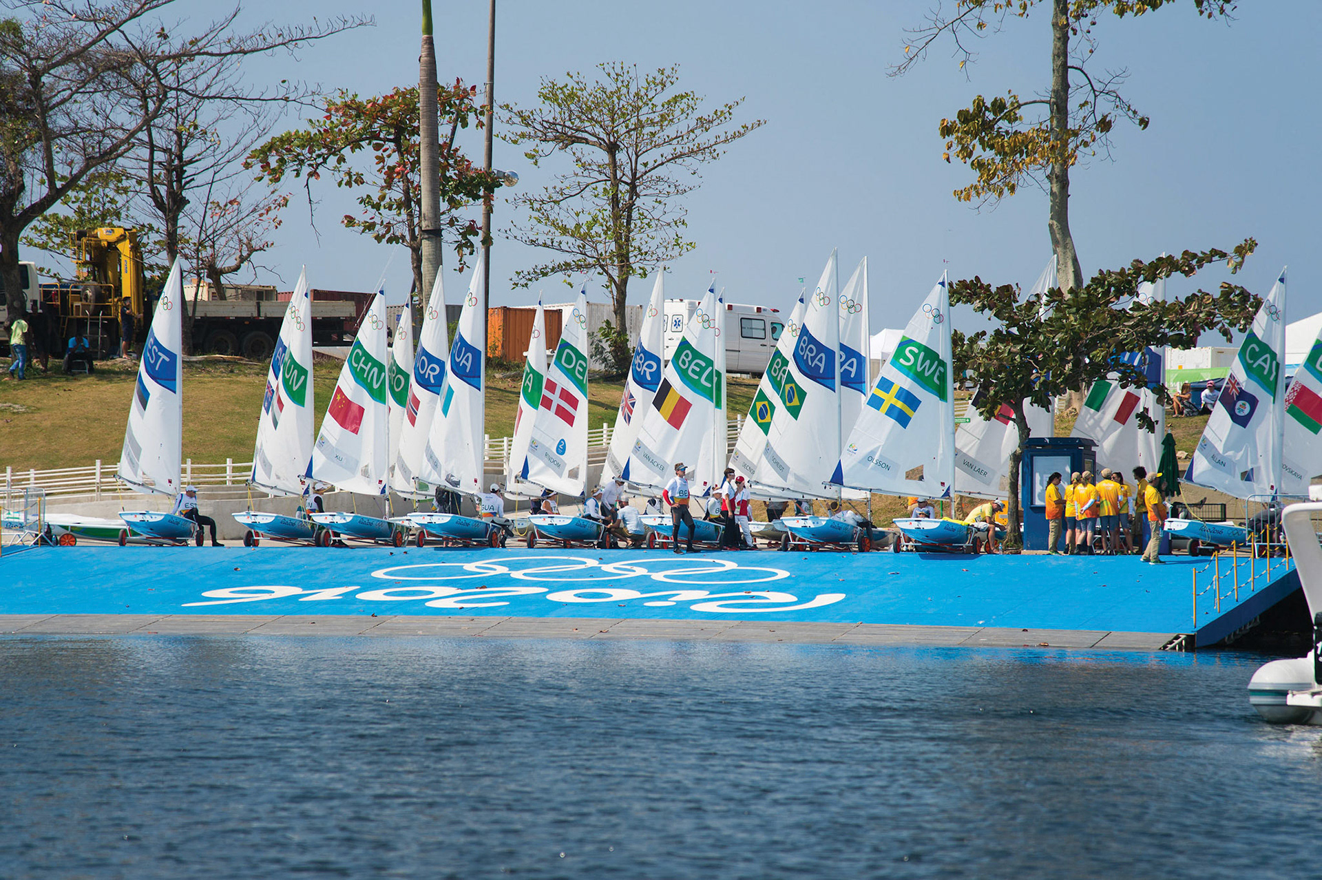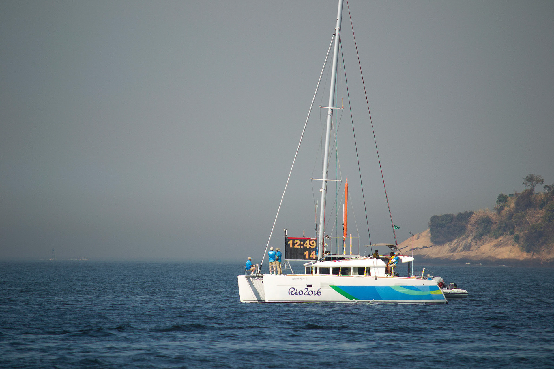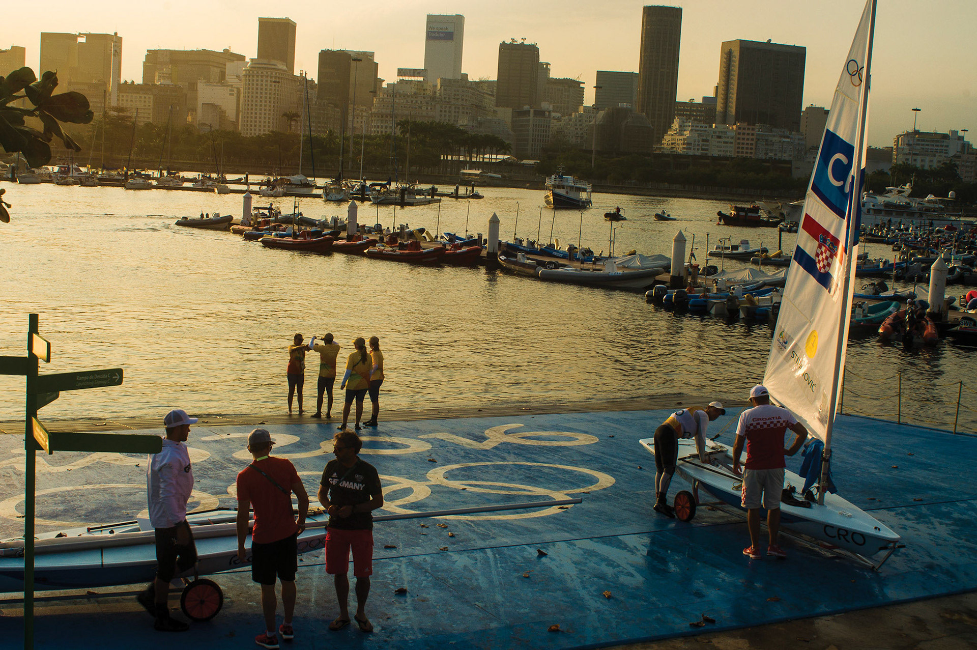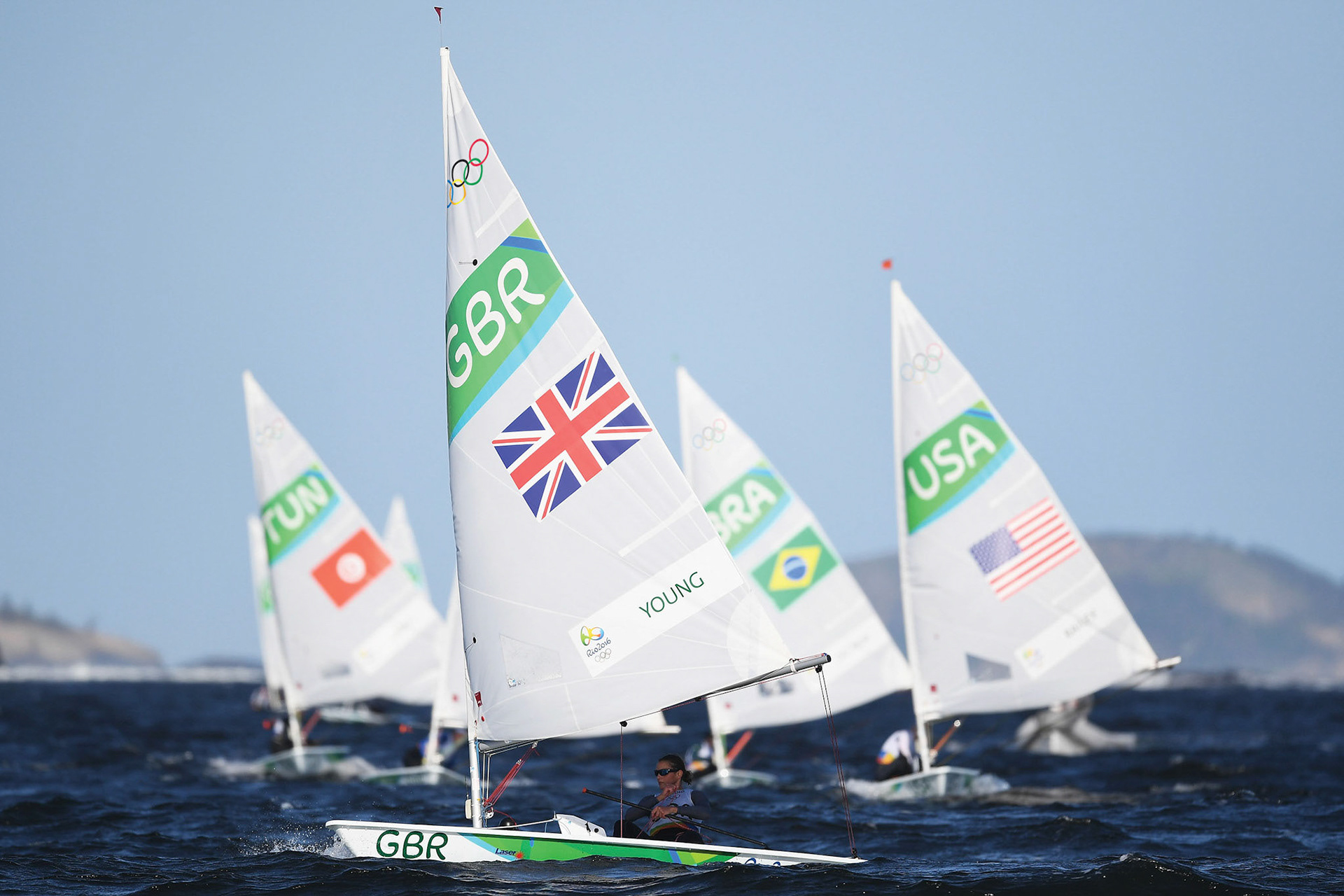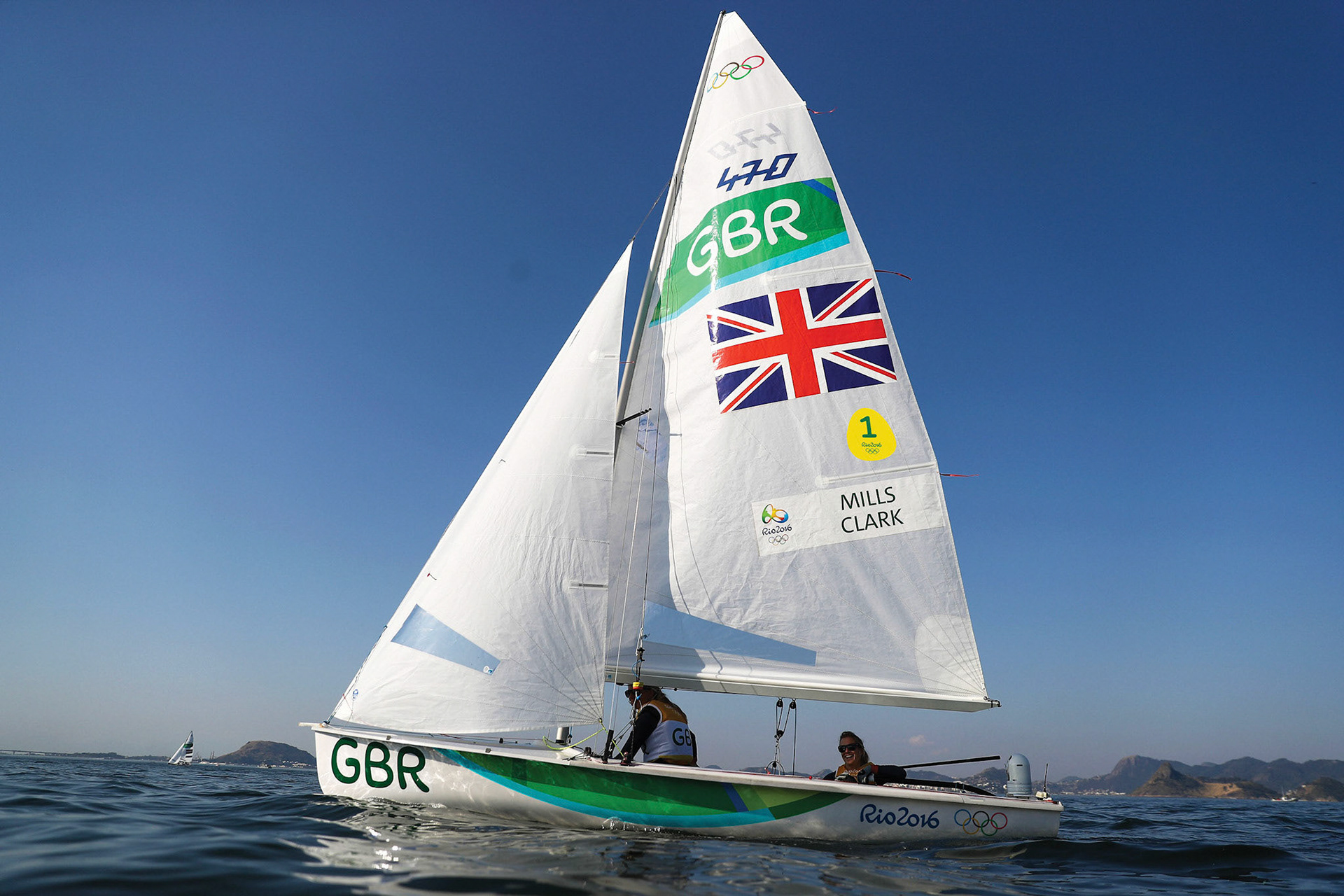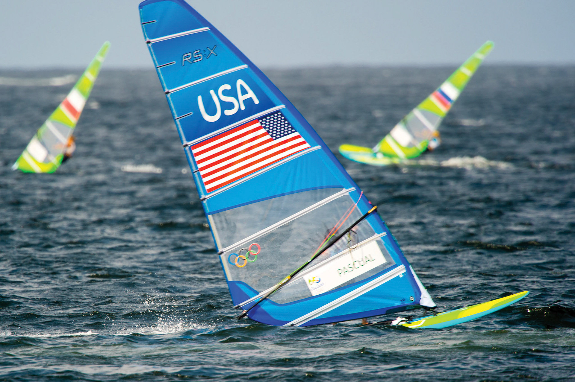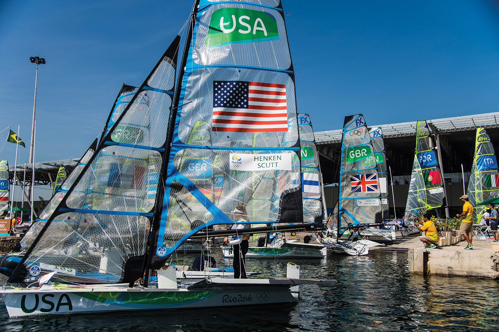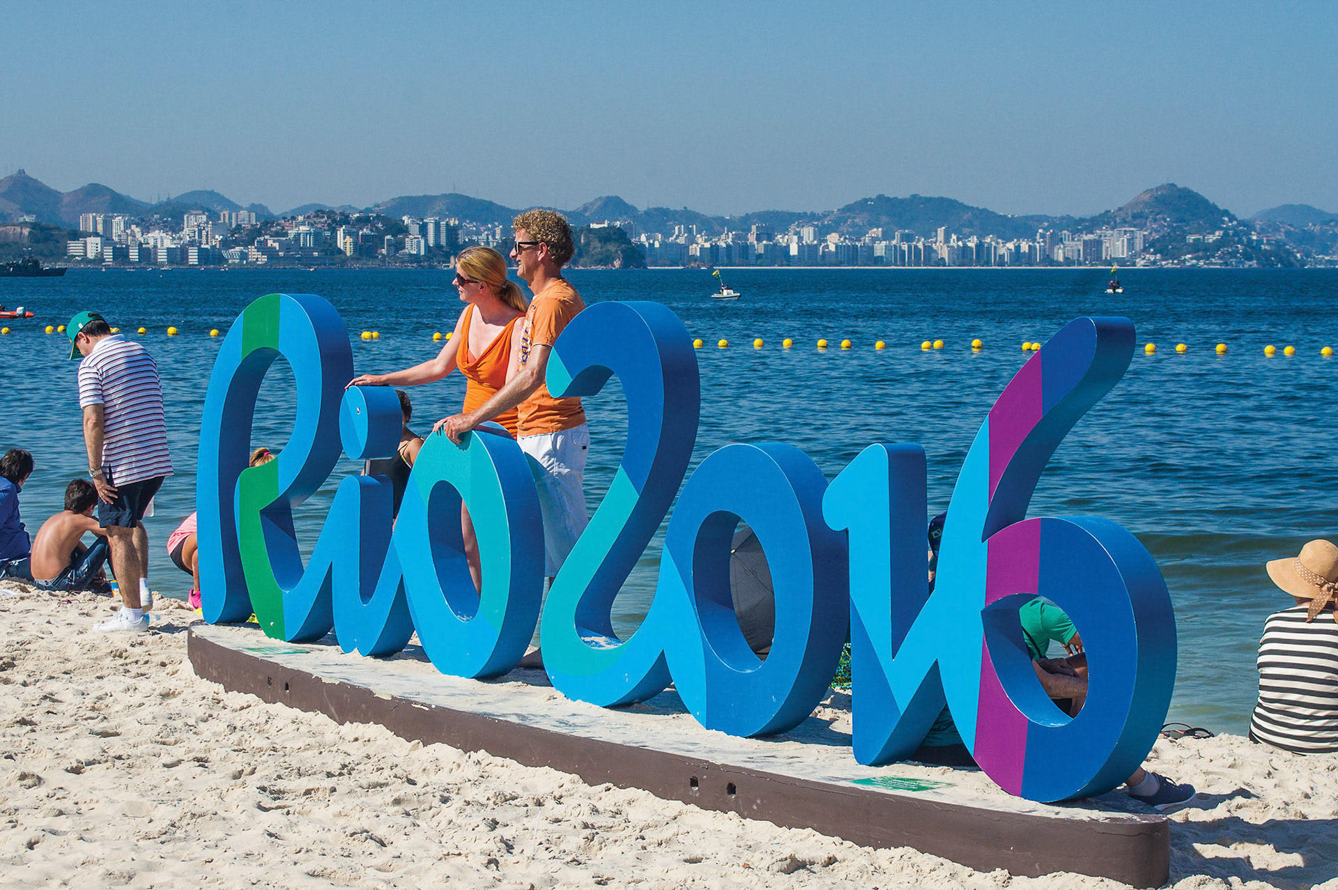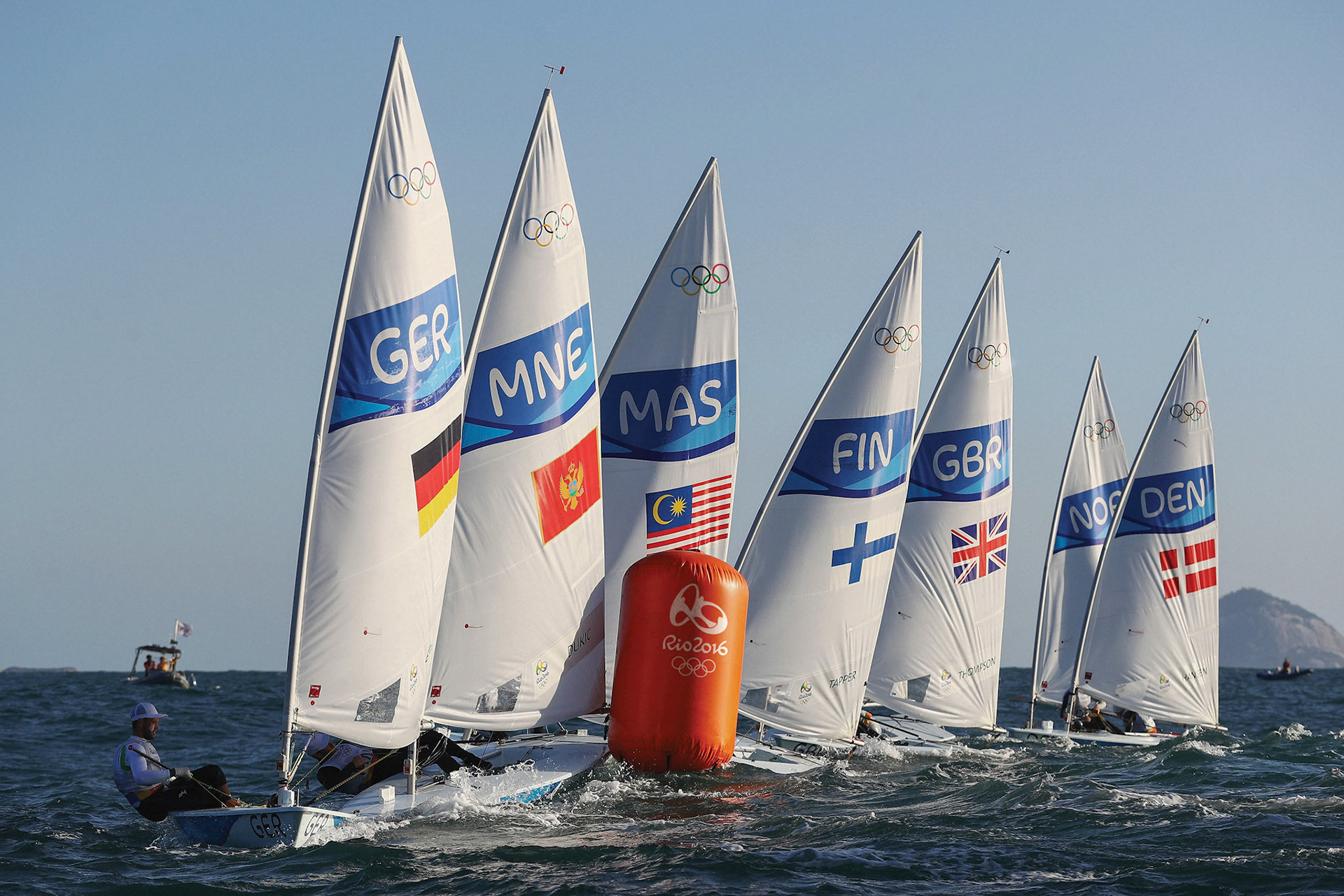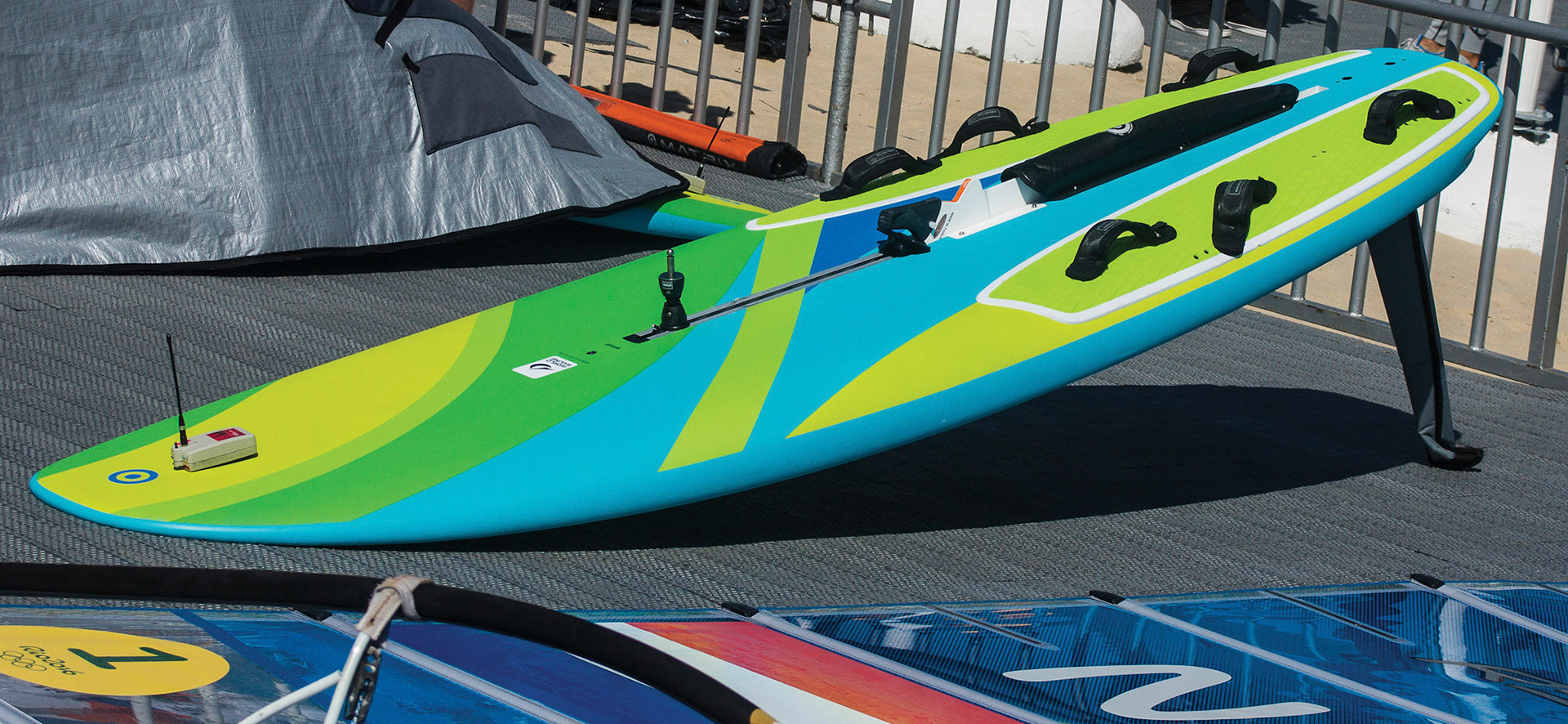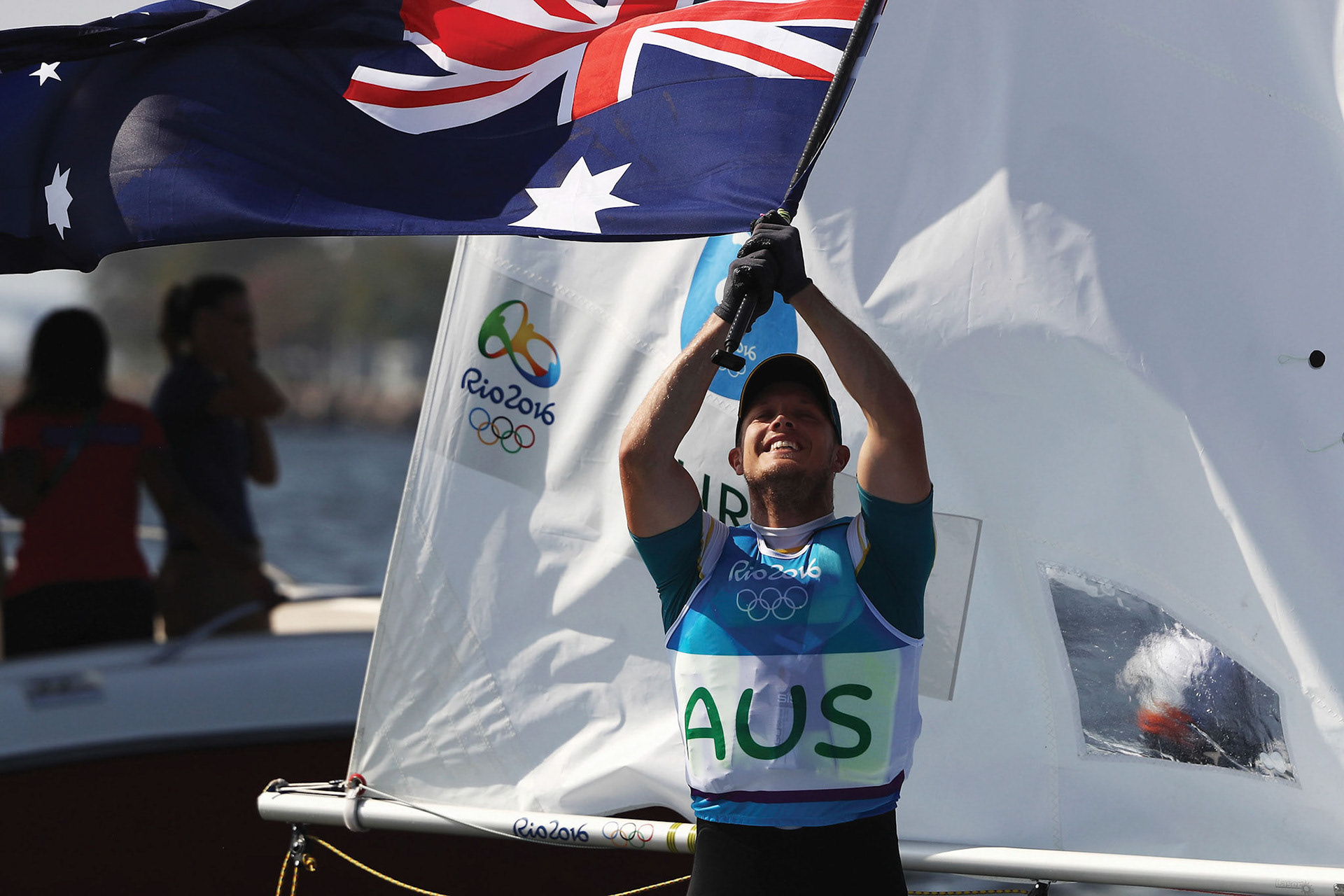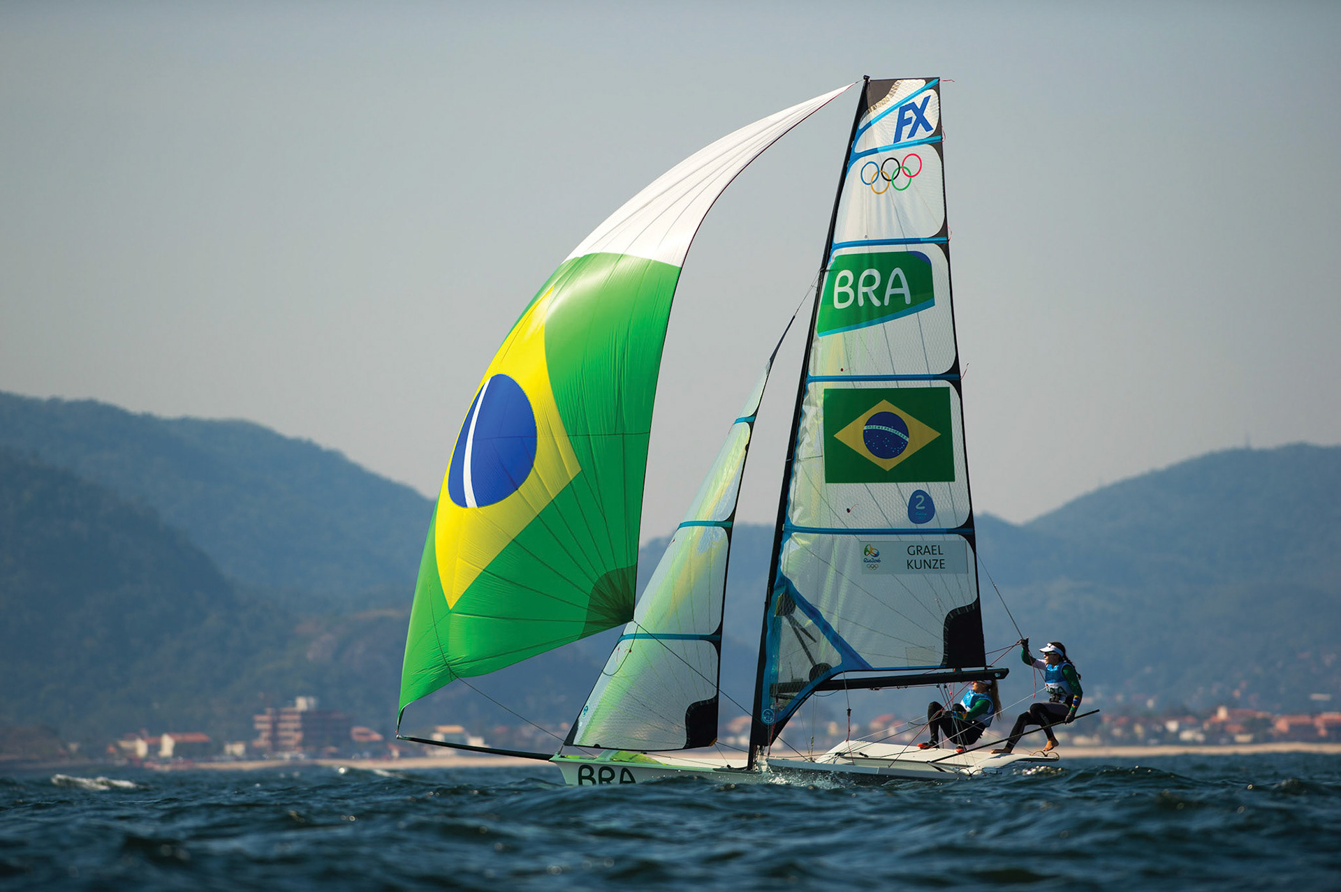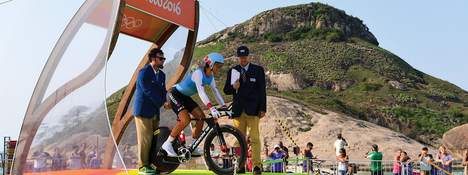
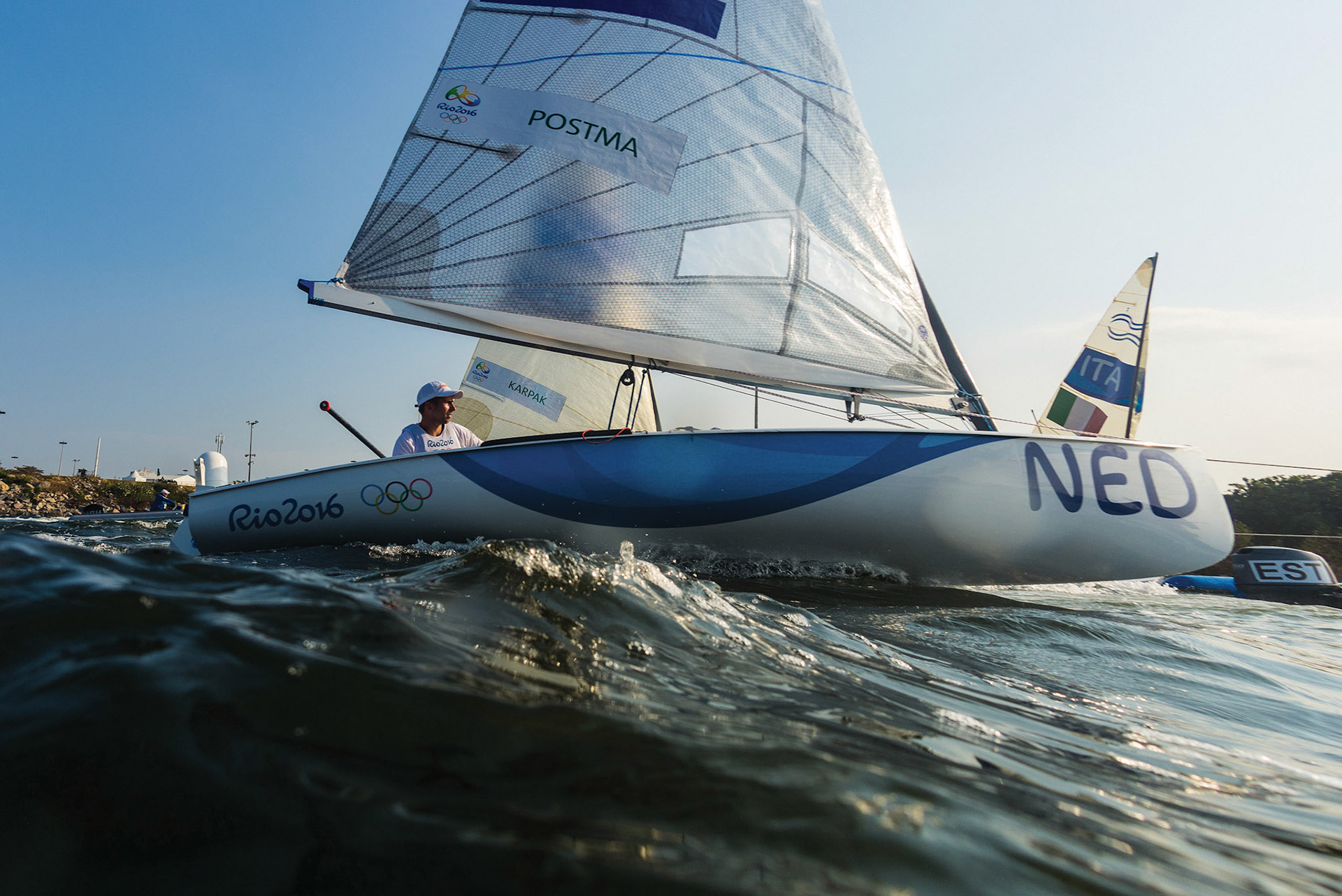
In 2016, I was the lead designer and project manager for the Olympic Sailing event in the Rio Olympics. As part of the project, I developed the design concept and execution of the competition boats and sport equipment such as boats, vests, buoy and pontoon dressing.
The look as a two colour scheme so there would be a distinction between male and female events. Blue was chosen for men and green, the main event colour for women. I used the crops of the master graphic to define colourful branded areas and I took advantage of the curves to create waves on the hulls and wind movements on the sails.
Men boat dressing concept

Women boat dressing concept

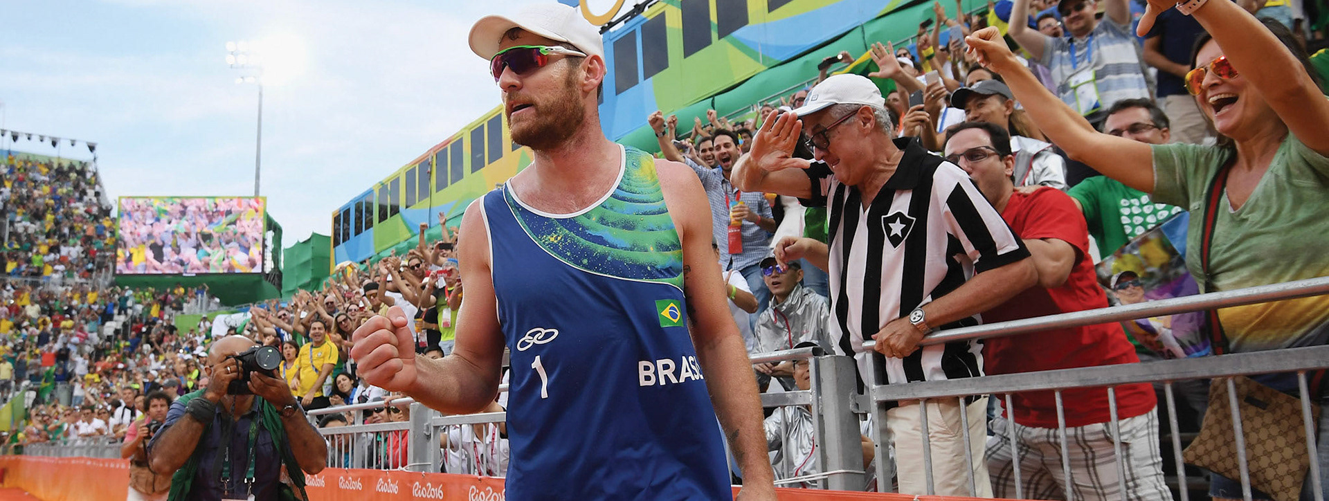
Windsurf design