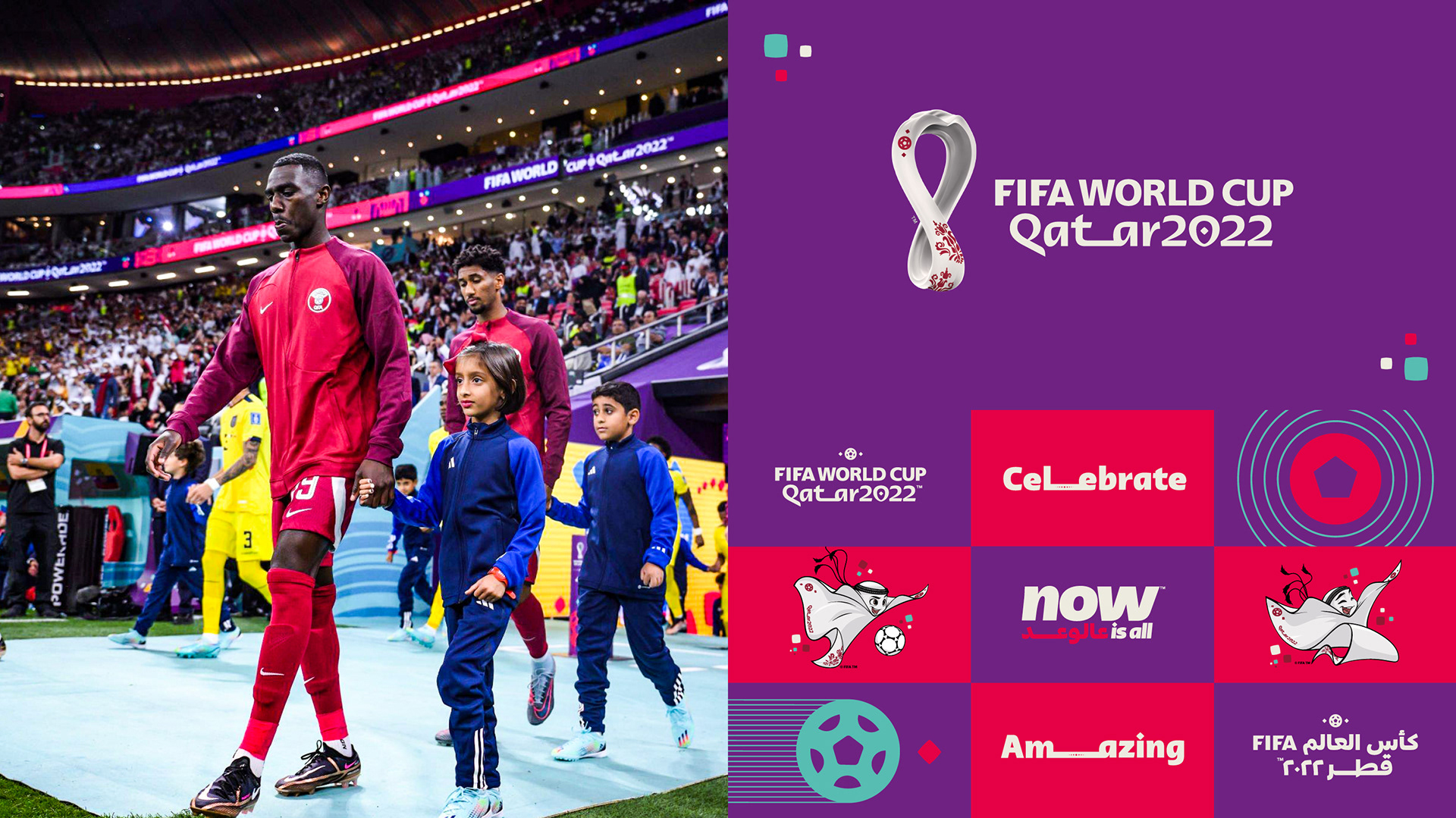
I have worked in collaboration with FIFA as Lead Creative at agency WORKS to deliver the brand evolution and event look for the FIFA World Cup Qatar 2022 across competition and non-competition venues, host city and functional areas.
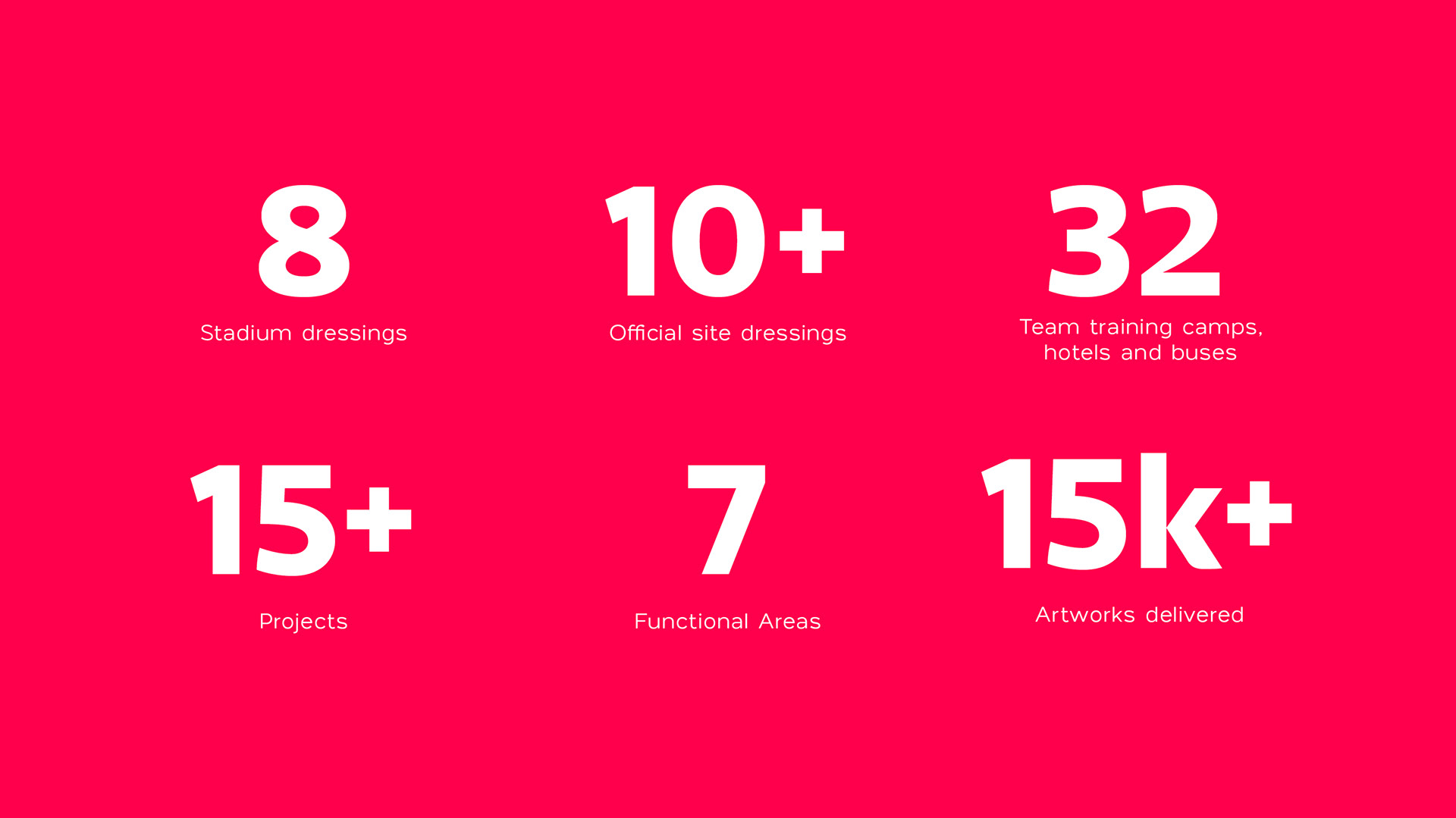
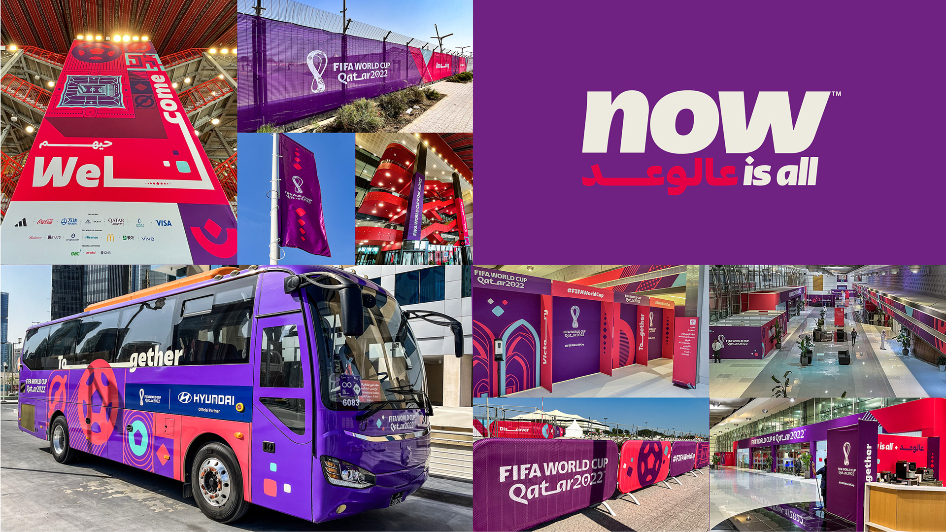
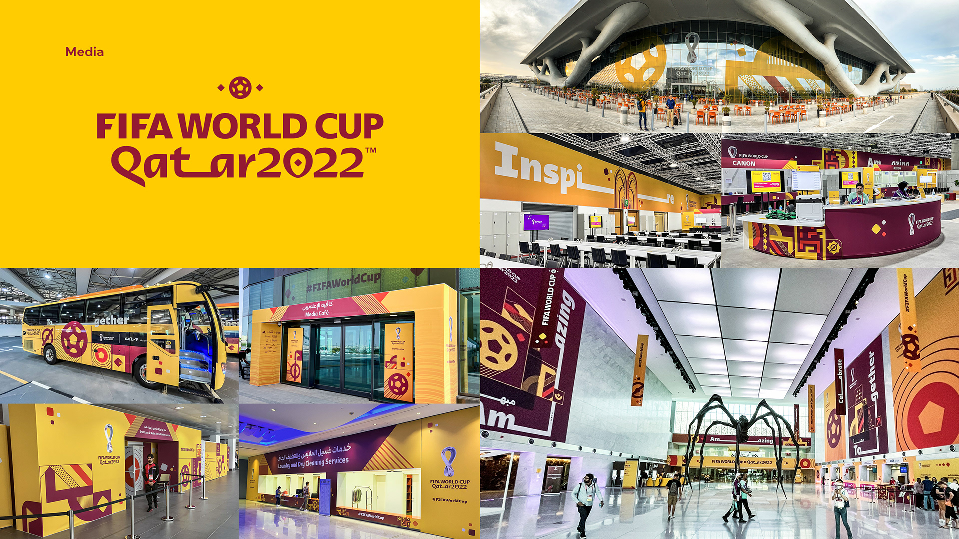
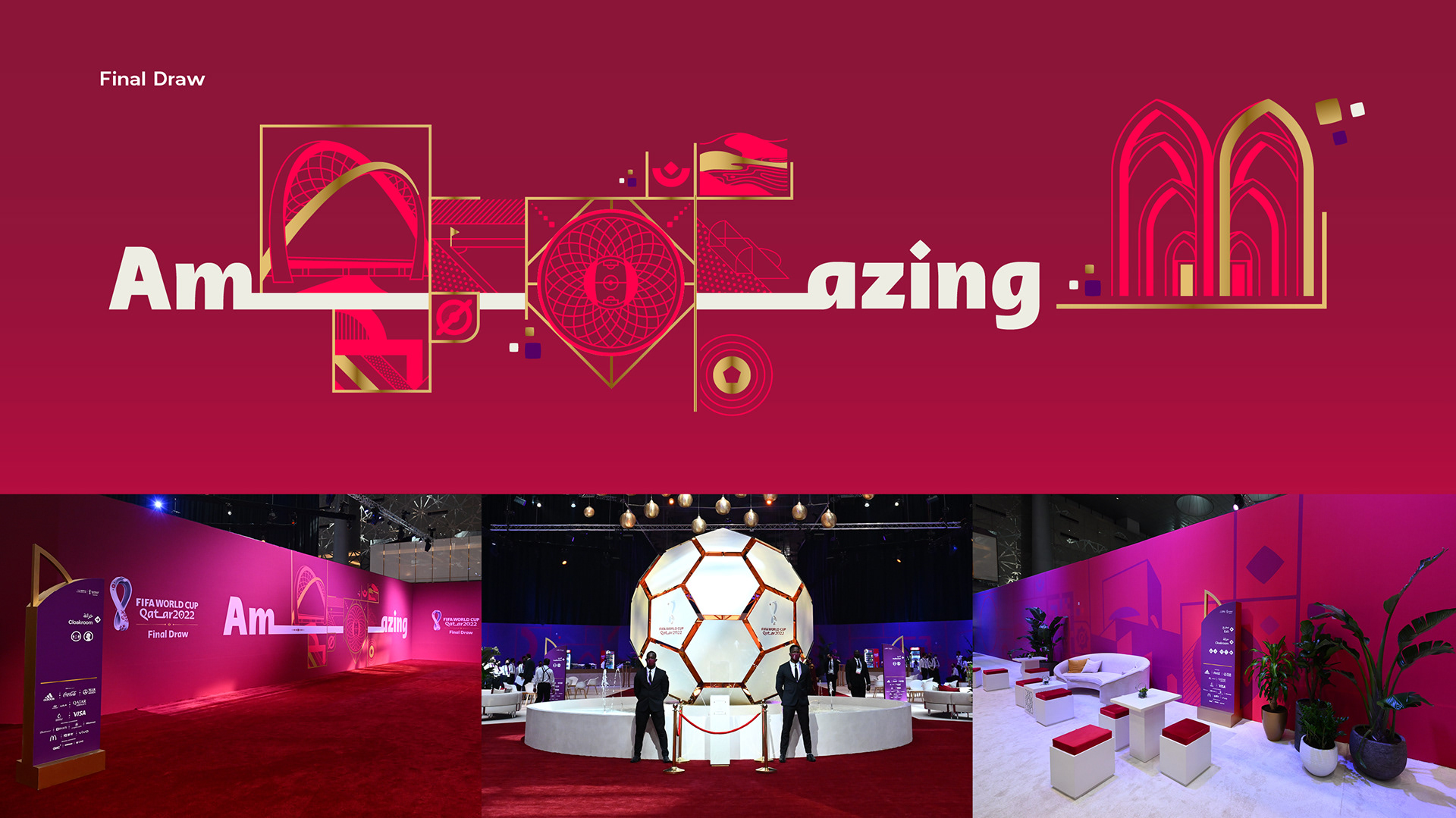
It was a two year long project in which we deliver brand development, creative, design and colour strategies, Kit of Parts (suite of assets) development and roll-out across 8 stadia, official sites, FIFA Fan Festival, Final Draw, fleet design and city dressing
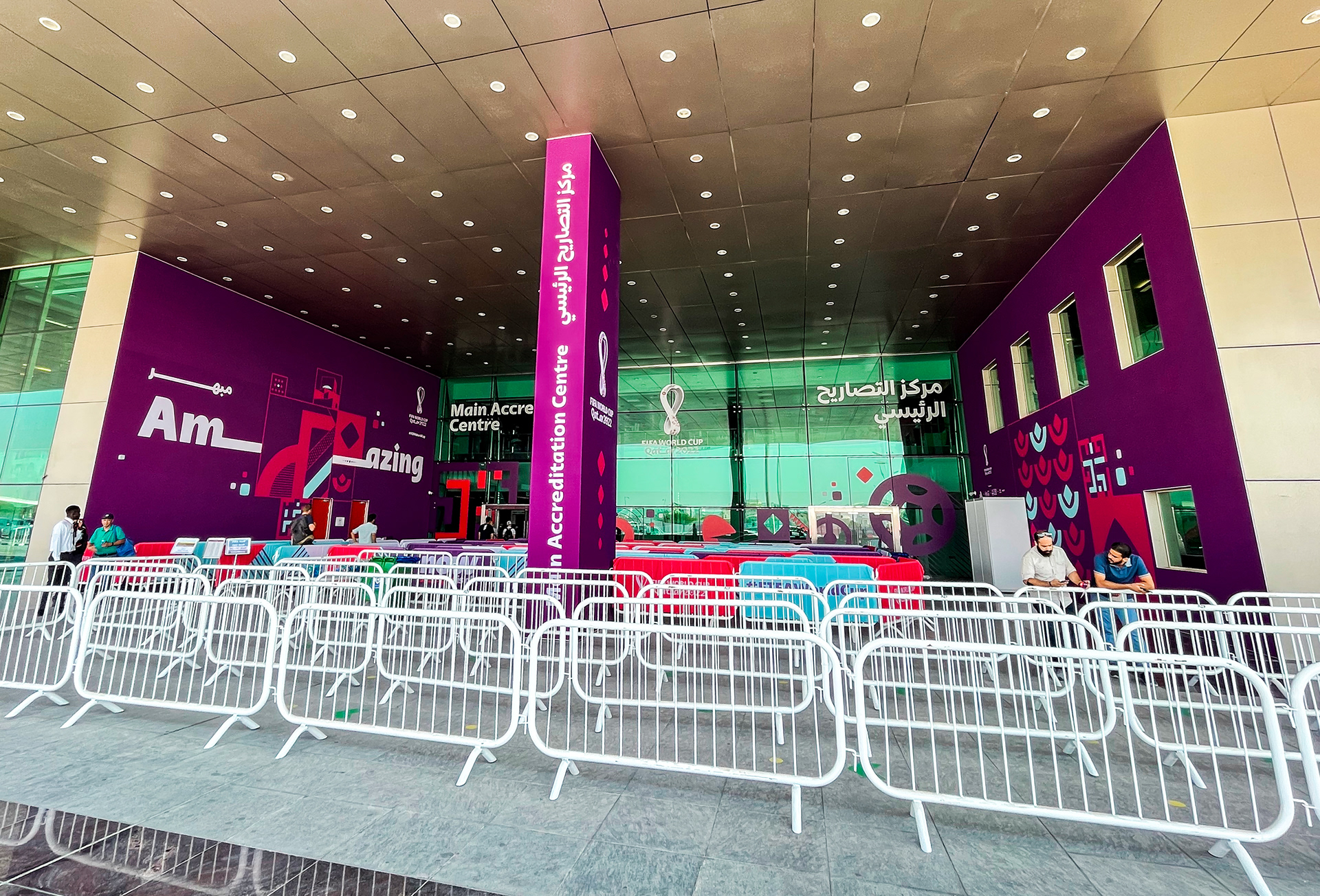
We have inherited a visual identity from another agency and I have set processes to using user-centred principles to set client journeys and simplification strategies to evolve the brand into something new for Game Time. Those processes were fundamental to ensure consistency and the right fit across each channel.

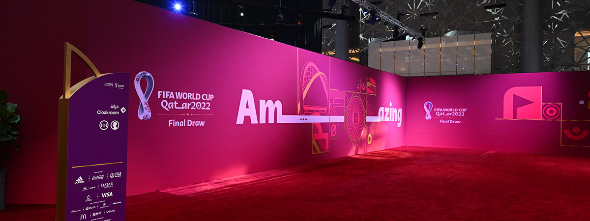
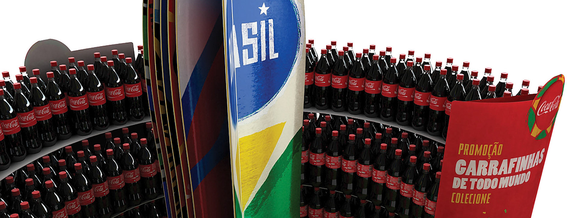
Colour strategies
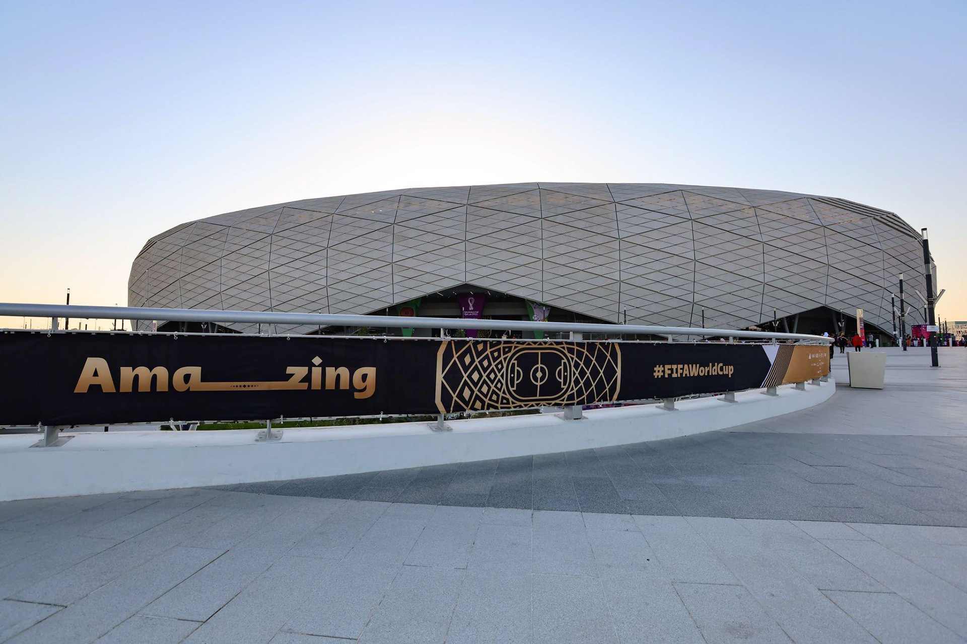
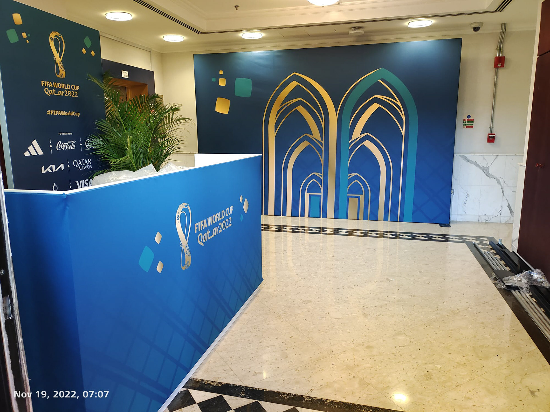
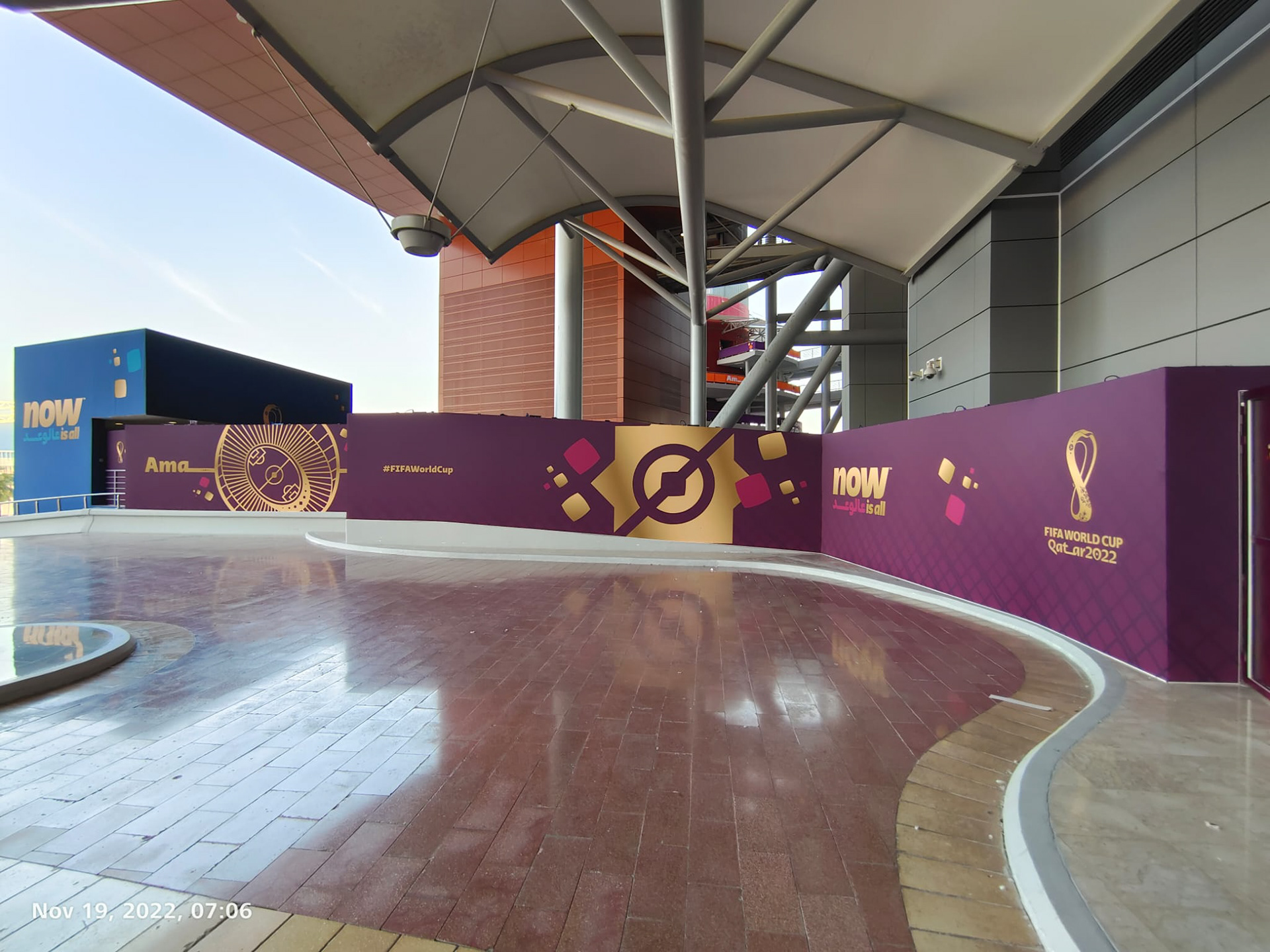
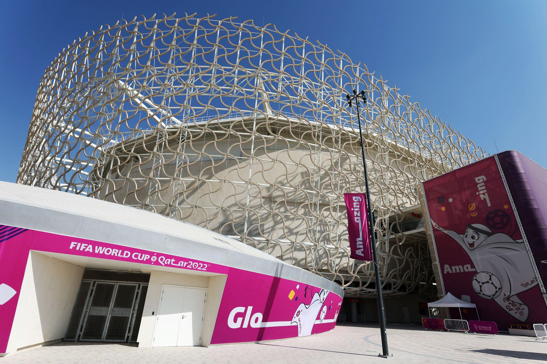
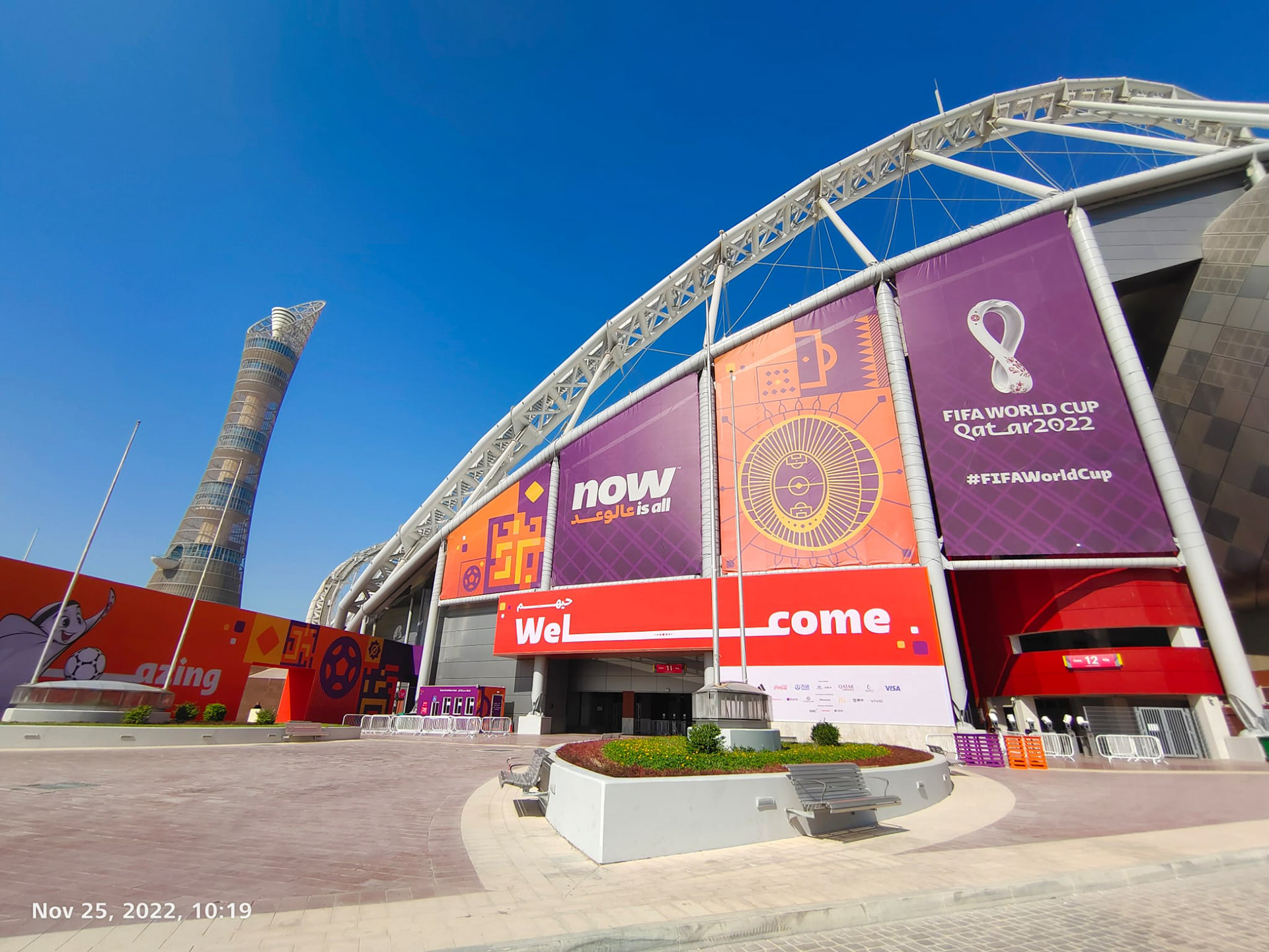
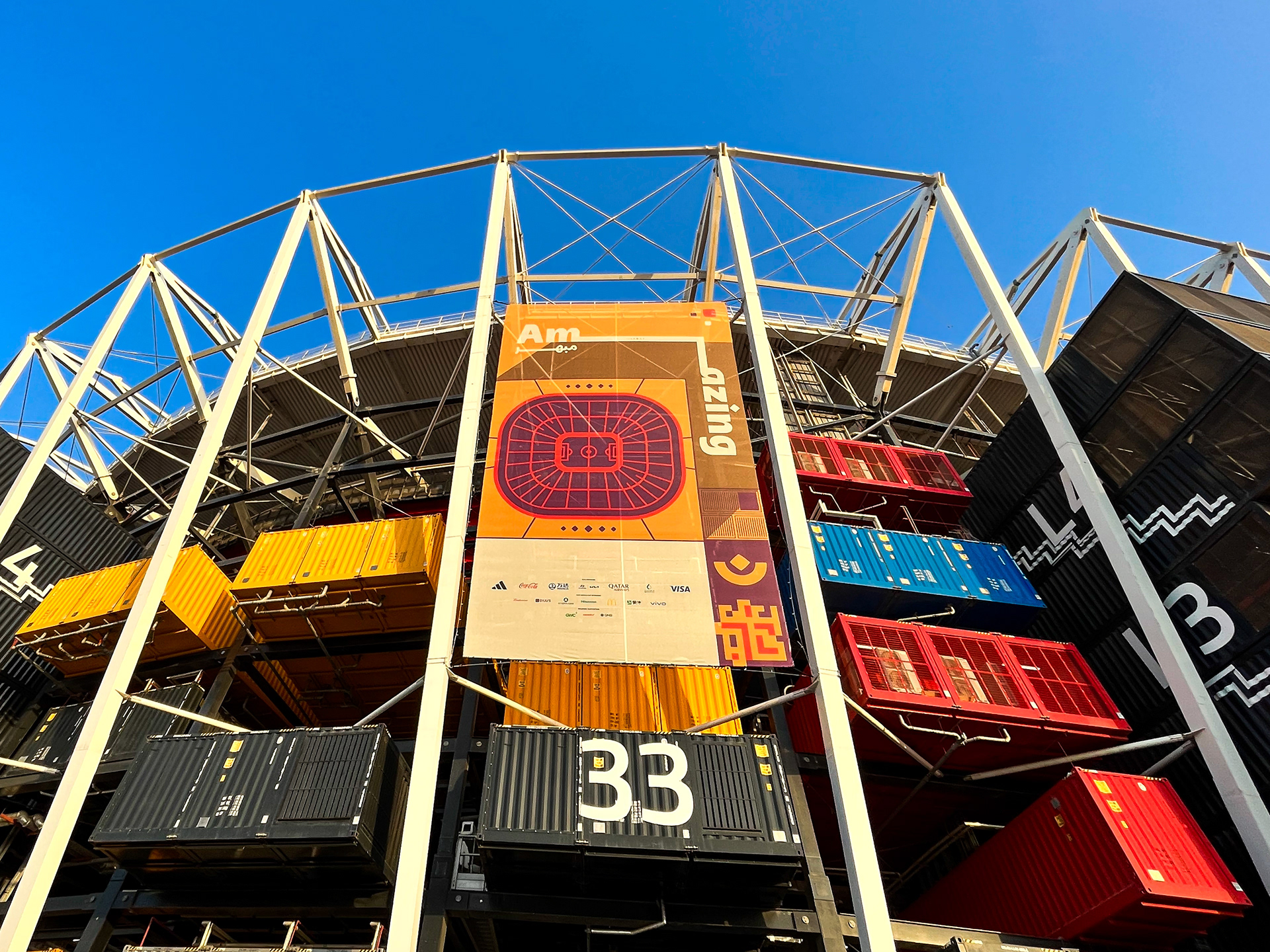
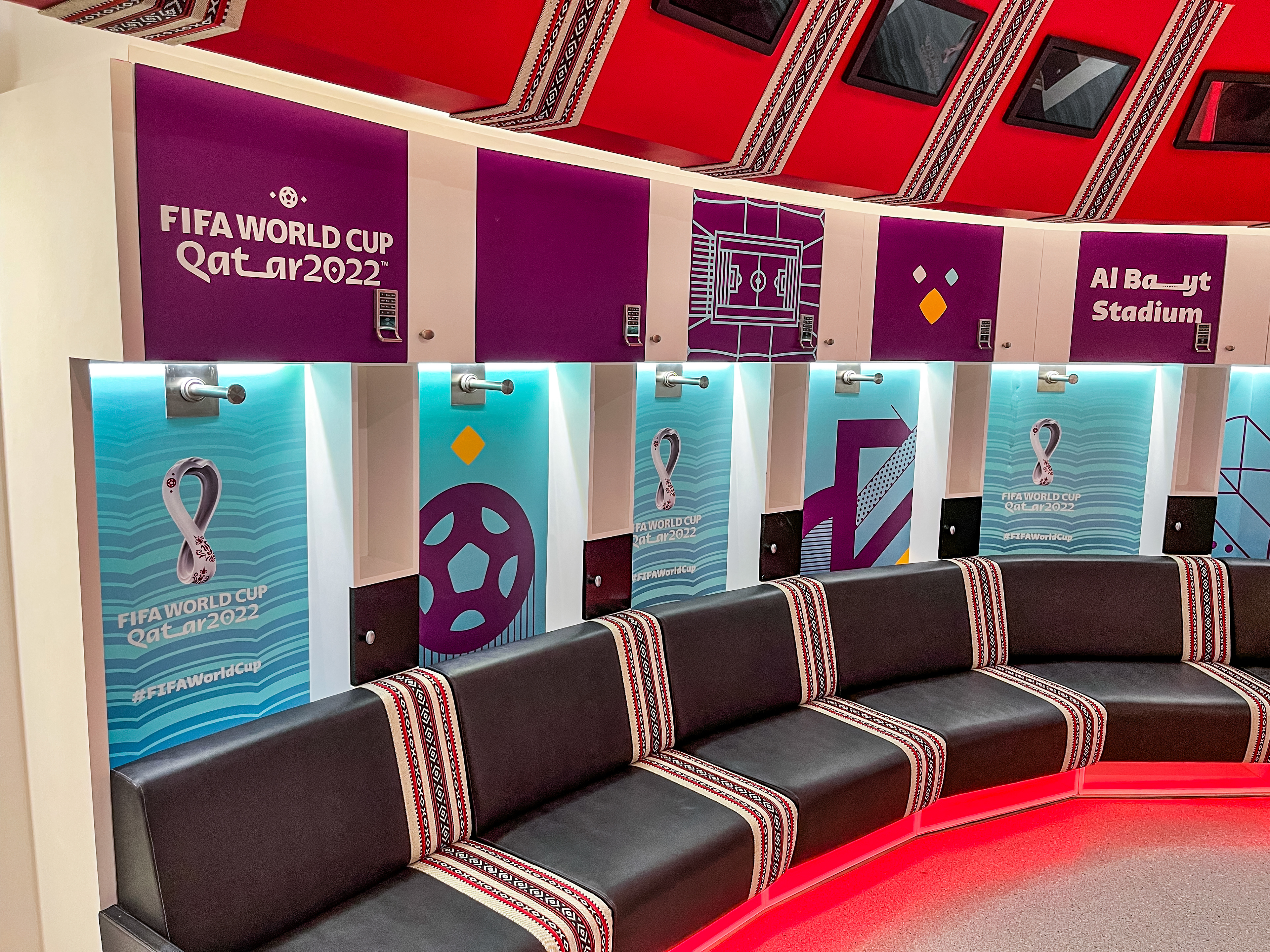
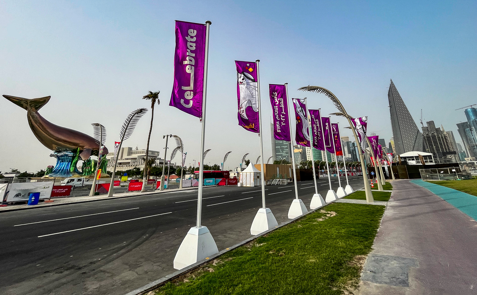
The FIFA World Cup Qatar 2022 was a multicoloured brand. Whilst Burgundy, the Qatar colour was the primary touchpoint to introduce the brand on arrival, purple became the connecting colour across all venues and projects. We have also set out colour strategies across many functional areas.


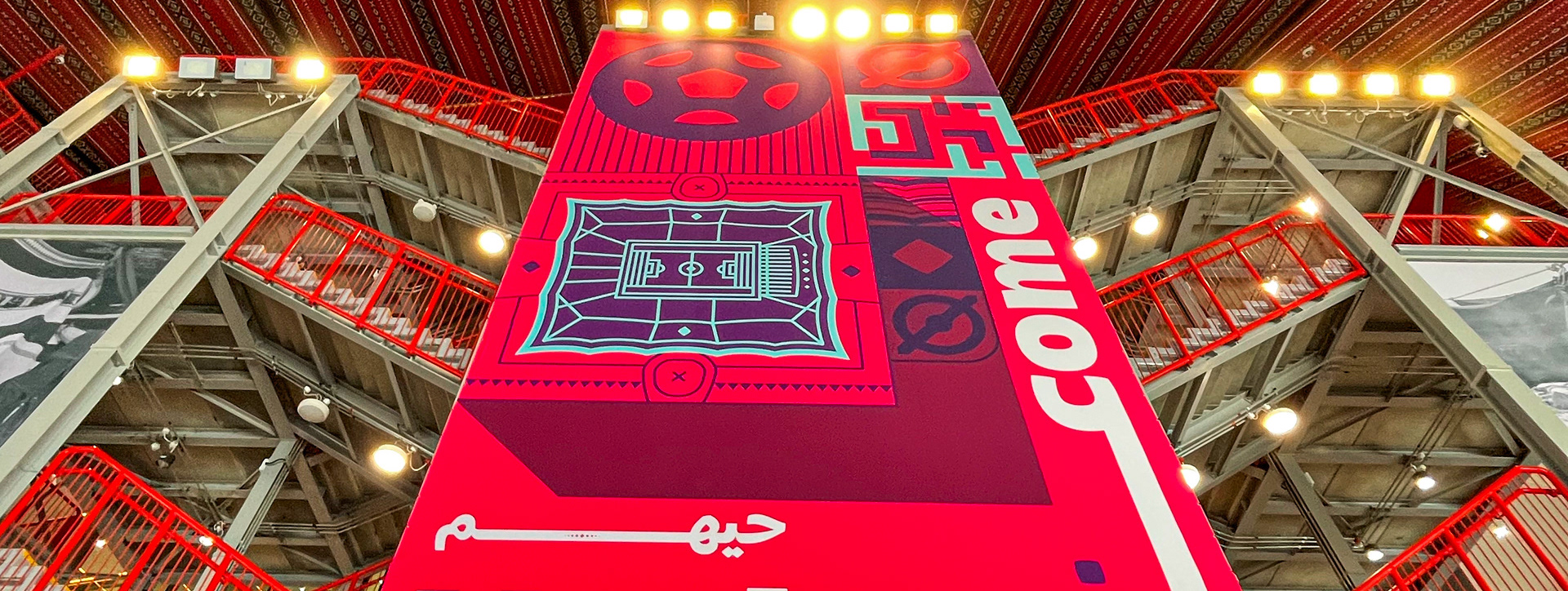
Graphic concept
Look Book
We have also created a final 400+ book documenting the delivery across all functional areas and projects.

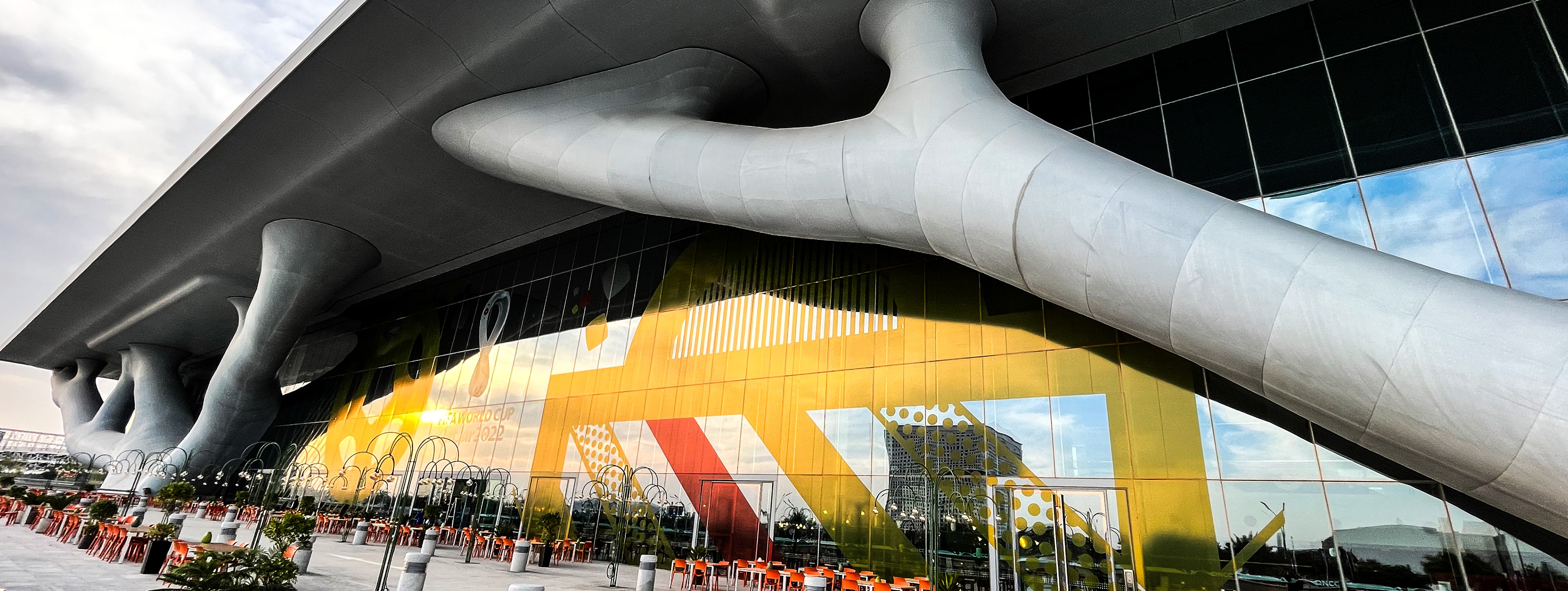
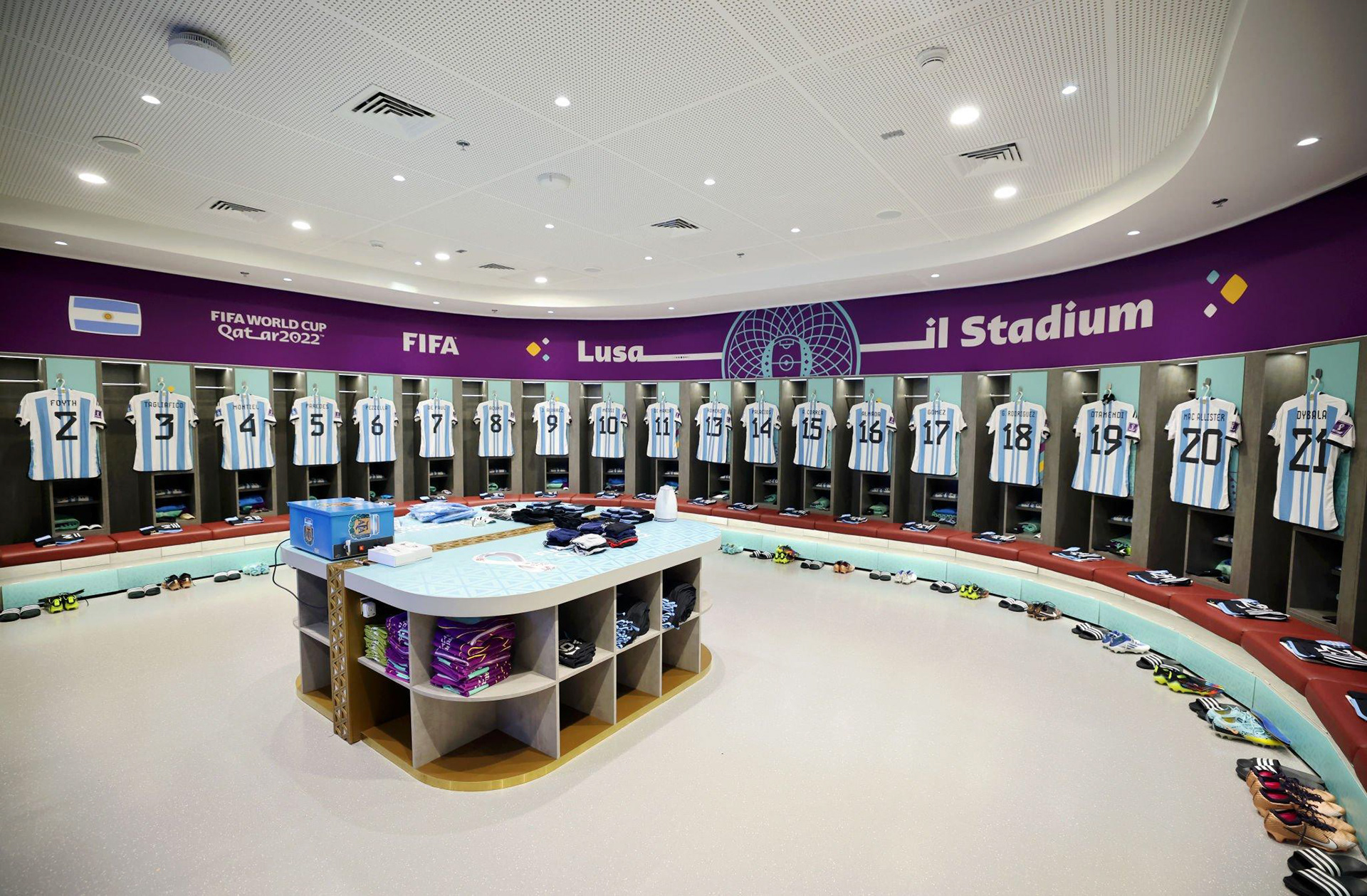
Stadium dressing

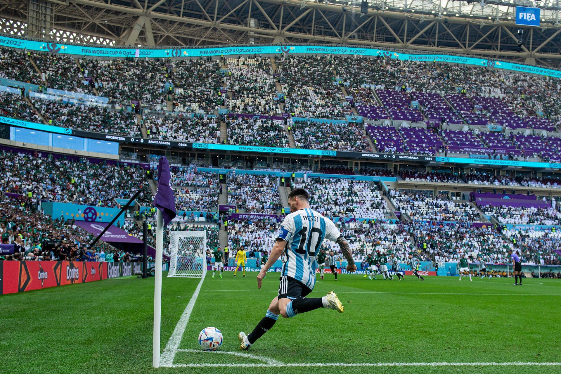

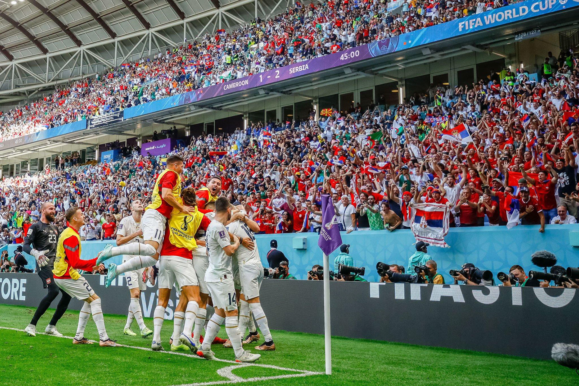
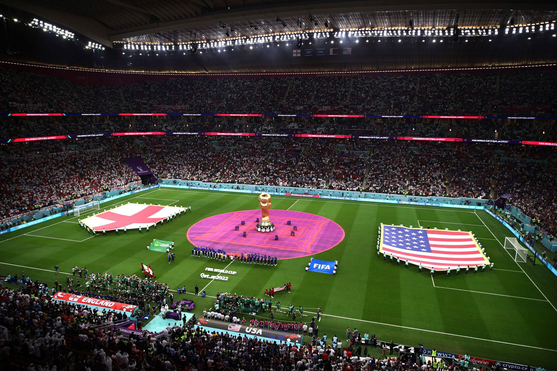
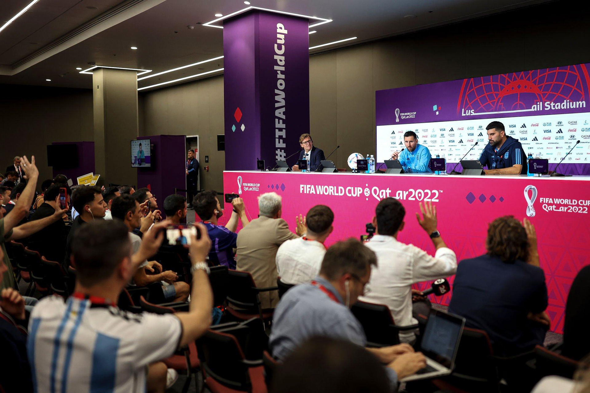
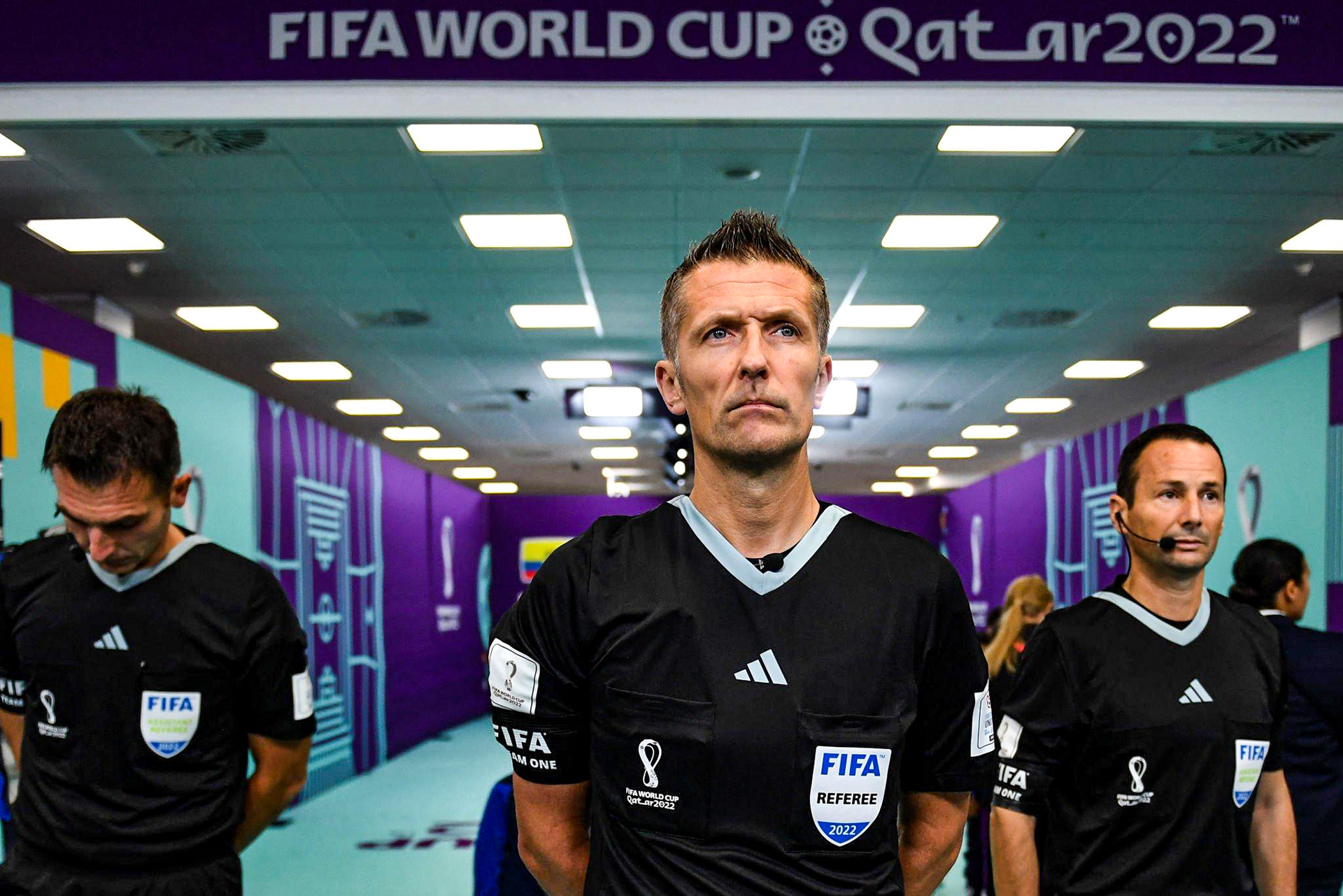
Competition areas
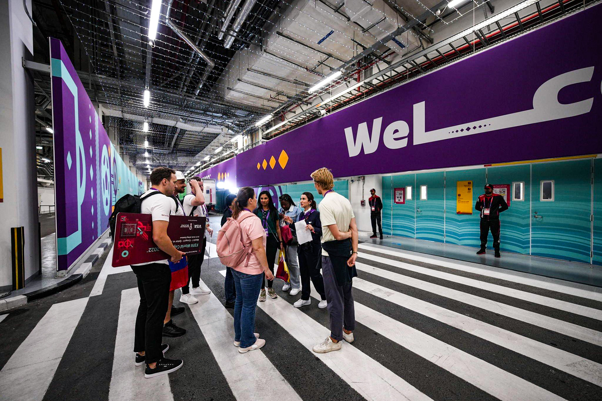
City dressing

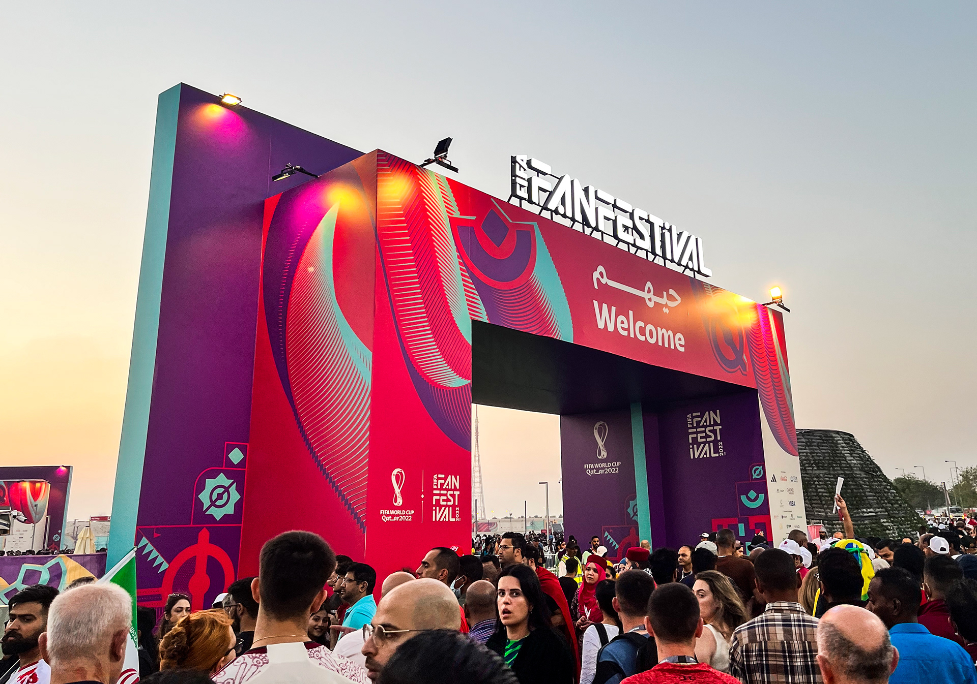
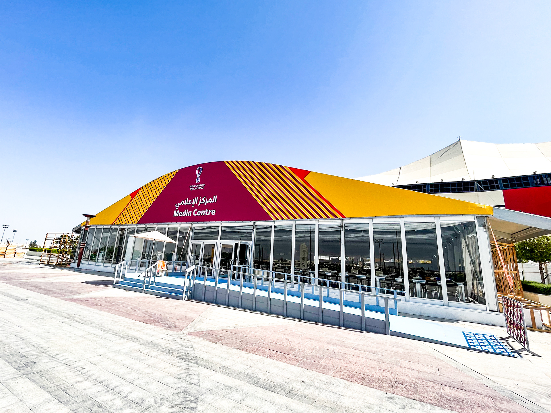
Functional areas