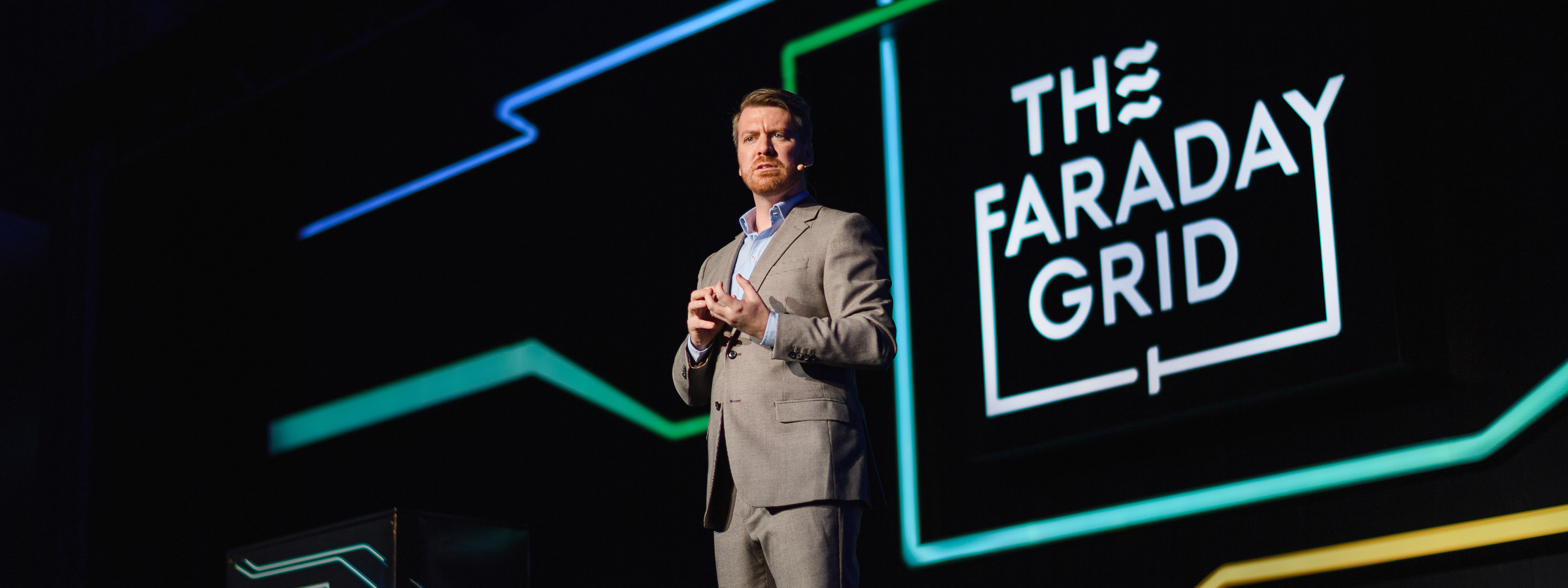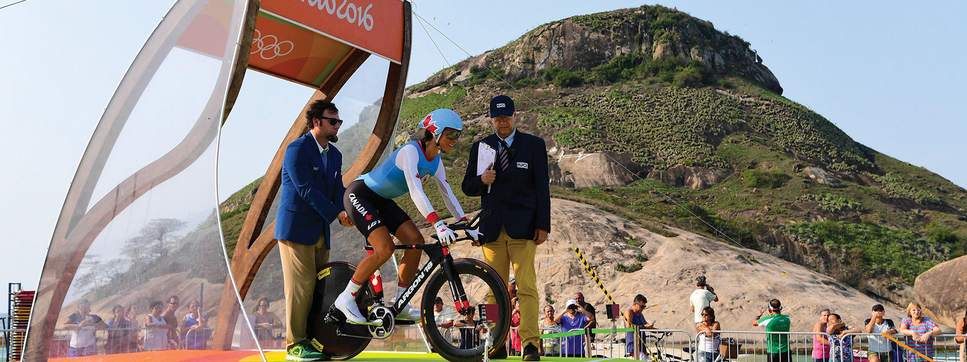
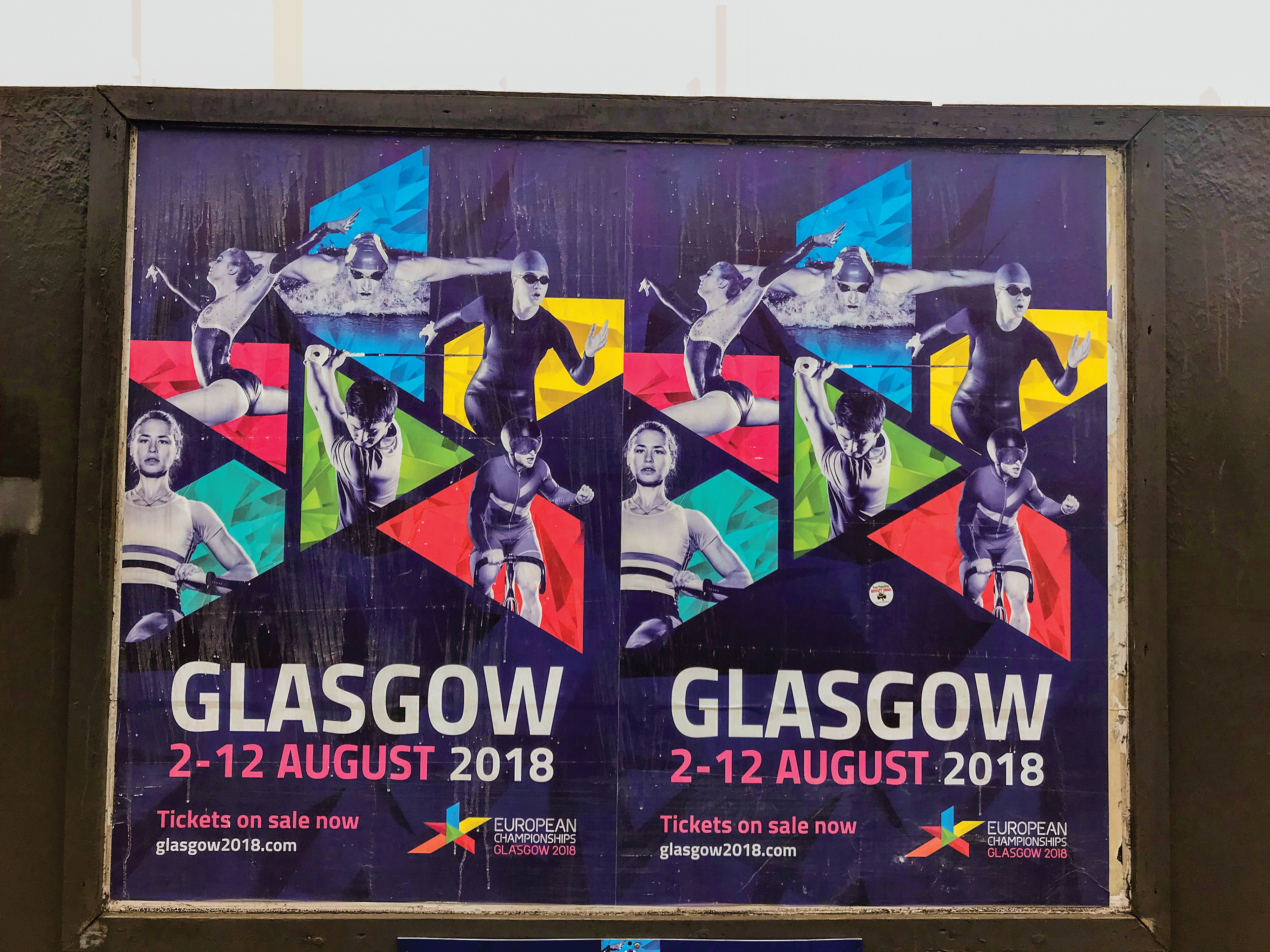
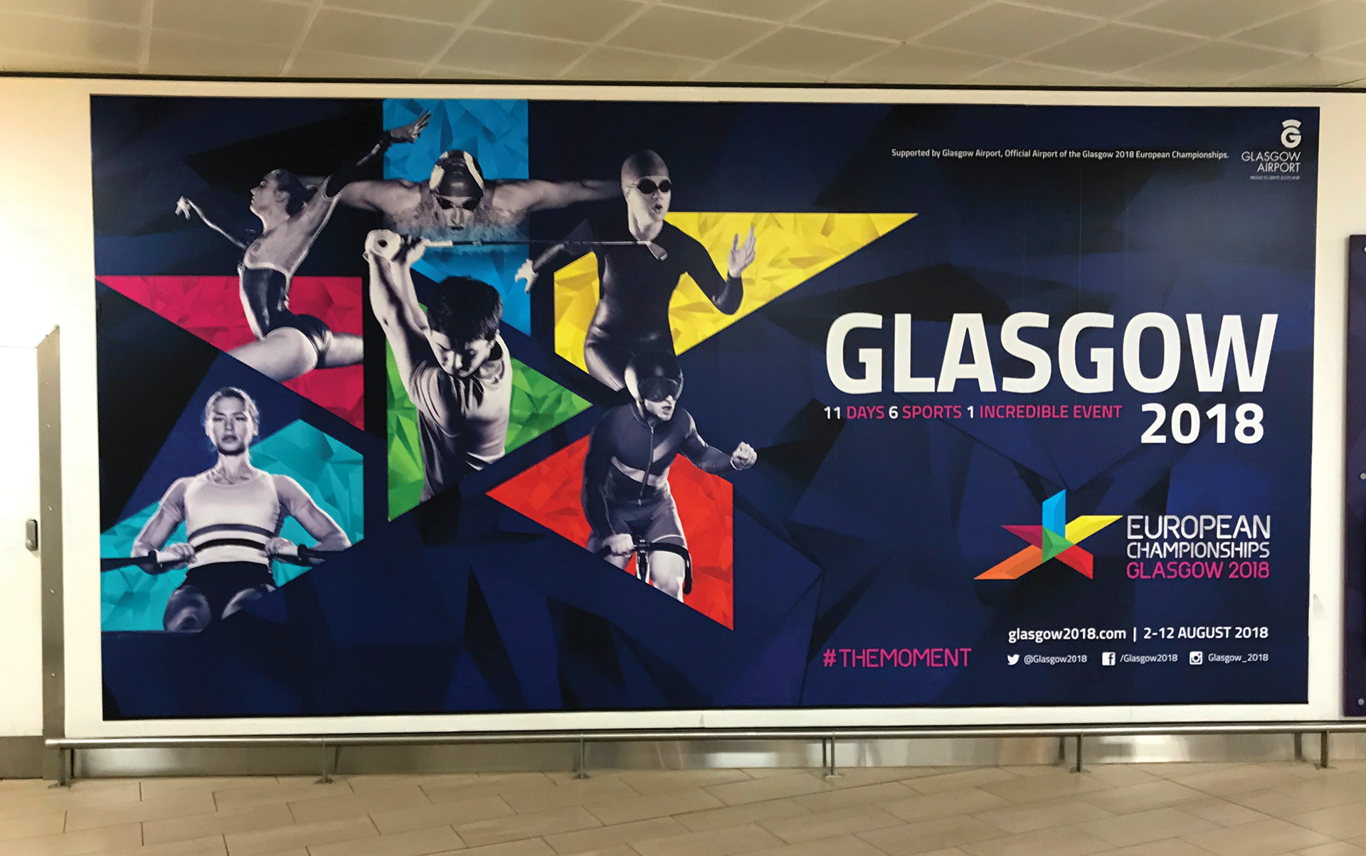
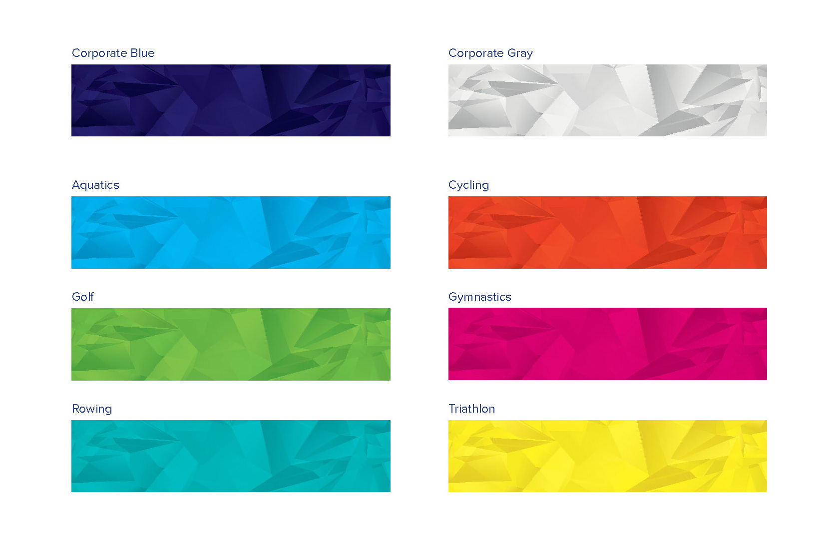
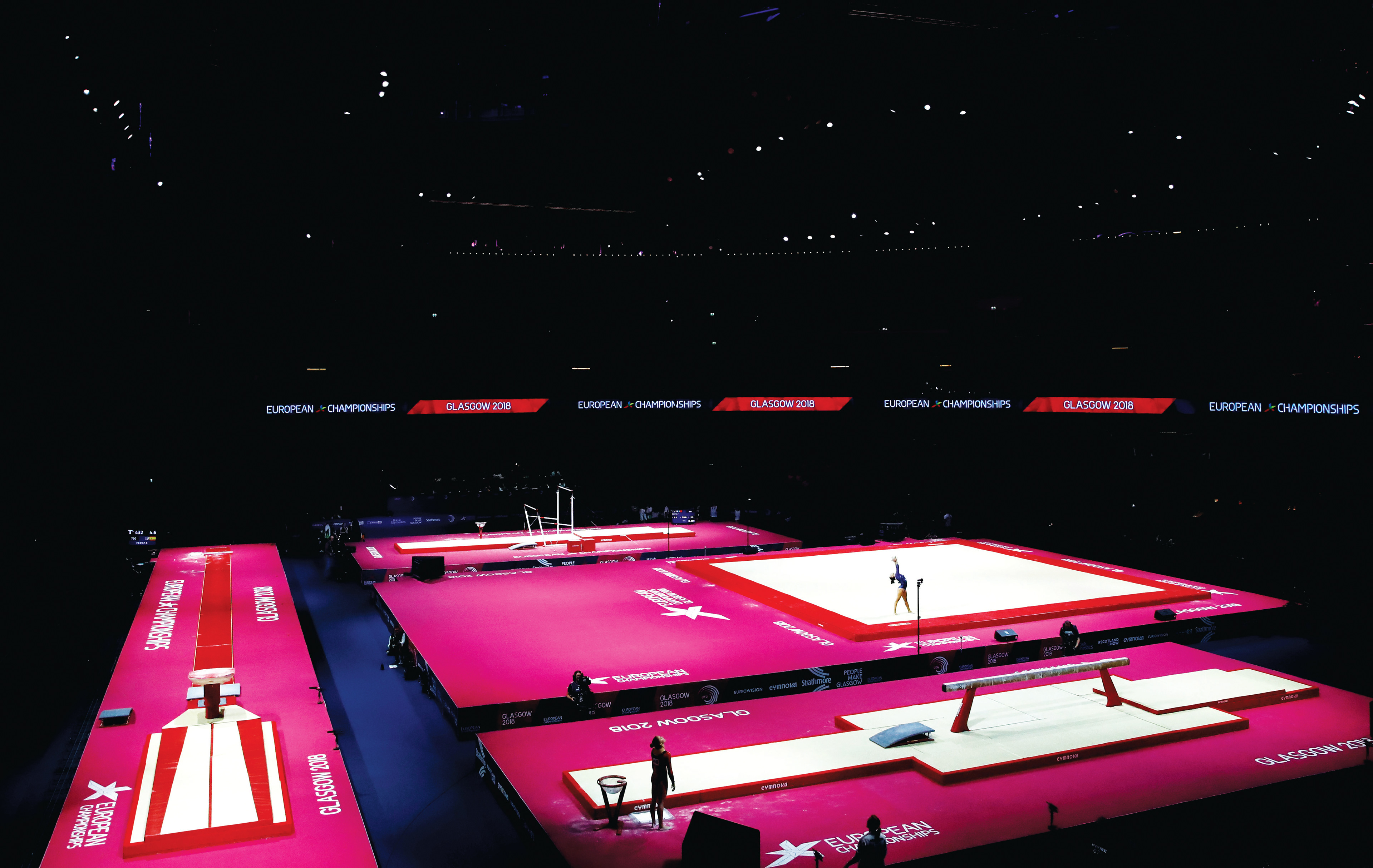
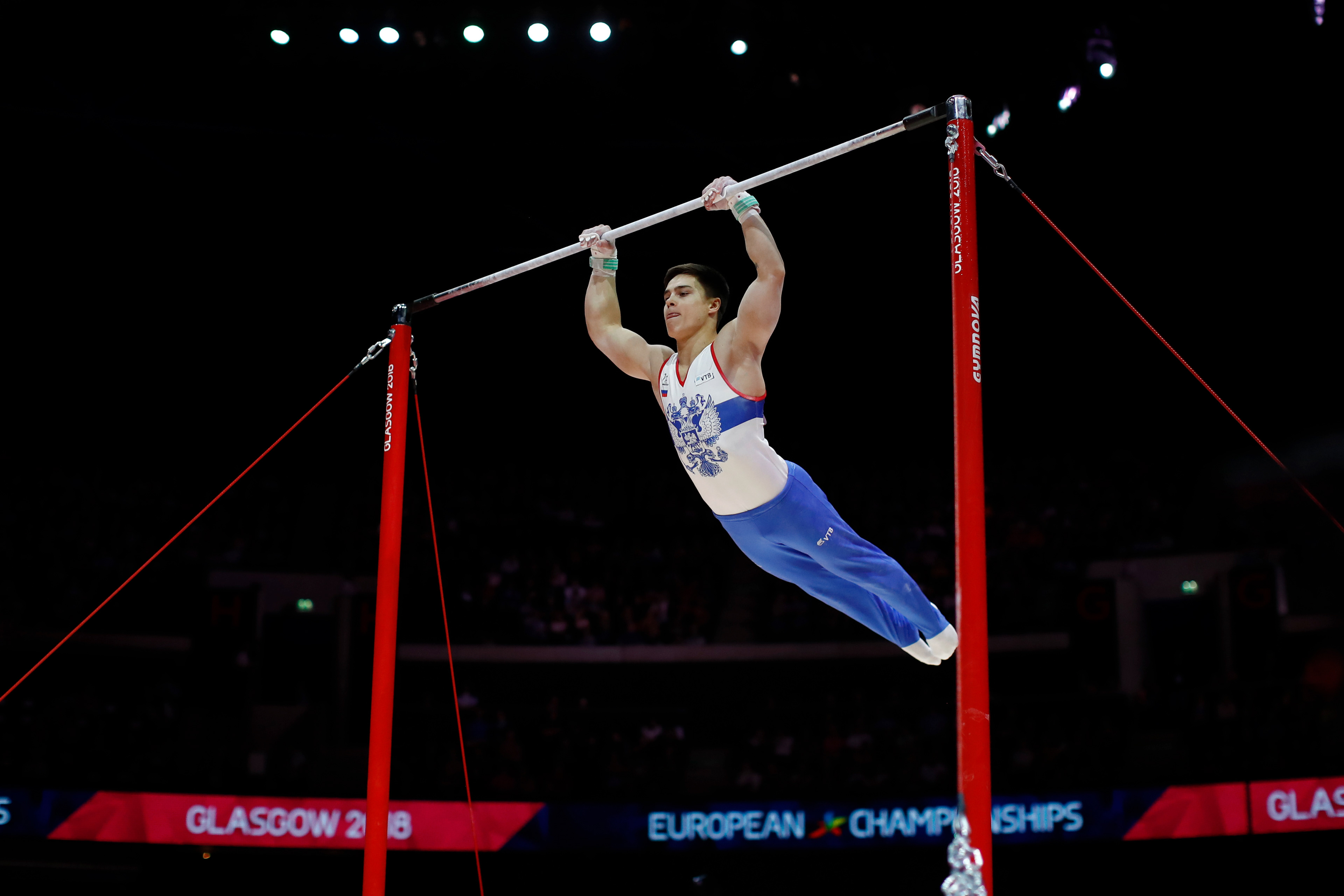
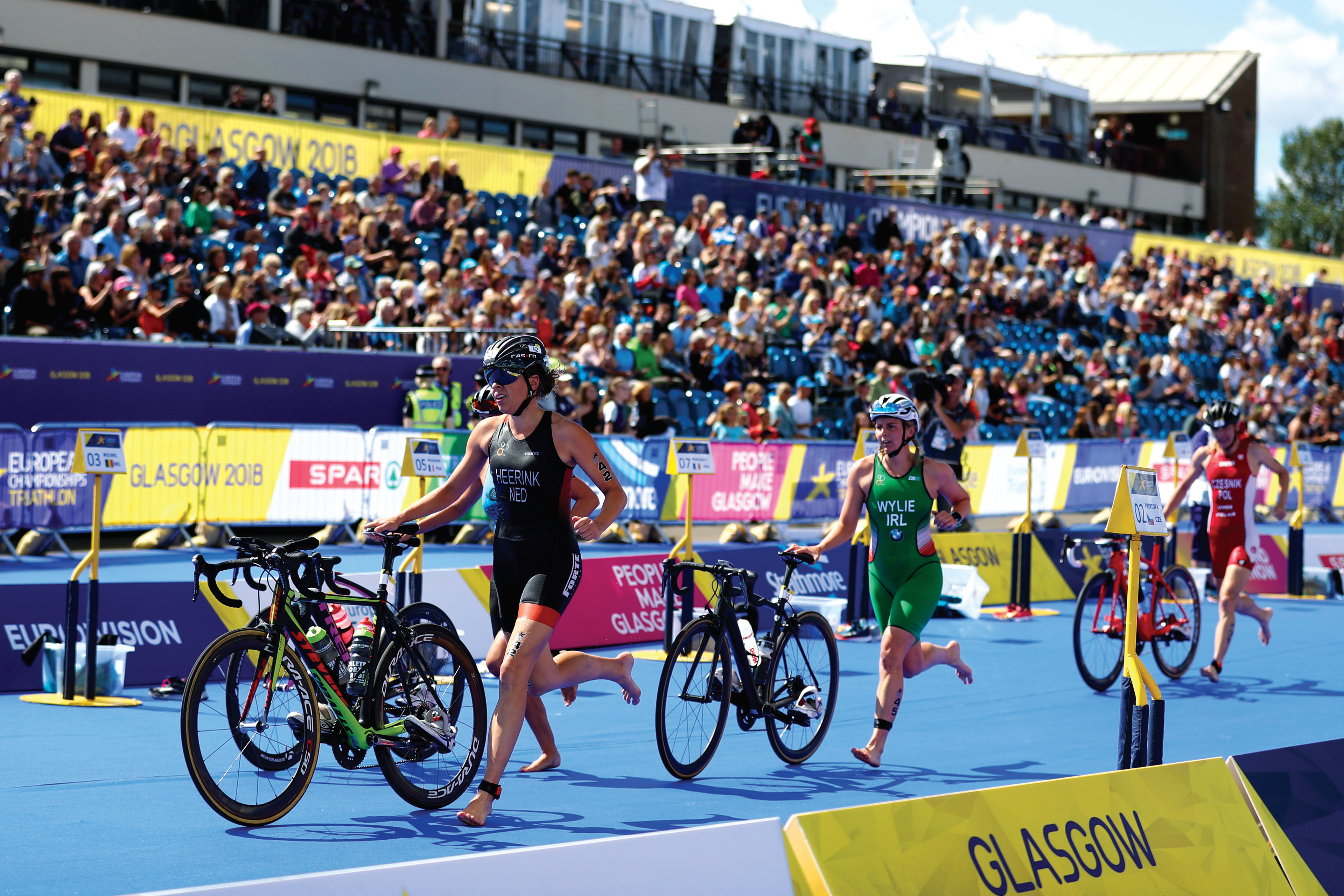
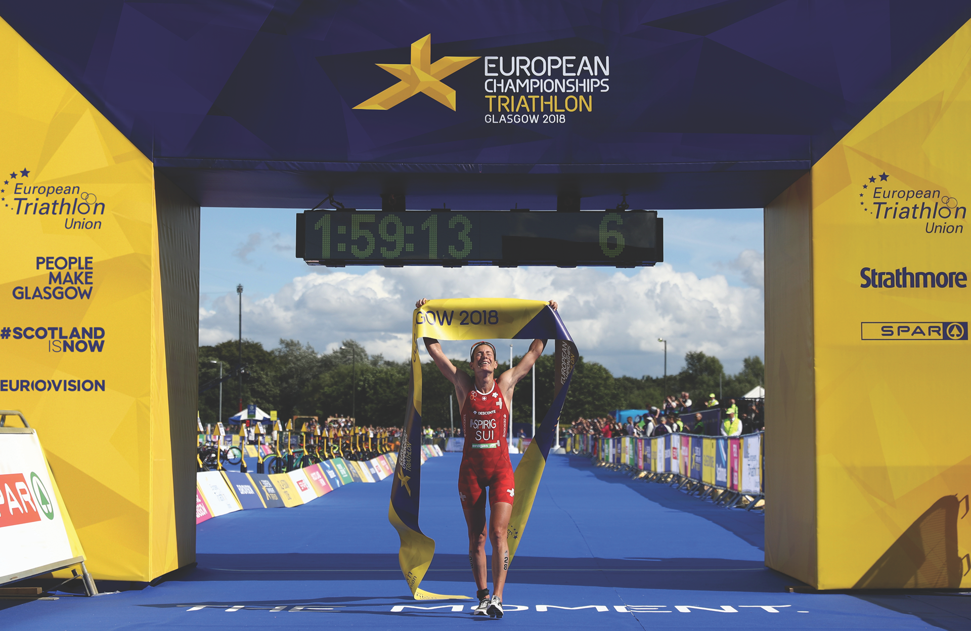
For the first time, an event brought together the European Championships of 6 different sports to take place in one host. The inaugural Glasgow 2018 European Championships introduced a new sport brand. There, a different colour represents each sport.
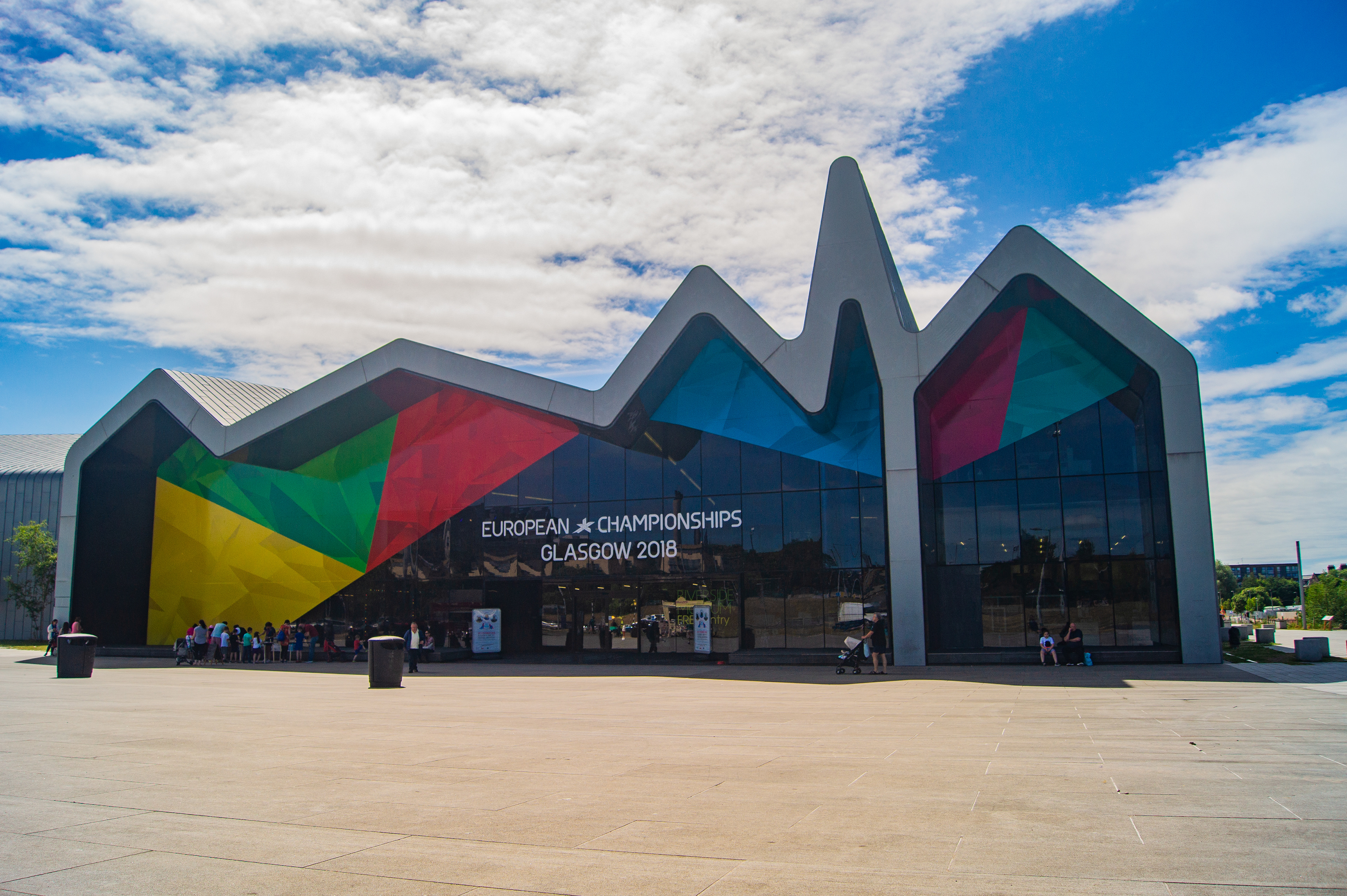
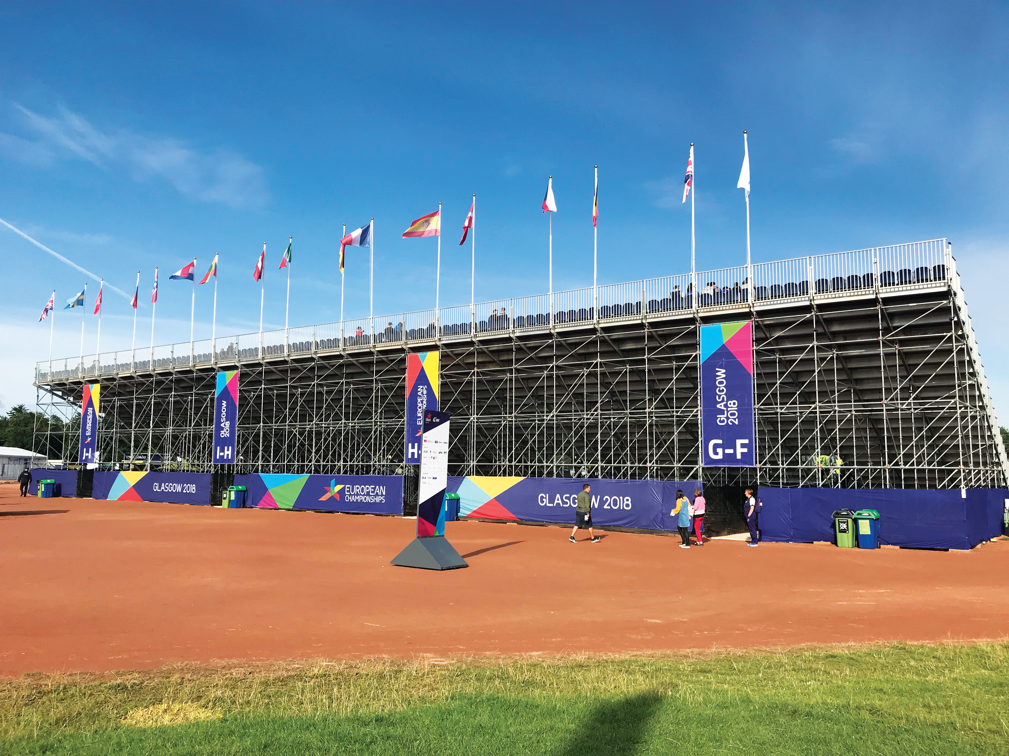
However, I developed a multicoloured identity for digital platforms, city look and feel, and non-broadcast areas in the venues to connect all events across Scotland as one brand.
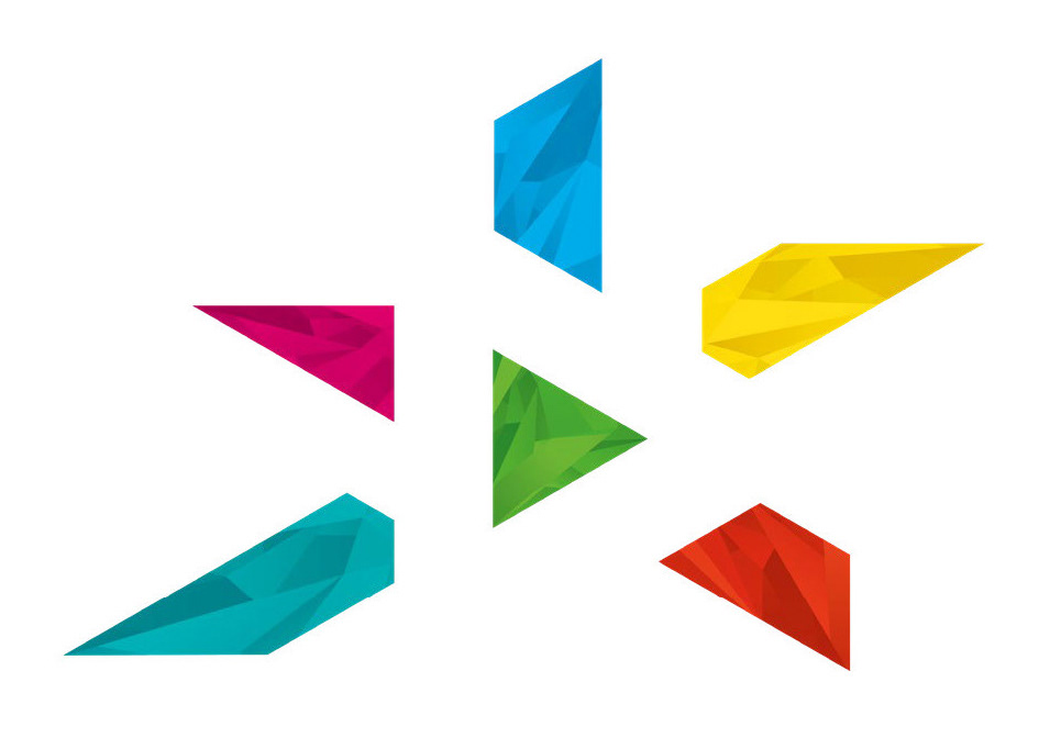
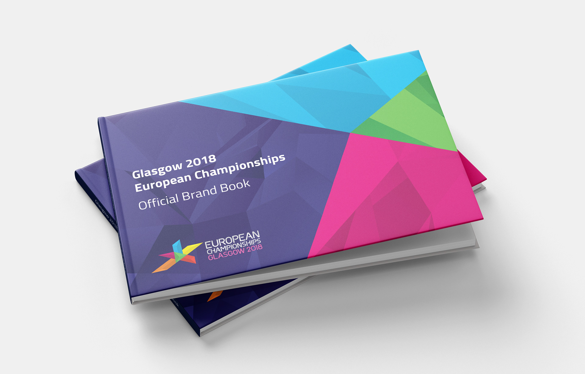
Sense of Unity
The star icon represents the attributes of the champion. Each segment, colour and pattern represented one of the sports that came together to establish this event brand.
By uniting the existing European Championships in the same calendar window, outstanding sporting performances could be showcased and celebrated by a wider audience across multiple cities, venues and events.
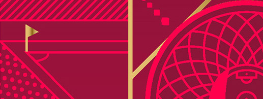
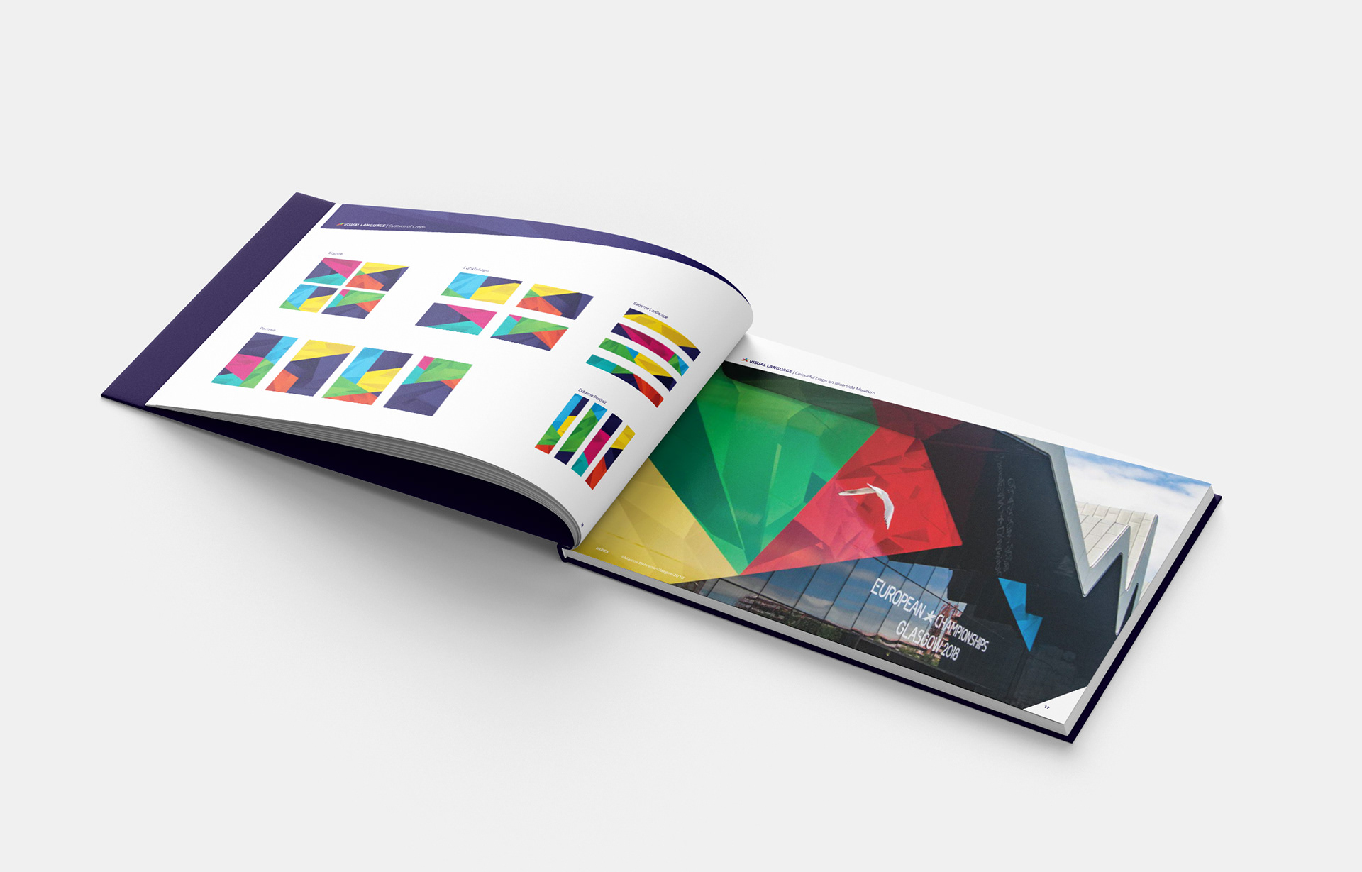
System of crops
Cropping the star made the identity flexible and sophisticated allowing multiple possibilities to expand the brand across venues, city and integrated communications.
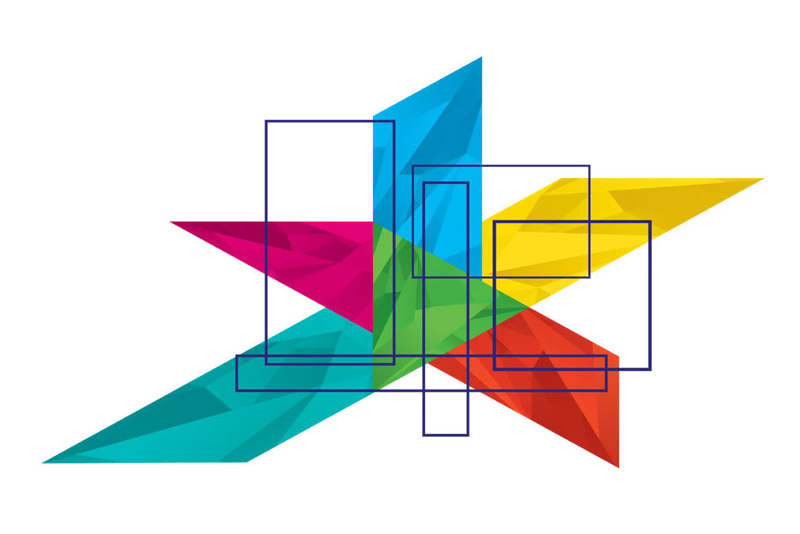
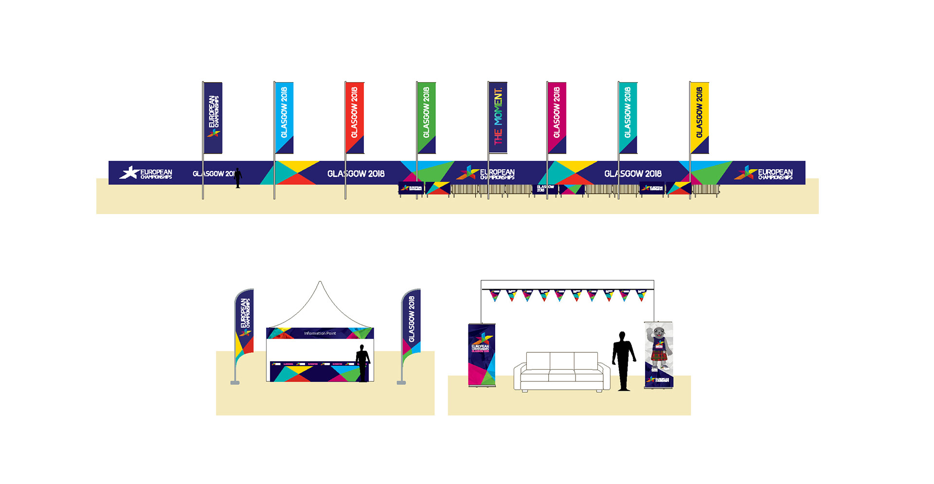
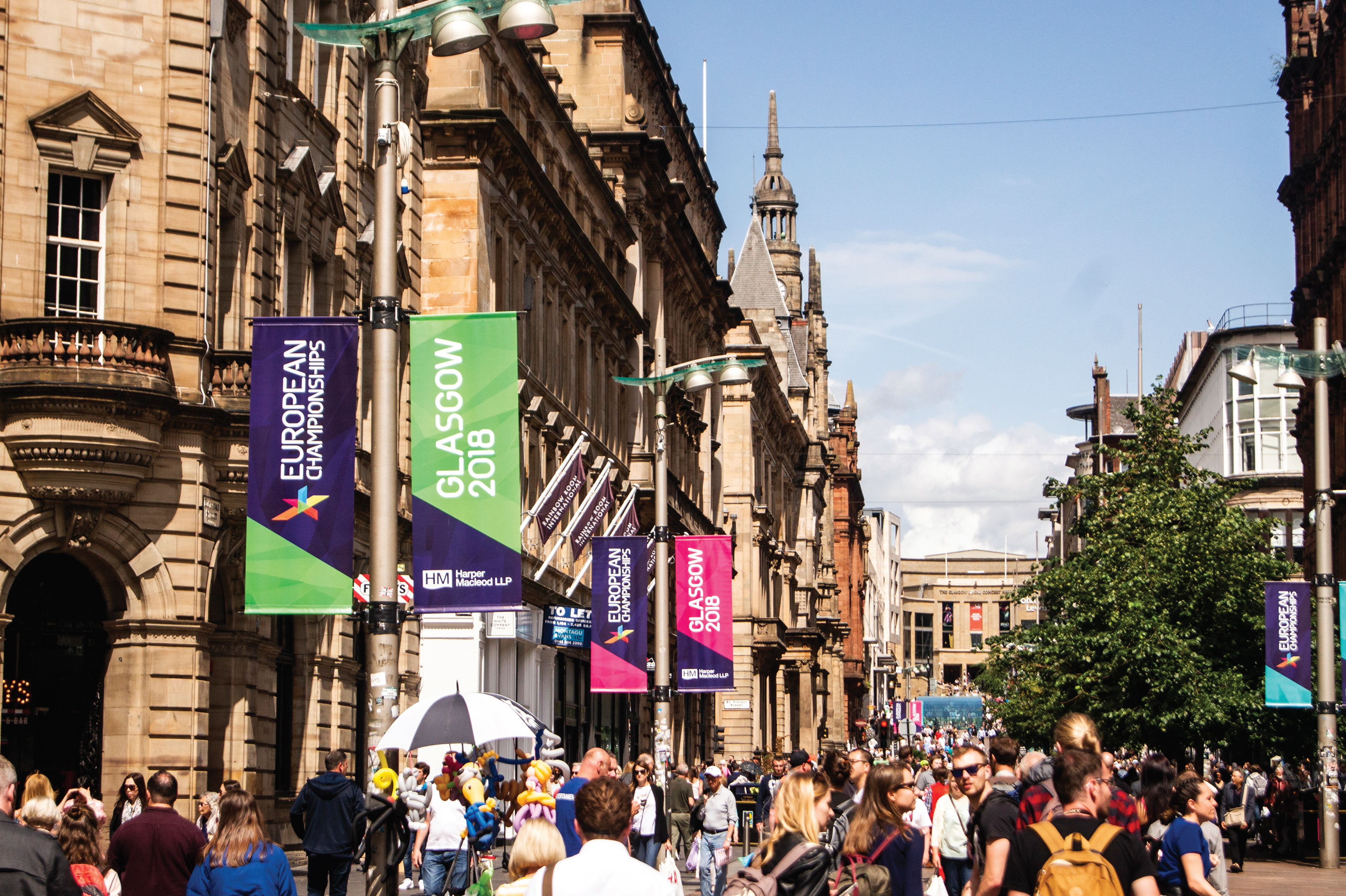
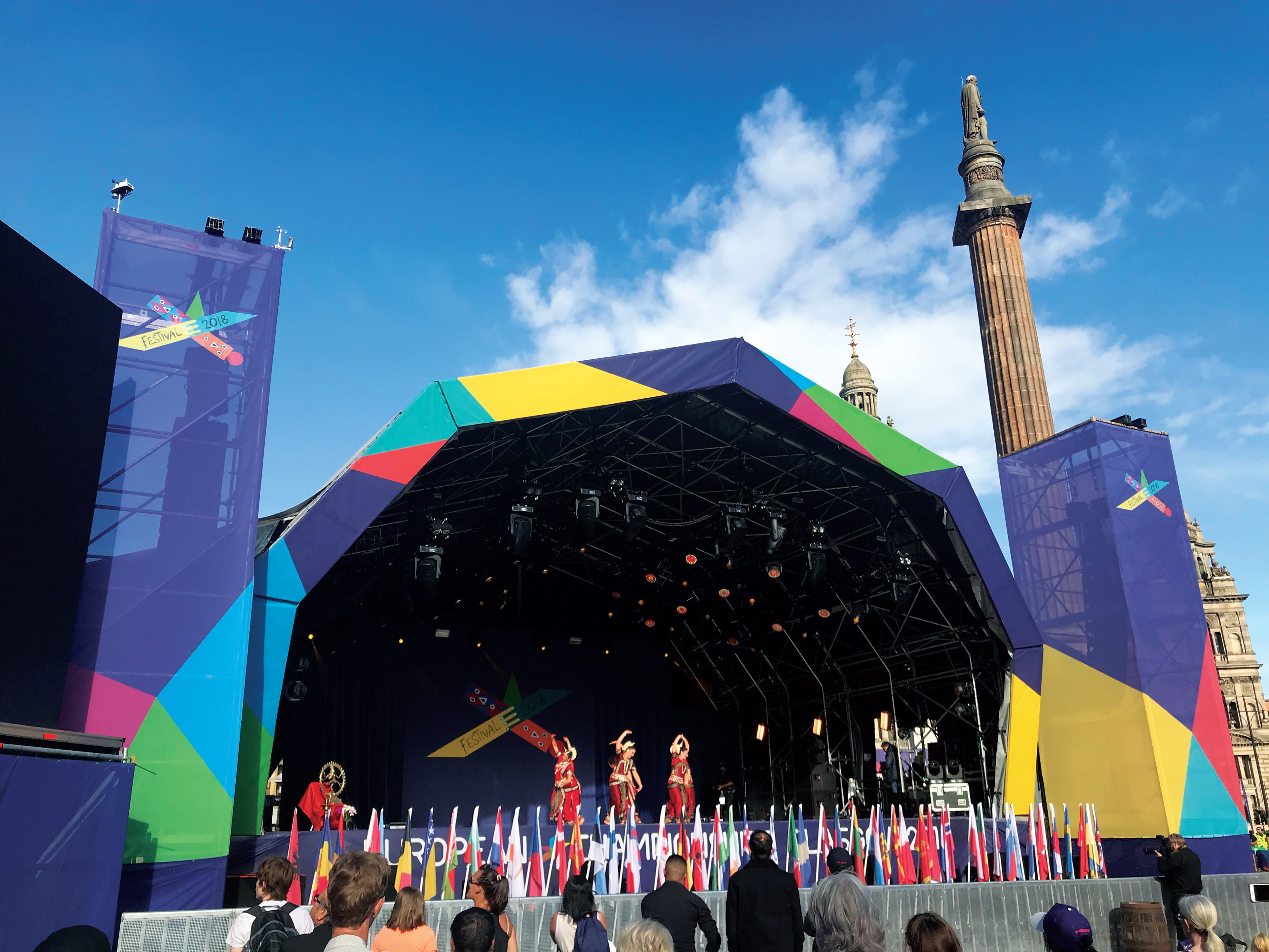
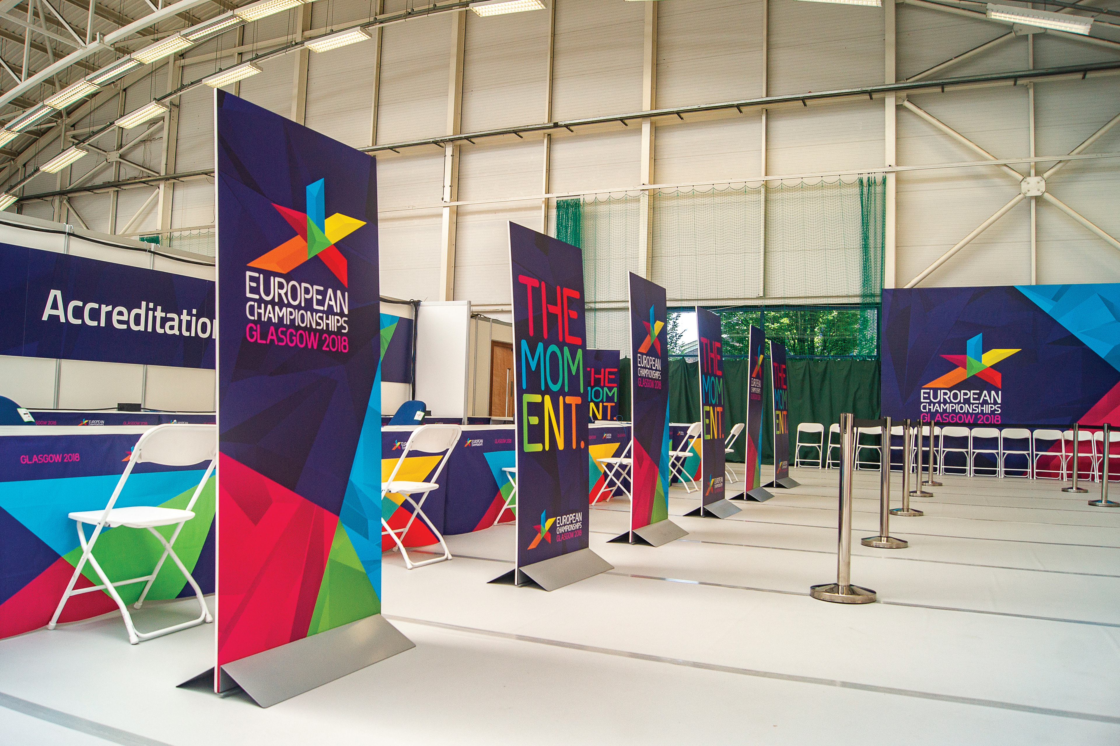
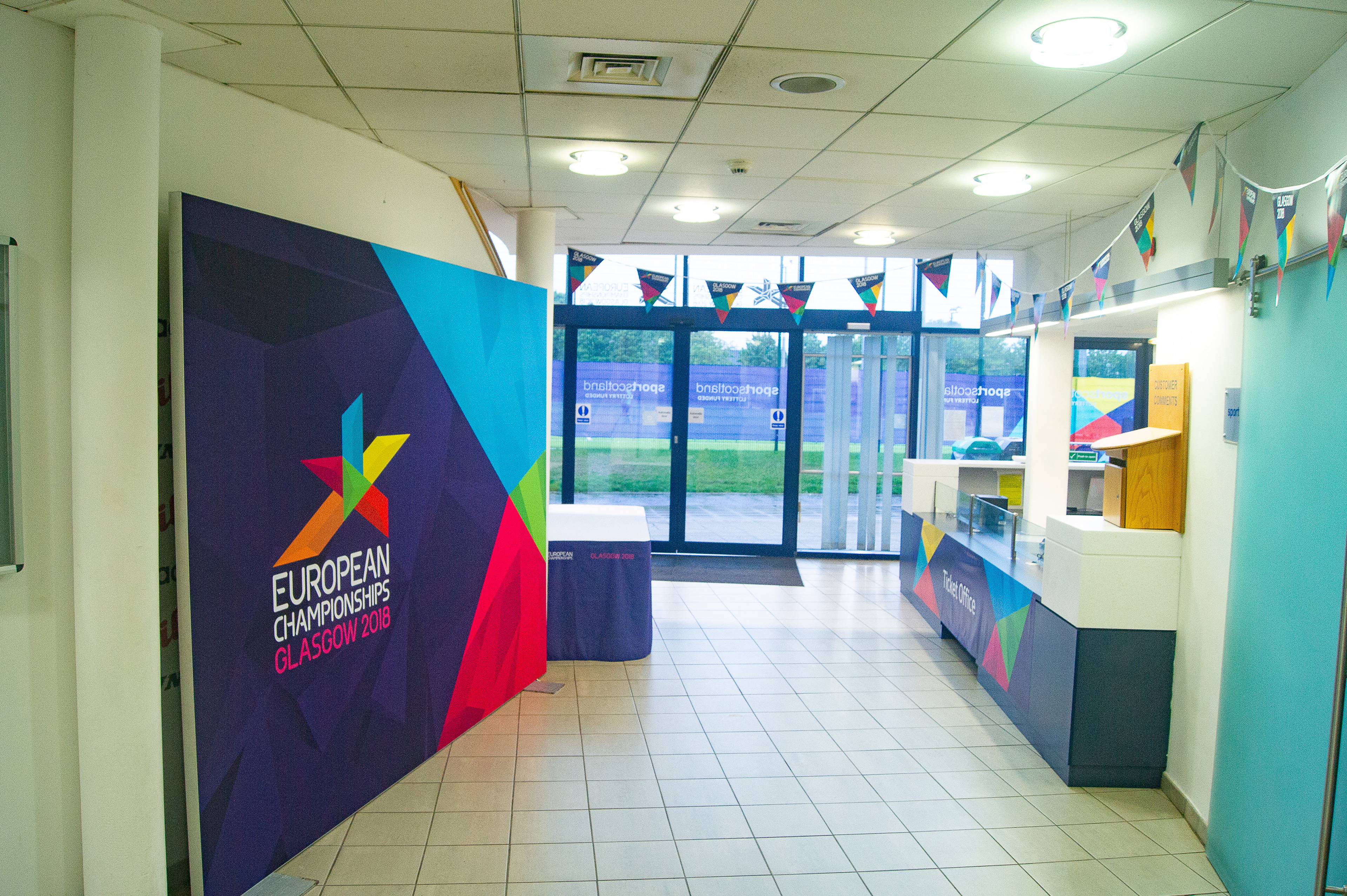
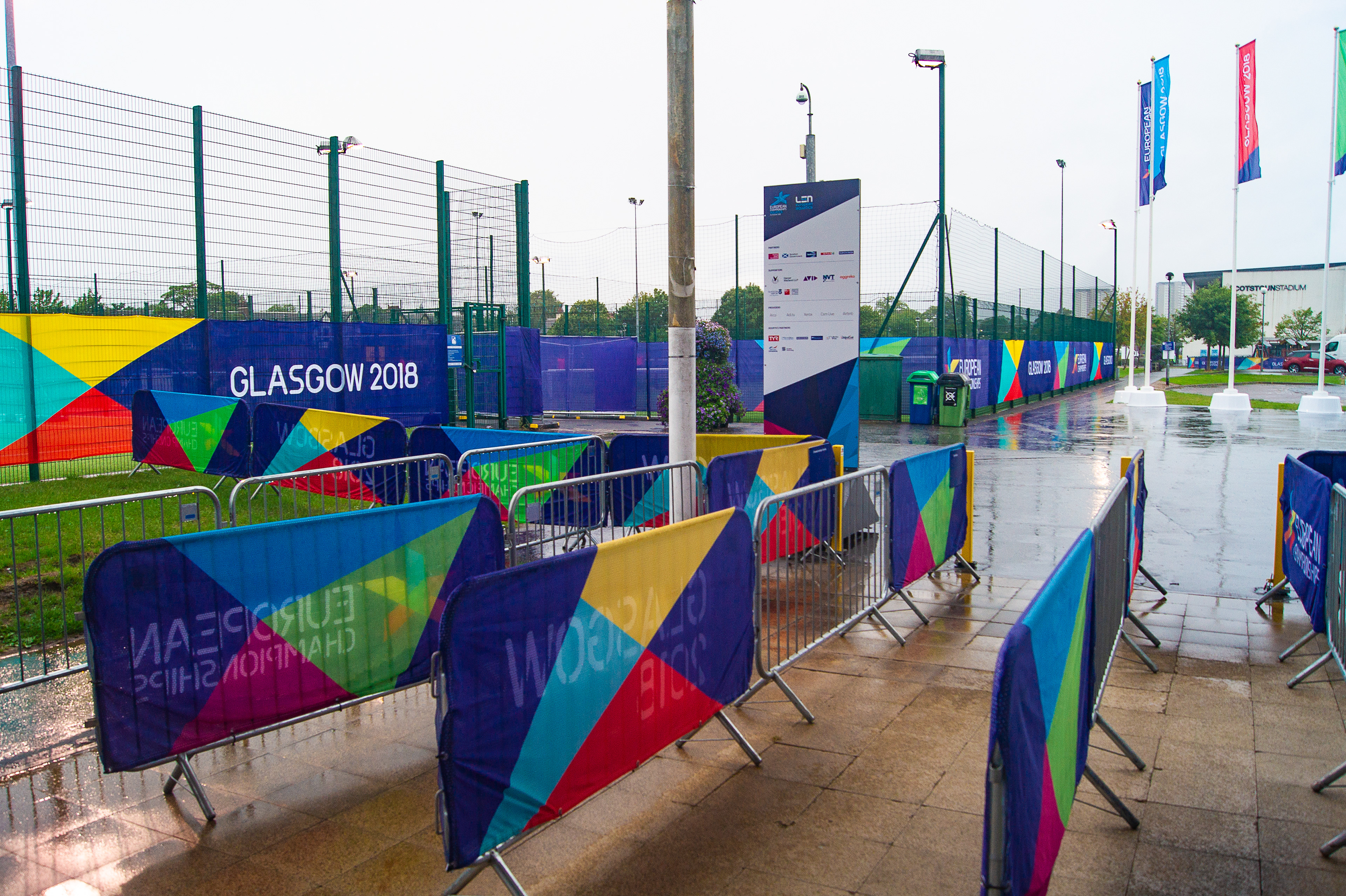
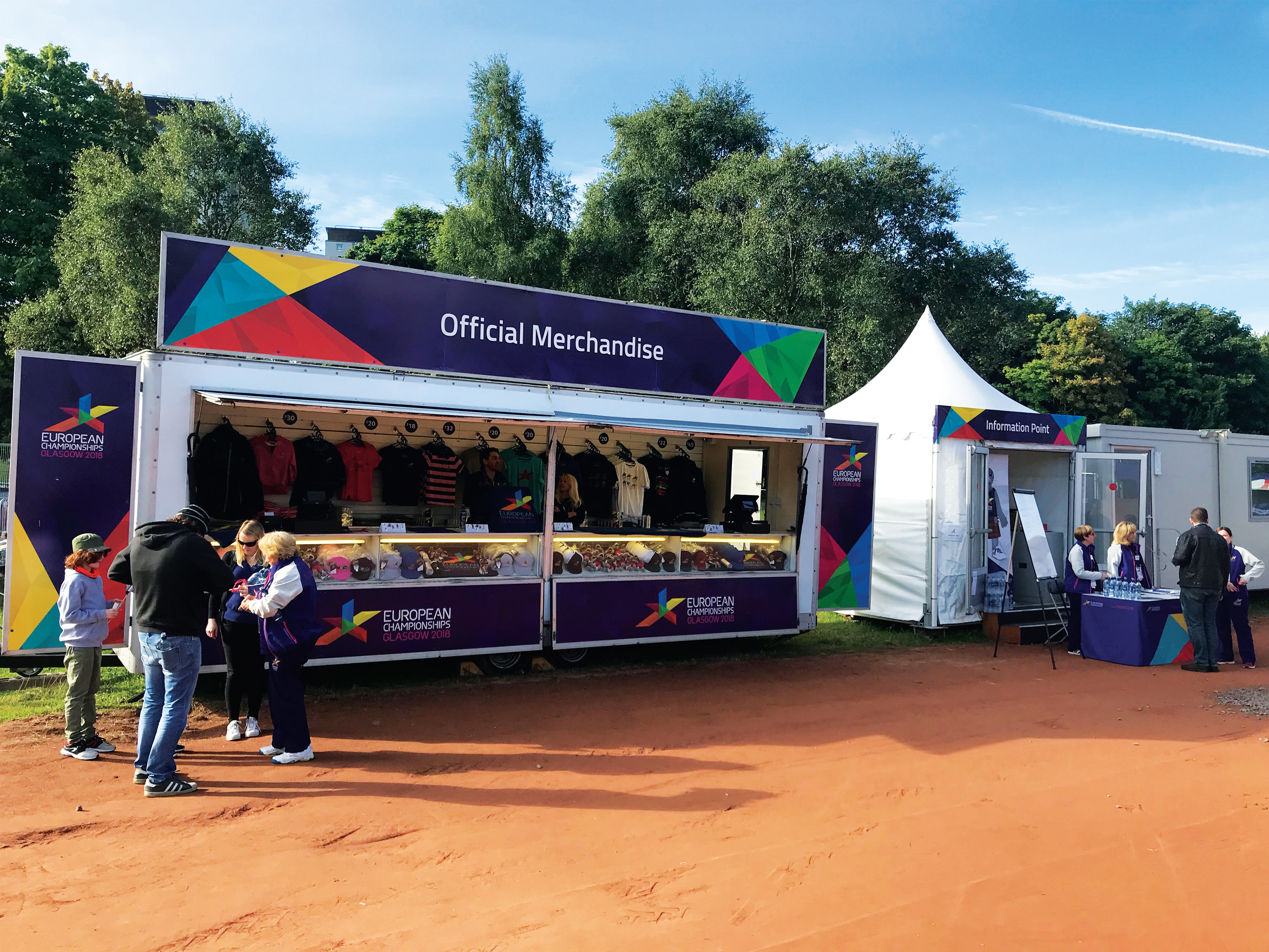
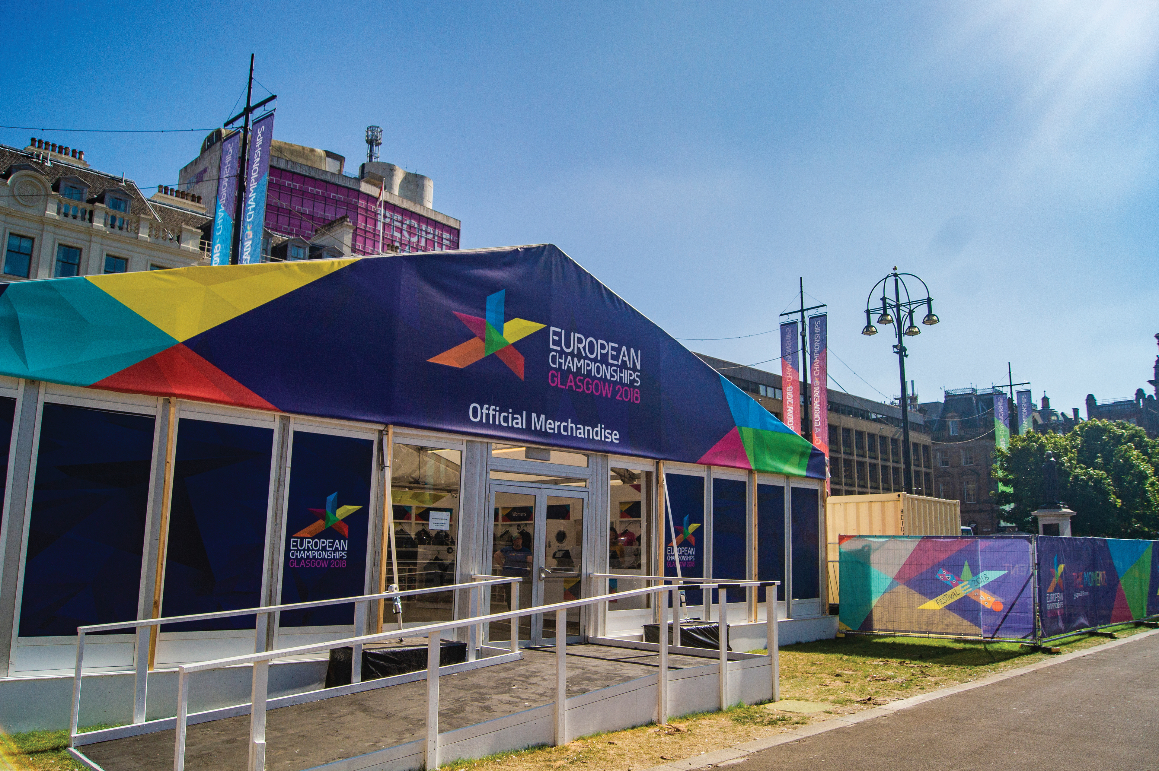
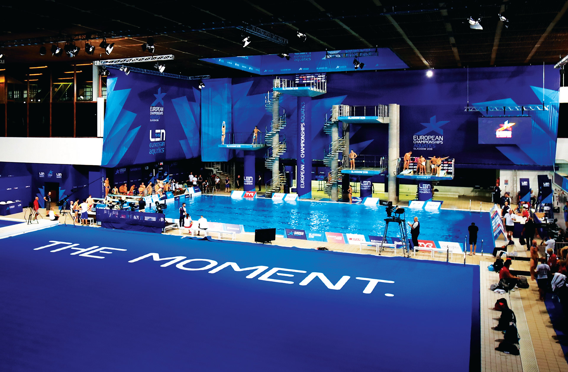
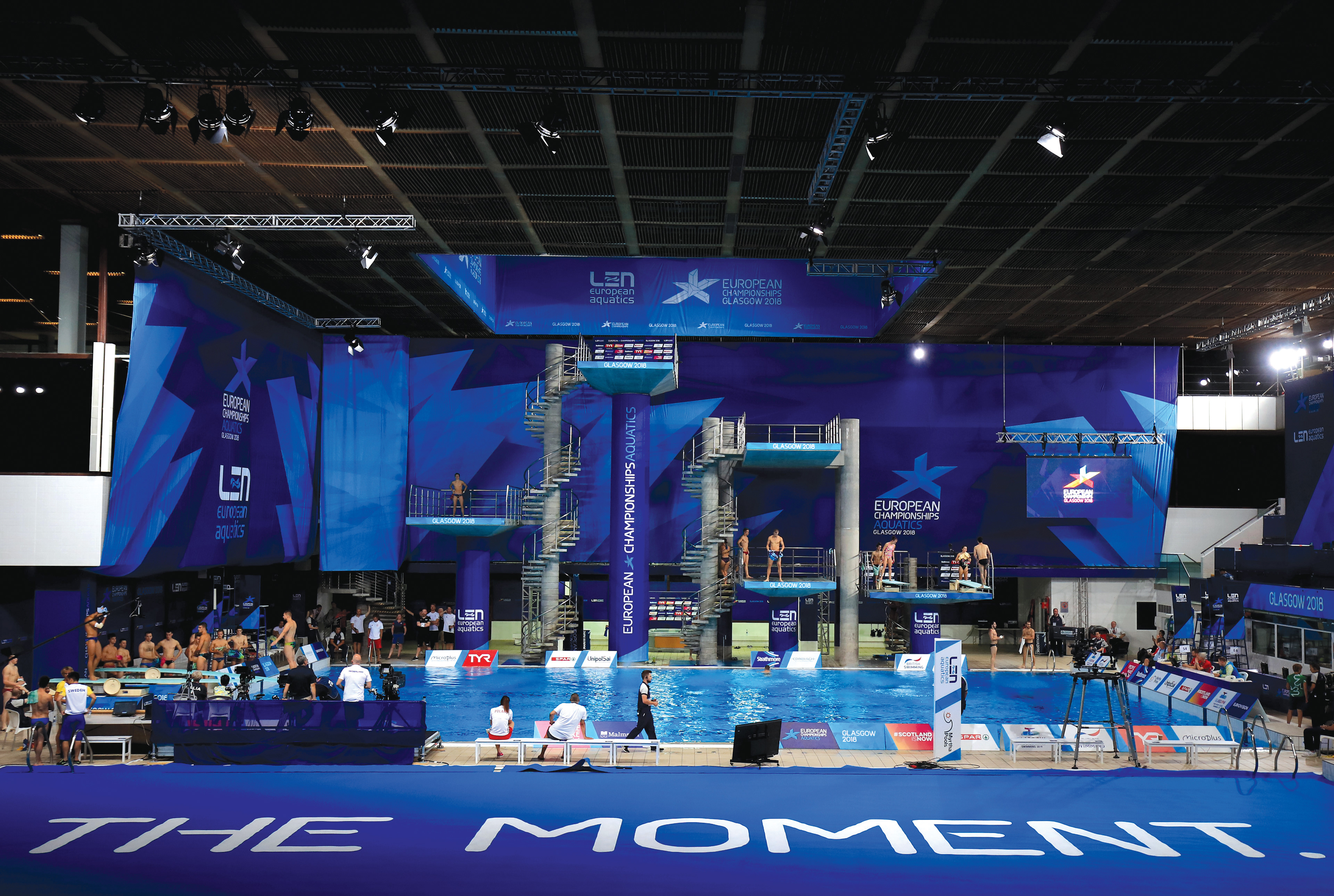
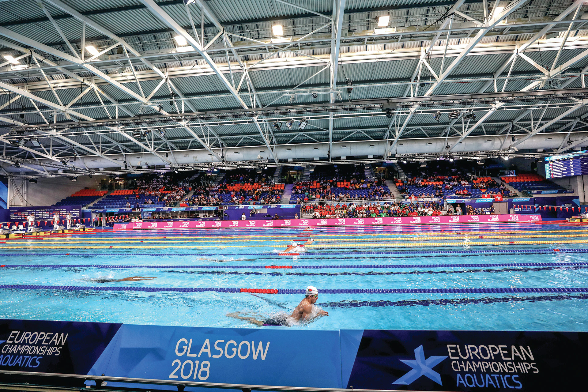
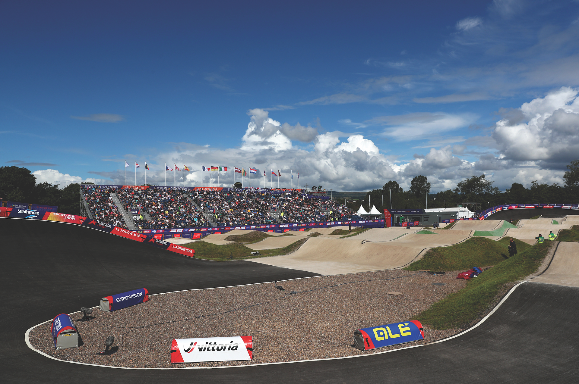
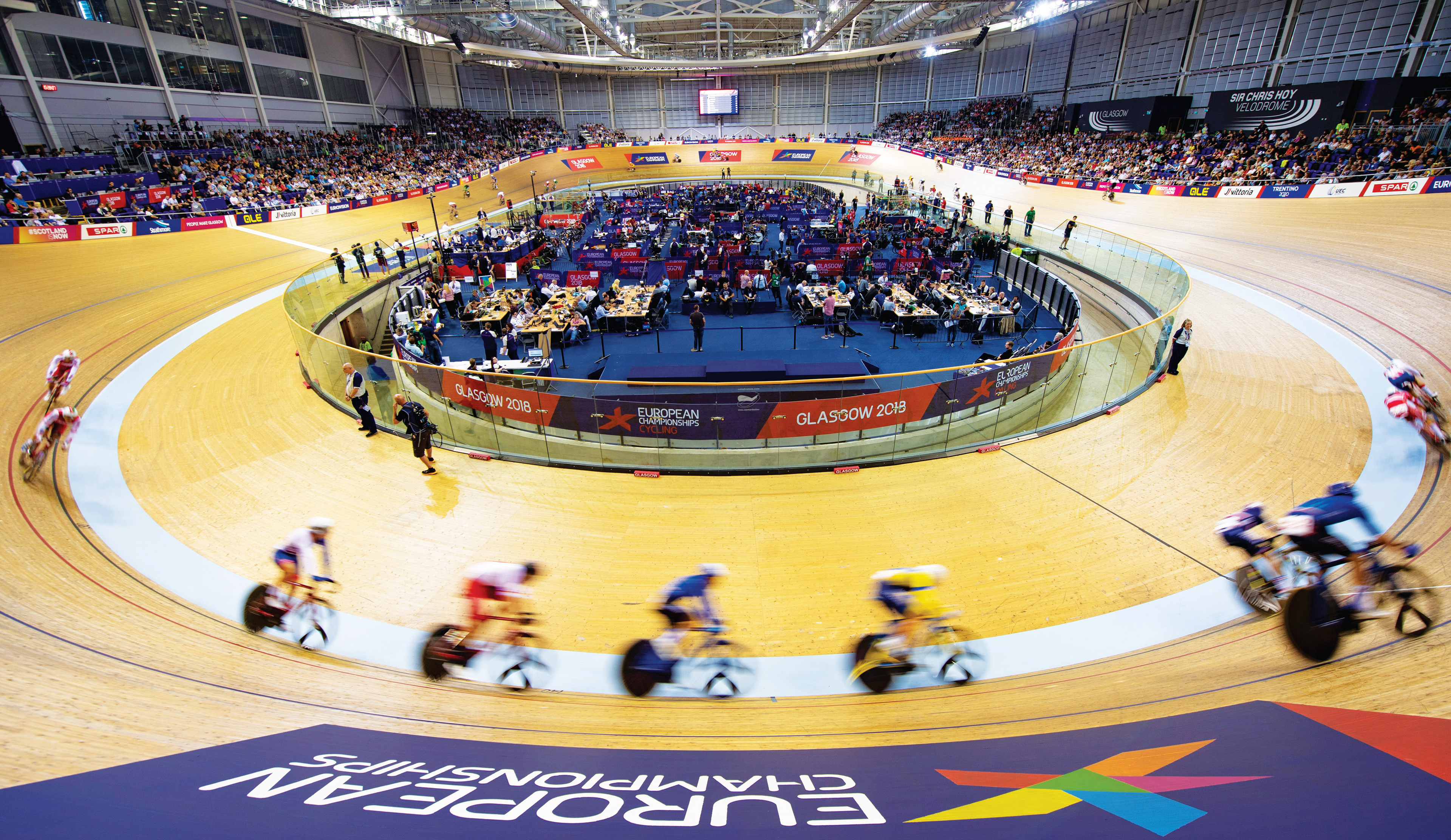
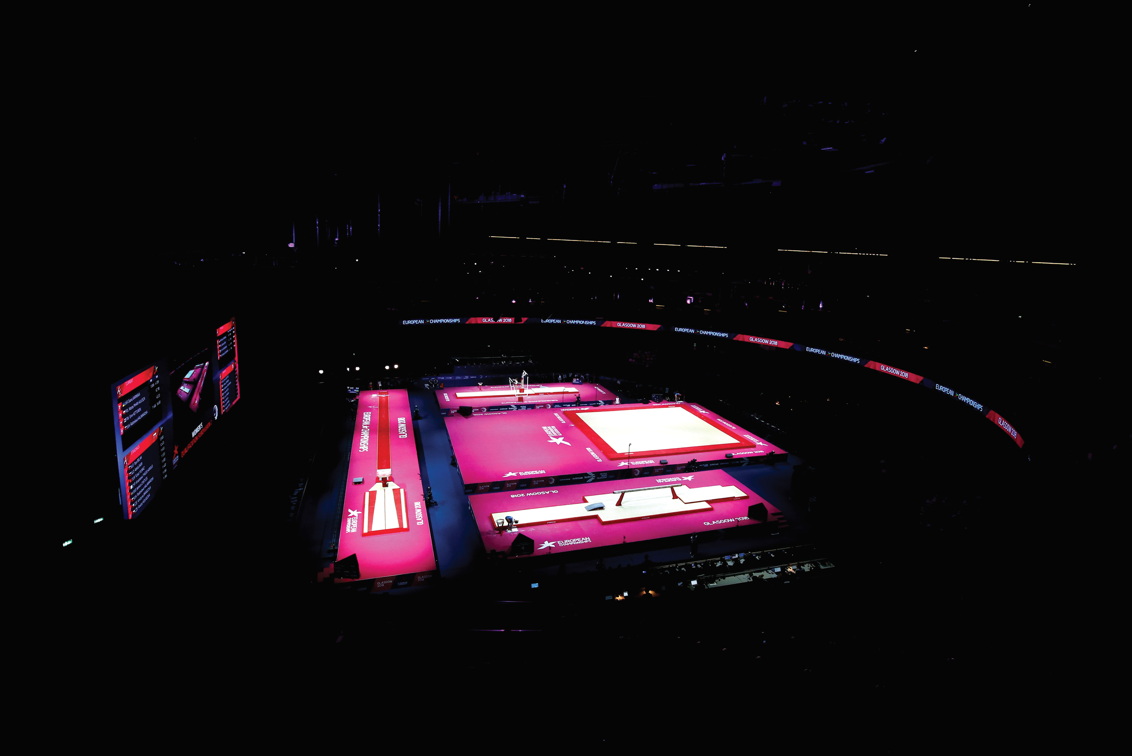
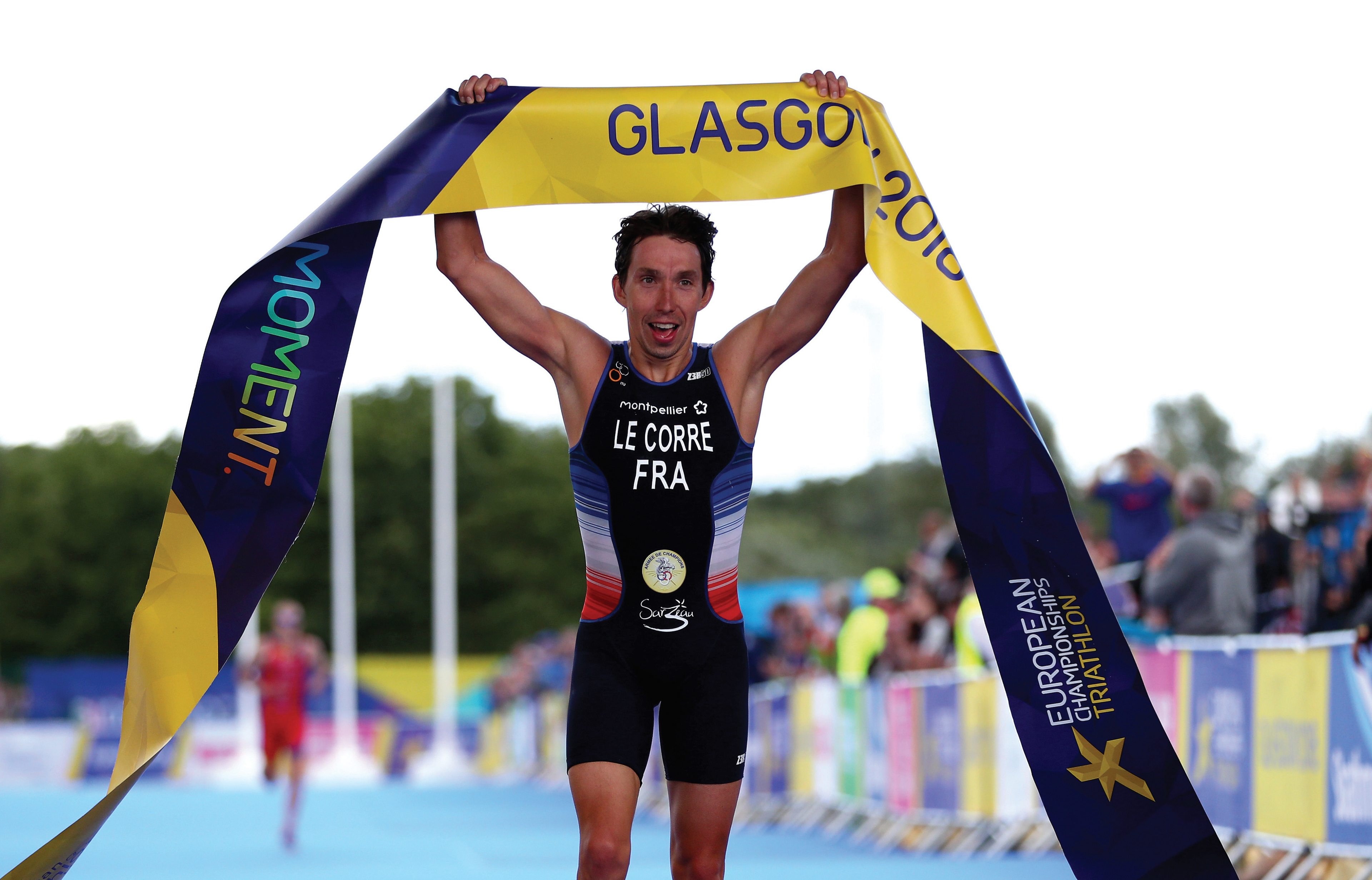
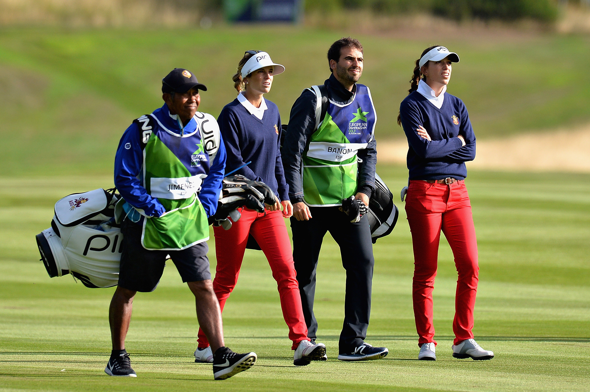
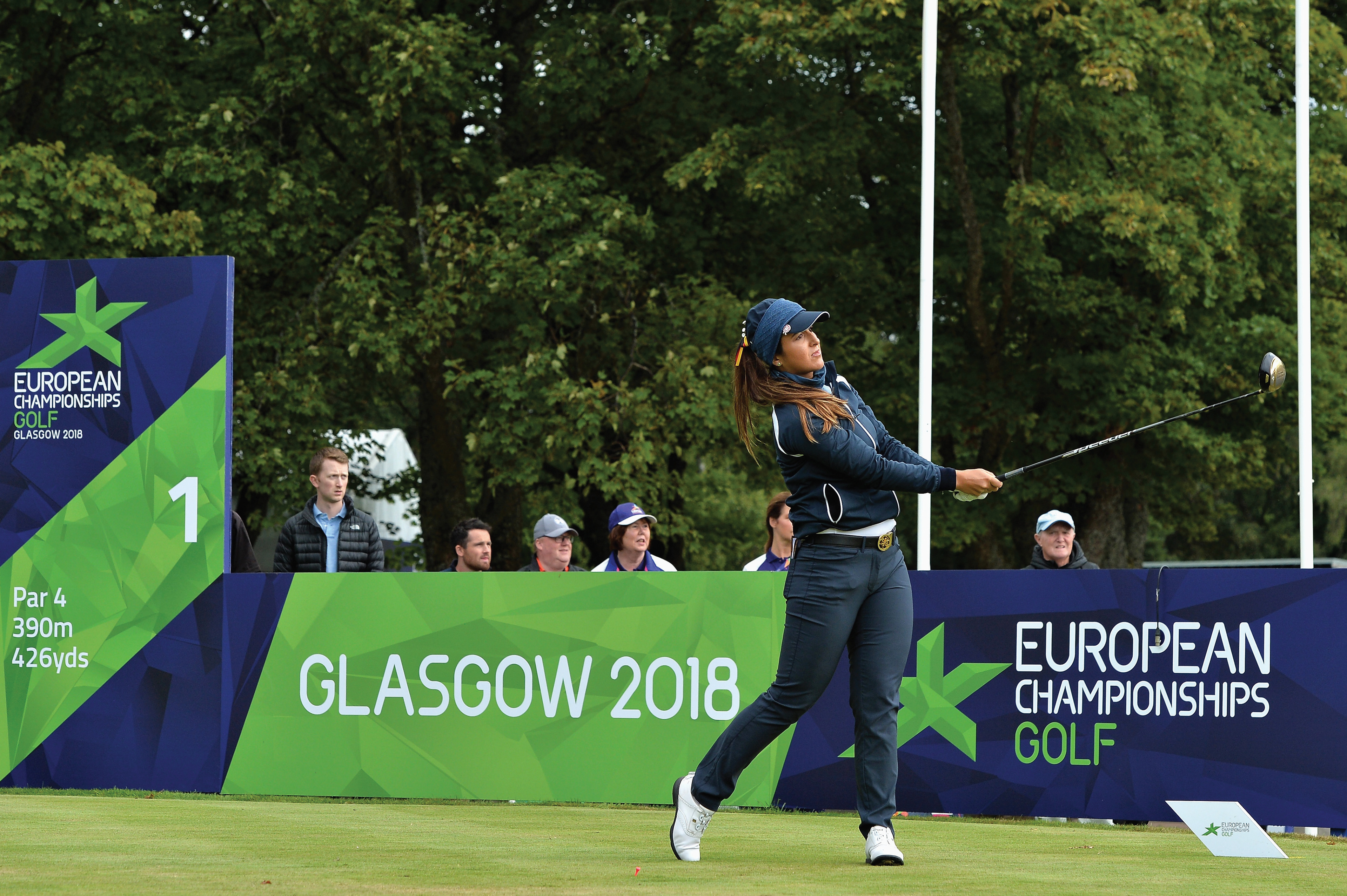
Multicoloured strategy
With a complex strategy that combined six different sport-specific colours, I defined a system to create a multicoloured environment for city, last mile, and non-broadcast spaces.
Based on that concept, I developed an extensive branding toolkit, including banners, flags, table dressing, and bespoke designs.
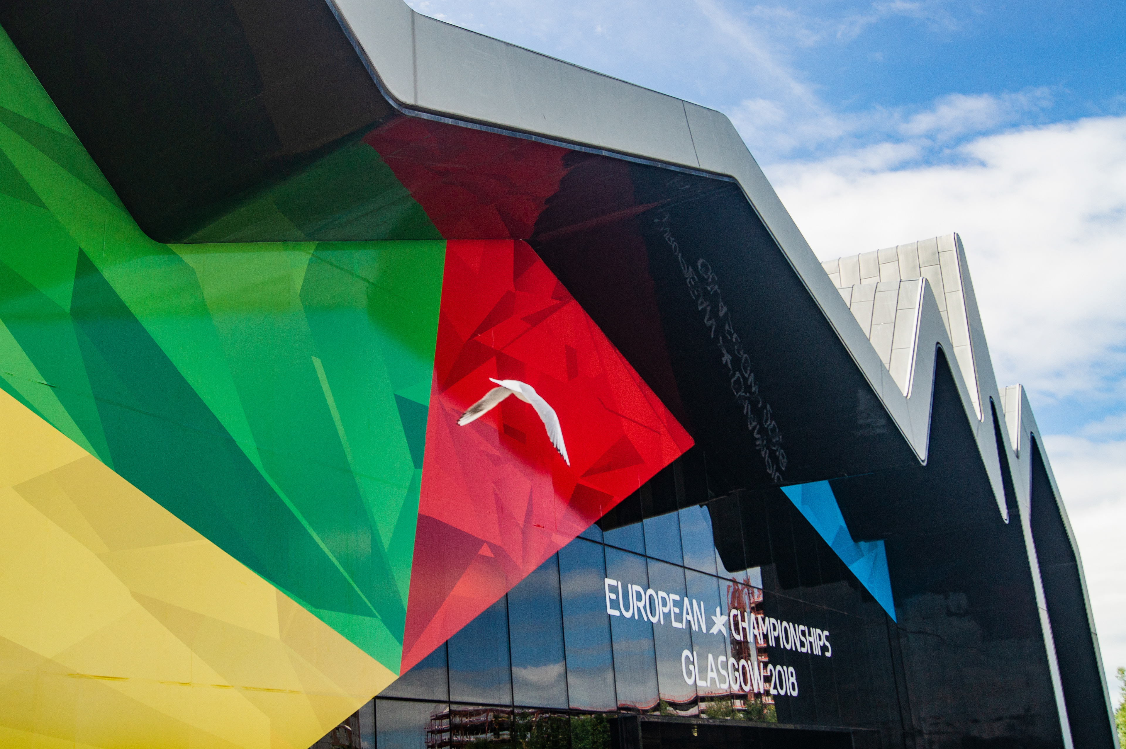
The crystal concept
The main graphic in the European Championships identity was the crystal meshes that carried the corporate and connecting colours and the sport-specific ones.


Learn more about the brand programme at: http://bit.ly/2DWlNEj