Brand Re-design
Friends of Queen’s Park: Logo Redesign Rooted in Community & Nature
Glasgow Queen's Park area is a second home to me, It’s a place I go for leisure and sports, meeting friends, getting in touch with nature and mending my mental health, especially since the pandemic.
When I returned to Glasgow, in 2023, after 2 years working in England, I wanted to be more involved with the community to improve the park however I could.
Over the past two years, I’ve volunteered with Friends of Queen’s Park — a charity that watch over the park — as a graphic designer as well as serving as a committee member.
This brand project grew from my commitment to the group and the desire to create a visual identity that truly reflects the park’s character and heritage and inspires others to take part in making it better everyday.

The opportunity
Working closely with committee leaders, we decided to revisit the charity’s old logo. The files had been lost over years of changing leadership within the charity and it was a good opportunity to rethink what really represents the park in the minds of locals and visitors.
The old mark displayed icon and traditional design depicting a Glasshouse dome which no longer exists. Also, it was a visual element that wasn't singular to Queen's Park, other parks in the Glasgow used to have a glasshouse.
There was an opportunity to set a new visual signature that not only represents the area today but also position the charity as open, friendly and modern caretaker of the park.
Before
After


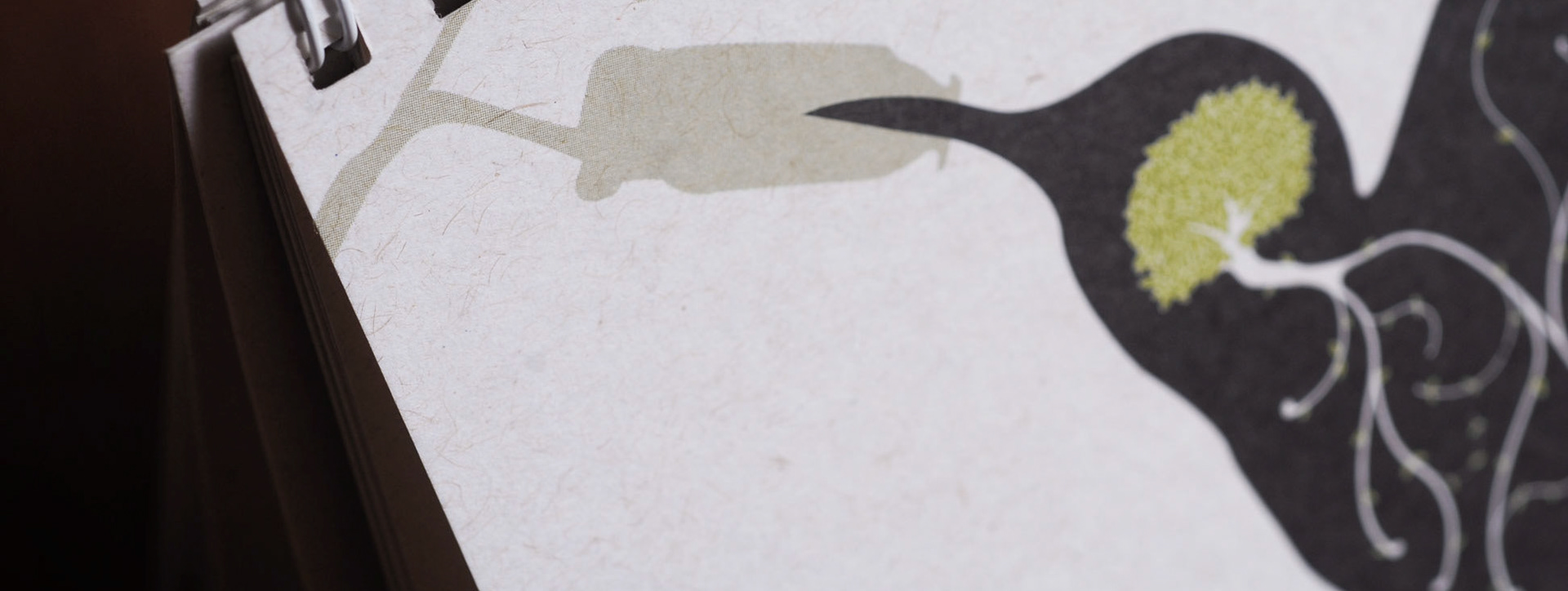
Rethinking the Park’s Symbol
The existing logo featured the park’s former glasshouse dome, a symbol that no longer exists. To create a more meaningful visual mark, I engaged with committee members, volunteers, and community stakeholders.
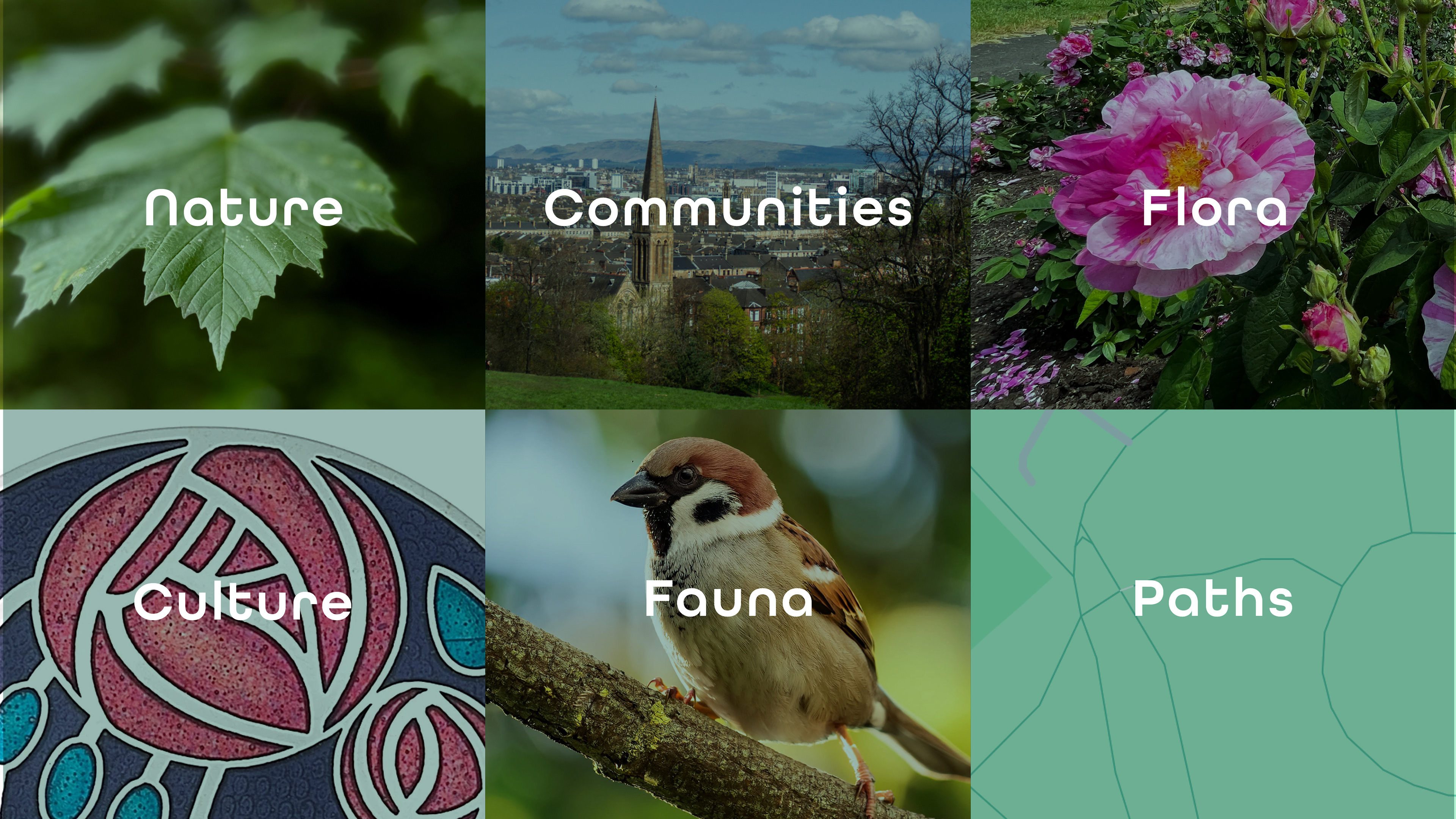
The whole process spun over a few months which coincided with the Glasgow City Council’s public consultation on the park. Having had access to the findings of the research, I gathered the insights on what resonates most to the new brand:
• The Flag Pole viewpoint, Scottish Poetry Rose Garden, and boating pond as favourites spots of the public.
• The healing power of nature and biodiversity.
• The park’s role as a welcoming space for families, friends, and the wider community.

Illustrative Identity: Flora, Fauna, Heritage & Pathways
Inspired by these insights, the new logo captures key park elements—community, flora and fauna, Scottish heritage, and walking paths—through an illustrative design style. It draws on the artistry of Charles Rennie Mackintosh and Margaret MacDonald, whose rose motifs echo the Poetry Rose Garden’s importance to the charity in their conservation efforts.

Colour from Nature & Local Spirit
Our palette celebrates colours of the park and surrounding communities throughout the seasons: sunrise, blossoms, snow, petals, bird feathers, and the brownstone architecture of Queen’s Park area. It reflects vitality, community warmth, and the ever-changing landscape surrounding the park.

Bringing the Brand to Life
This identity was designed to be flexible across posters, adverts, social media, printed materials, and volunteer communications—enhancing awareness and pride within the Queen’s Park community.


Let's connect
I specialise in illustration-led branding grounded in place, culture, and people. Let’s work together to design something that leaves a legacy.