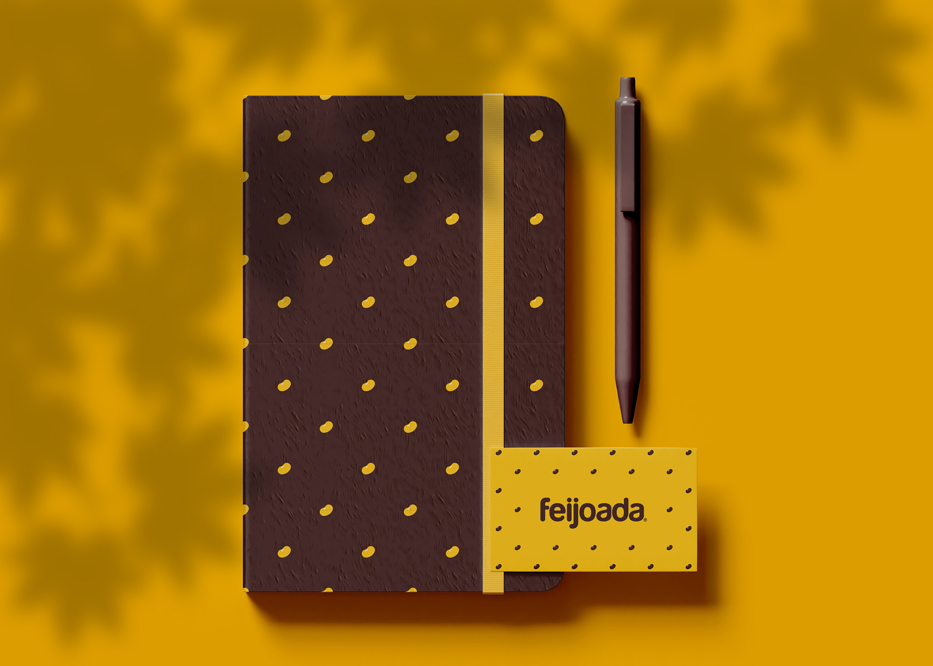
Celebrating Brazil's cultural identity with a locally-inspired brand.
Feijoada Art & Design is a creative collaboration between Brazilian designers and illustrators Marcos Behrens and Alex Hagas. We set out to make art and design accessible and part of people's lives. Named after one of Brazil’s most iconic dishes, Feijoada is a playful shorthand for cultural mixing: flavours, colours and styles that form an authentic Brazilian visual DNA.


Challenge
How do you turn a passion for culture into a coherent product range that’s both authentic and affordable? The brief we set ourselves was simple: create bold, illustrative designs and graphic ar exploring, typographic posters, vector art and digital collages for accessible printed goods that felt true to street markets and everyday life in Brazil, while working at small scale and modest budgets.
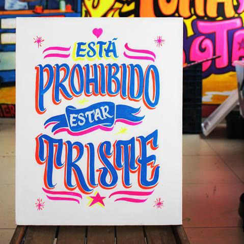
A moodboard of inspiration from Brazil's popular scene.
Colourful street market stalls in Brazil, reference for Feijoada Art & Design palettes, textures and typographic signage
Colourful street market stall in Brazil, reference for Feijoada Art & Design palettes, textures and typographic signage

Colourful street market stall in Brazil, reference for Feijoada Art & Design palettes, textures and typographic signage
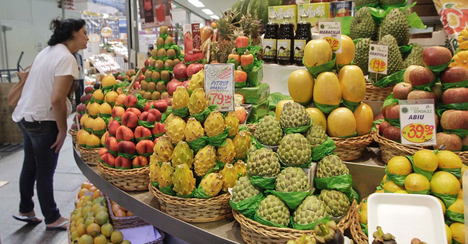
Colourful street market stall in Brazil, reference for Feijoada Art & Design palettes, textures and typographic signage
Colourful street market stall in Brazil, reference for Feijoada Art & Design palettes, textures and typographic signage

Colourful street market stall in Brazil, reference for Feijoada Art & Design palettes, textures and typographic signage

Colourful street market stall in Brazil, reference for Feijoada Art & Design palettes, textures and typographic signage

Colourful street market stall in Brazil, reference for Feijoada Art & Design palettes, textures and typographic signage
Approach
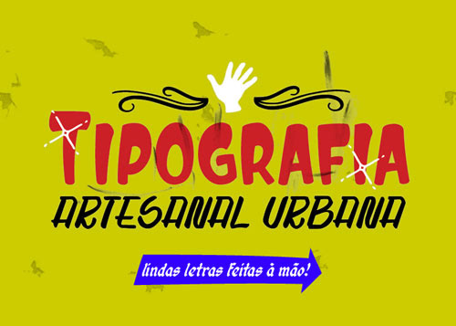
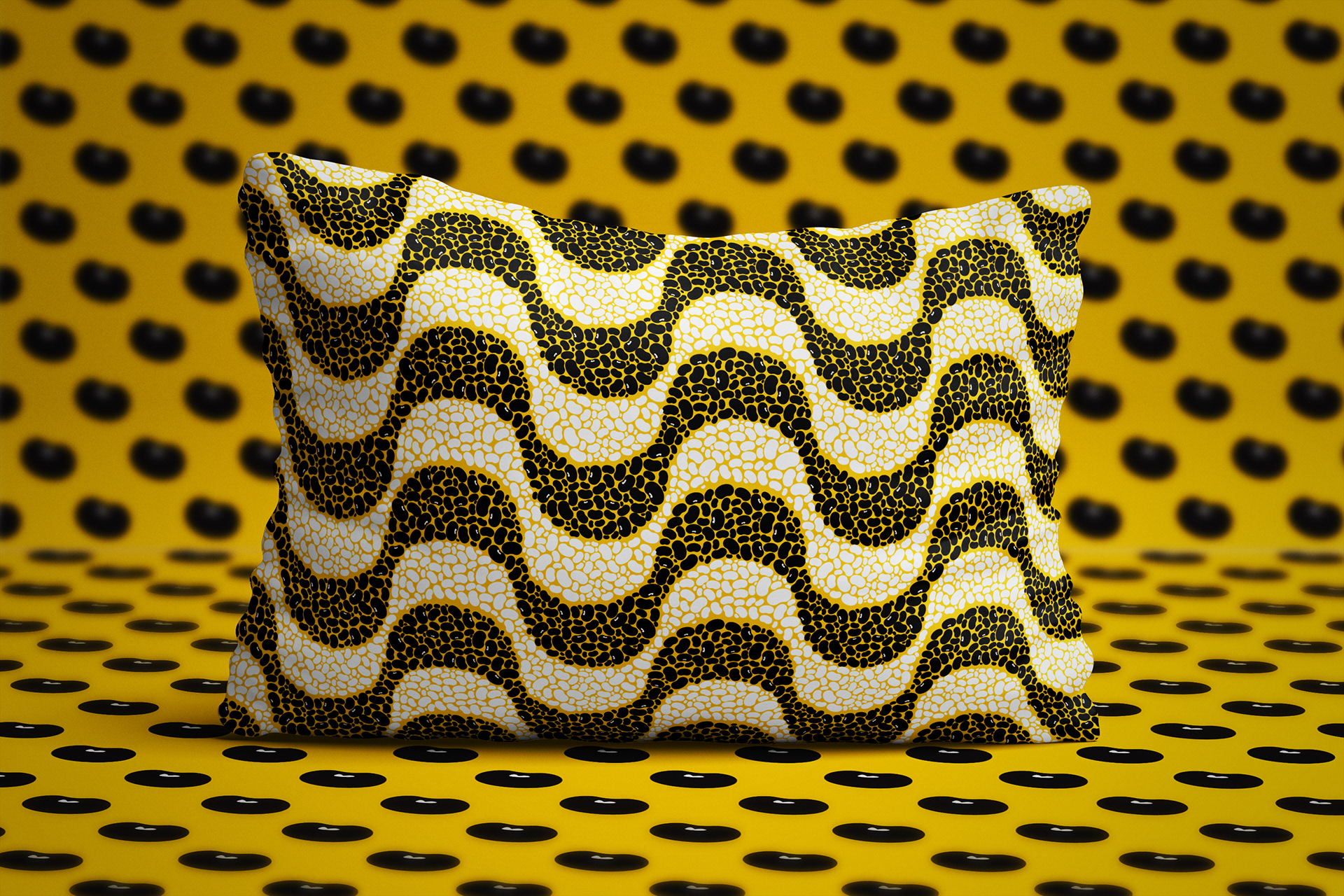
We have drawn inspiration for the visual language from Brazilian food markets, signage and festive typography. The result is a system built on strong type treatments, warm palettes pulled from food stalls and fabrics, repeatable and scalable motifs and patterns that can be applied across posters, T-shirts, tote bags and prints.
Although, we remain flexible and experimented with different, tool, techniques and styles, the brand artwork was vector-base so it scales cleanly across products.

Outcome & Impact
We have built a charismatic brand that drawn attention in art fairs, maker's market and I was feature in lifestyle and fashion magazines. e ran the project between late 2011 until mid-2017, when I relocated to the UK.
During that time we also strengthened creative partnerships with other makers and designers to bring more products to life, increasing local visibility, and showed how culturally-authentic illustration can be packaged as affordable everyday art.


Interested to know more about this brand?
Check out the complete identity guidelines here.
Looking in a collaboration or commissioned series?