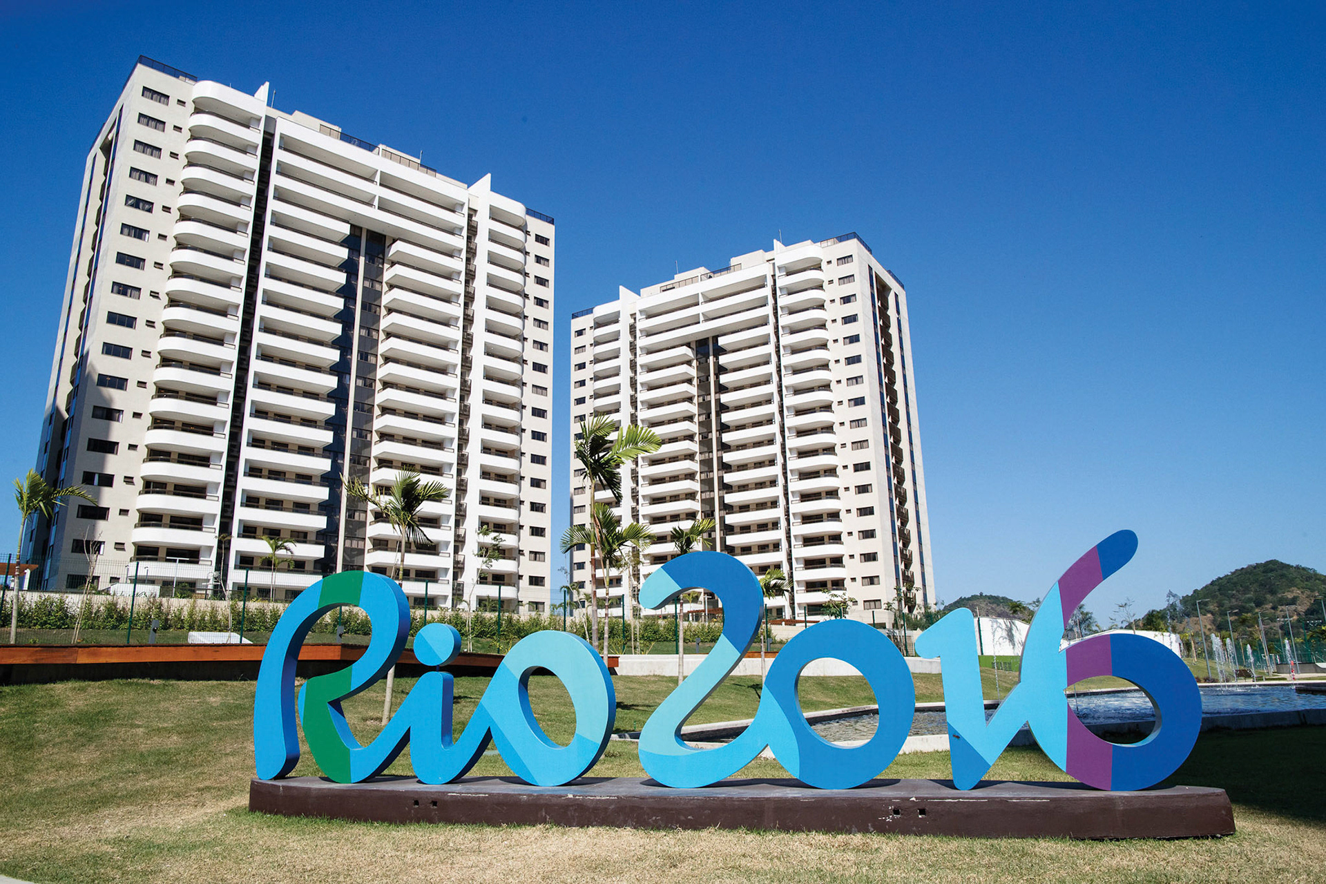
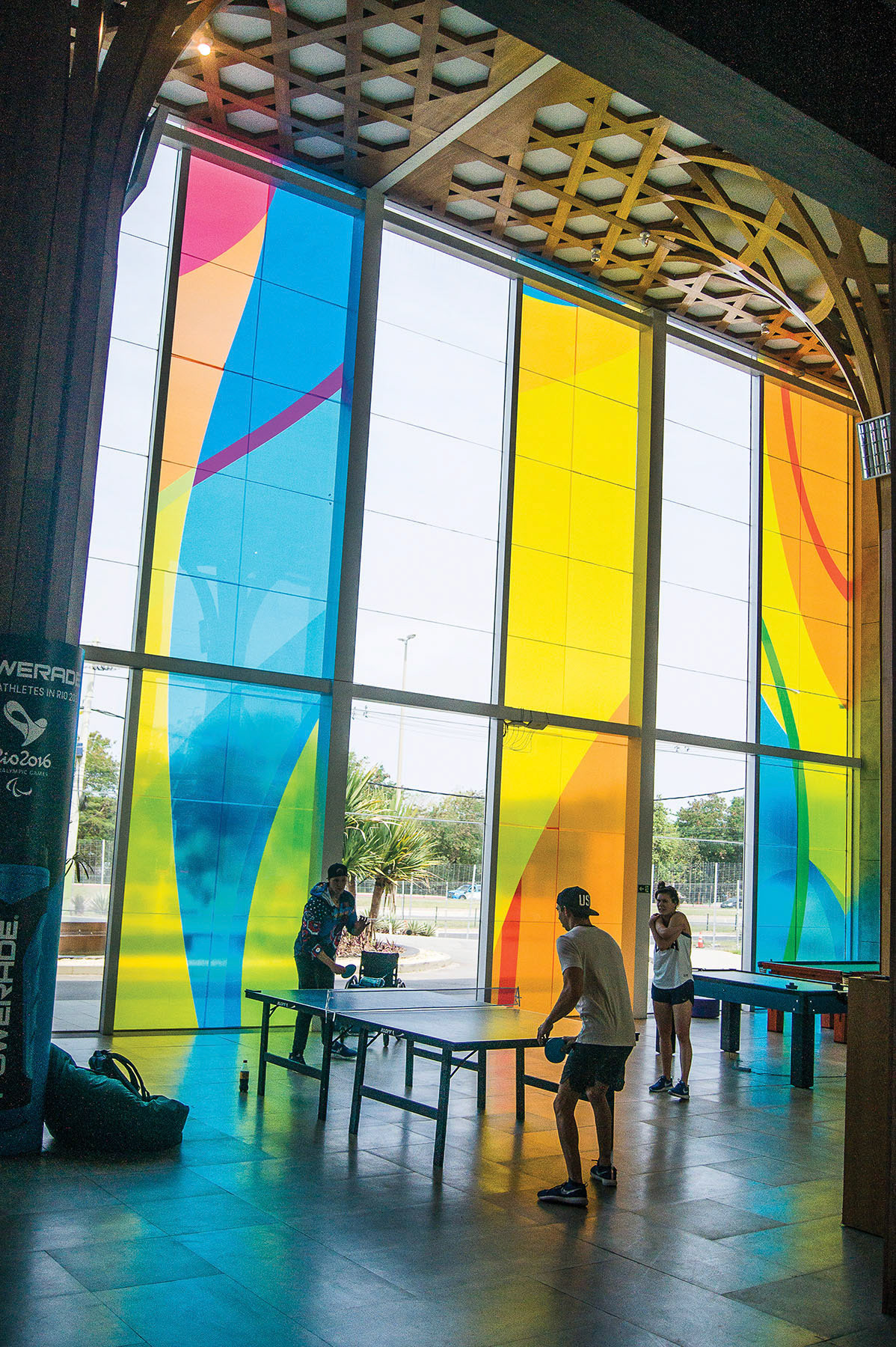
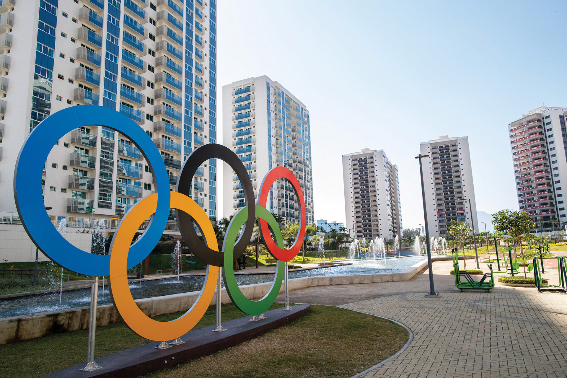
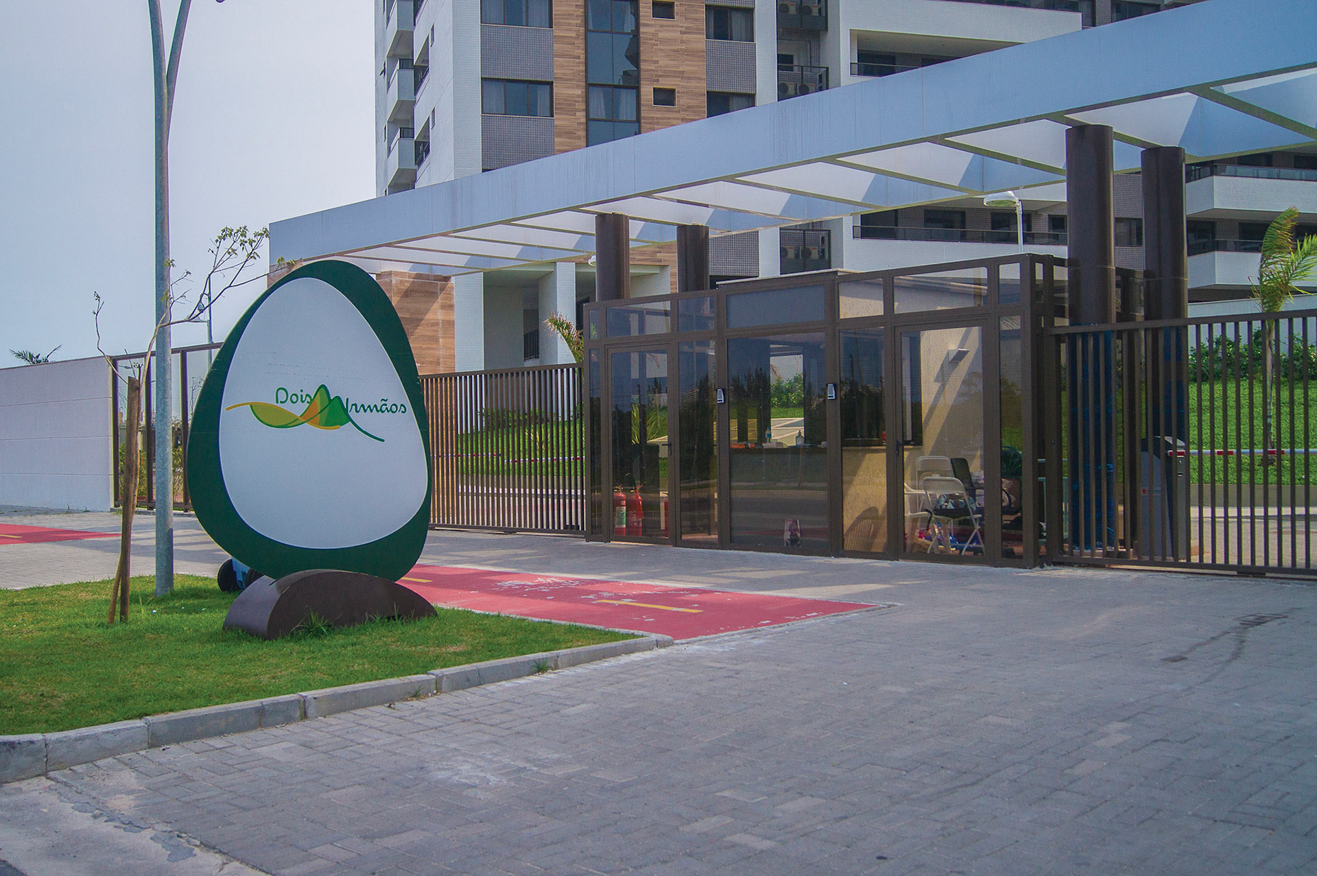
The athletes' village was in a vast newly built neighbourhood called Ilha Pura in Barra da Tijuca. It consisted of 31 buildings, split into seven condominia; to decorate it with Rio 2016 visual identity, we explored green as the primary colour and Looked's colourful crops. Within this complex project, I highlight the following:
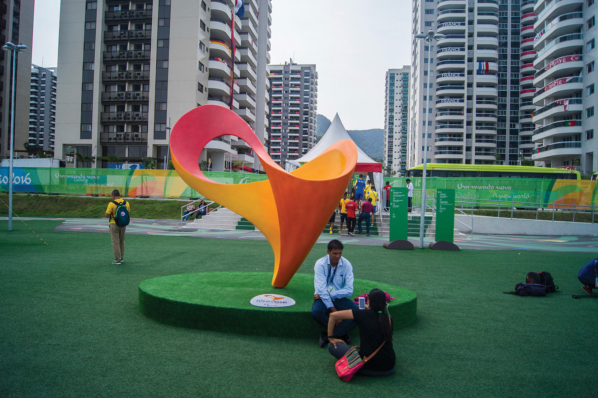
International Plaza
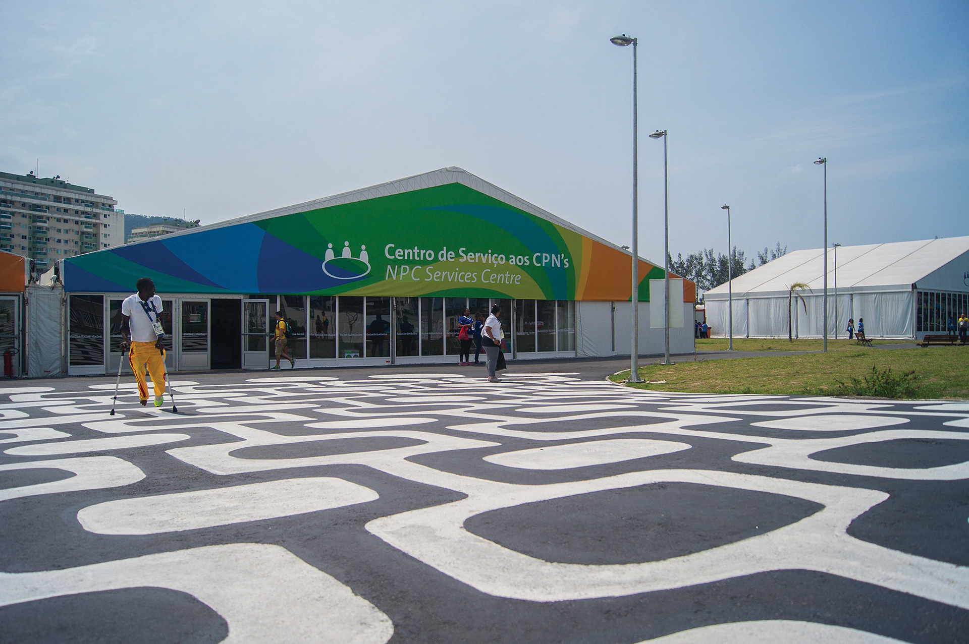
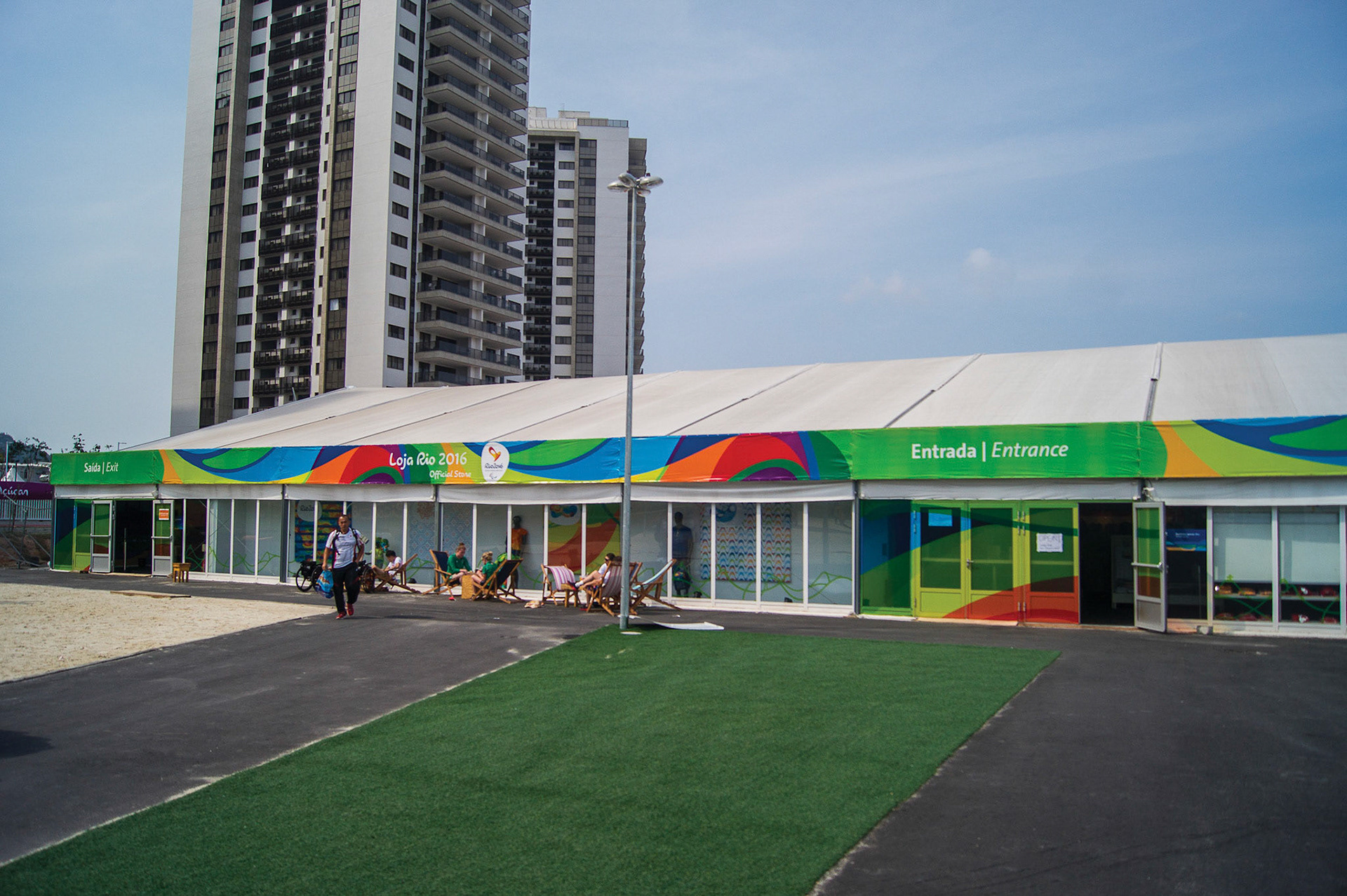
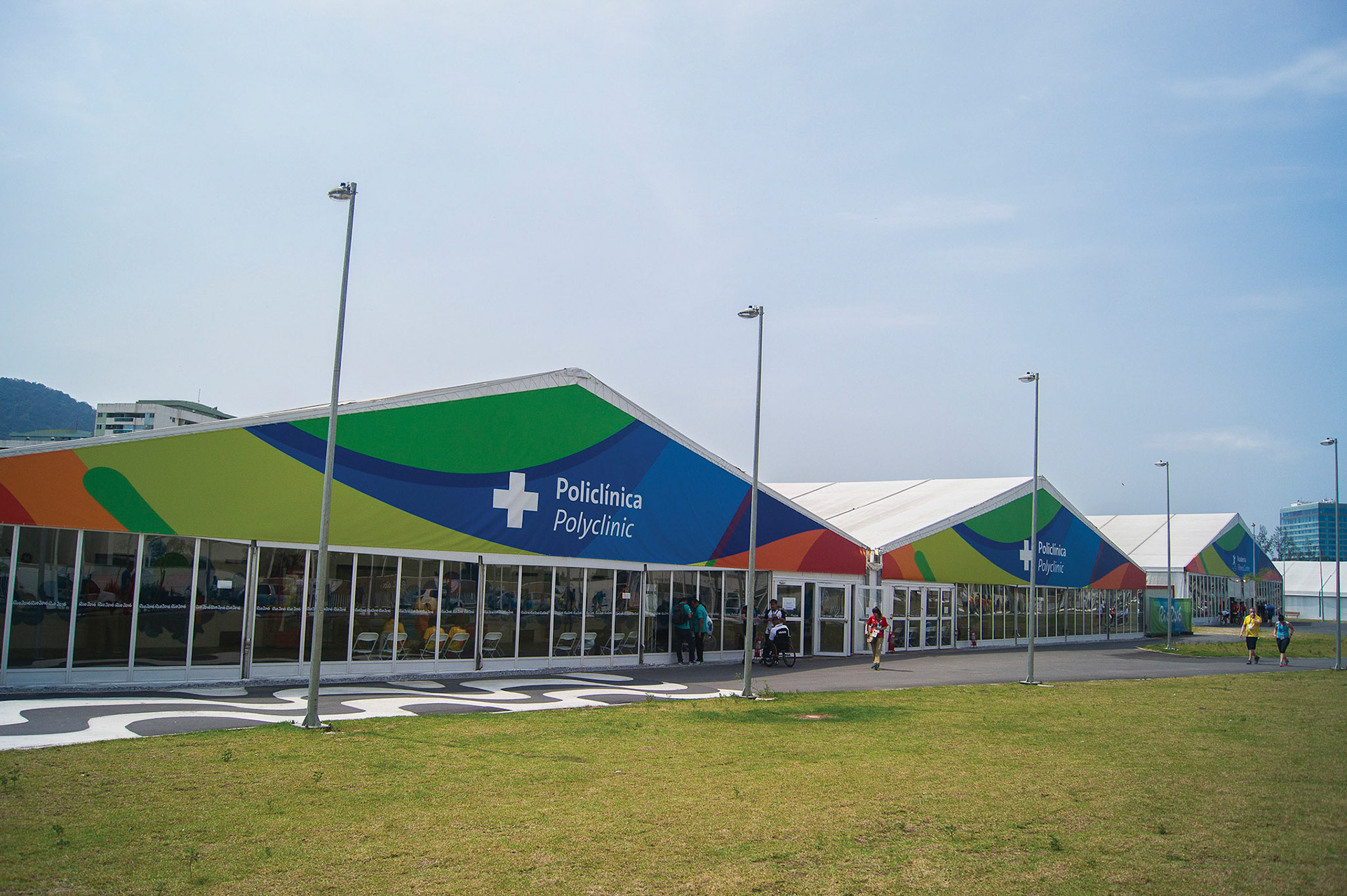
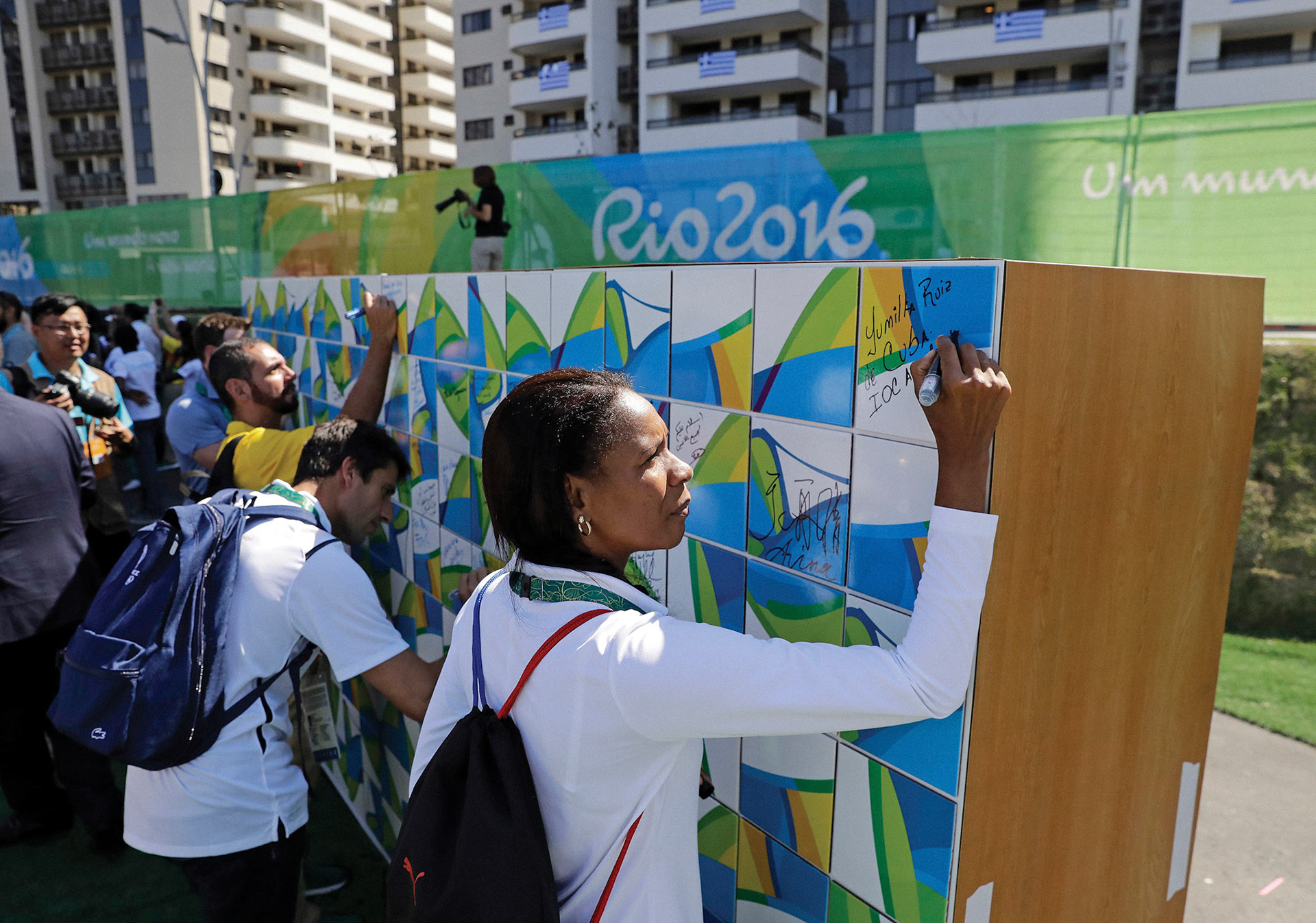
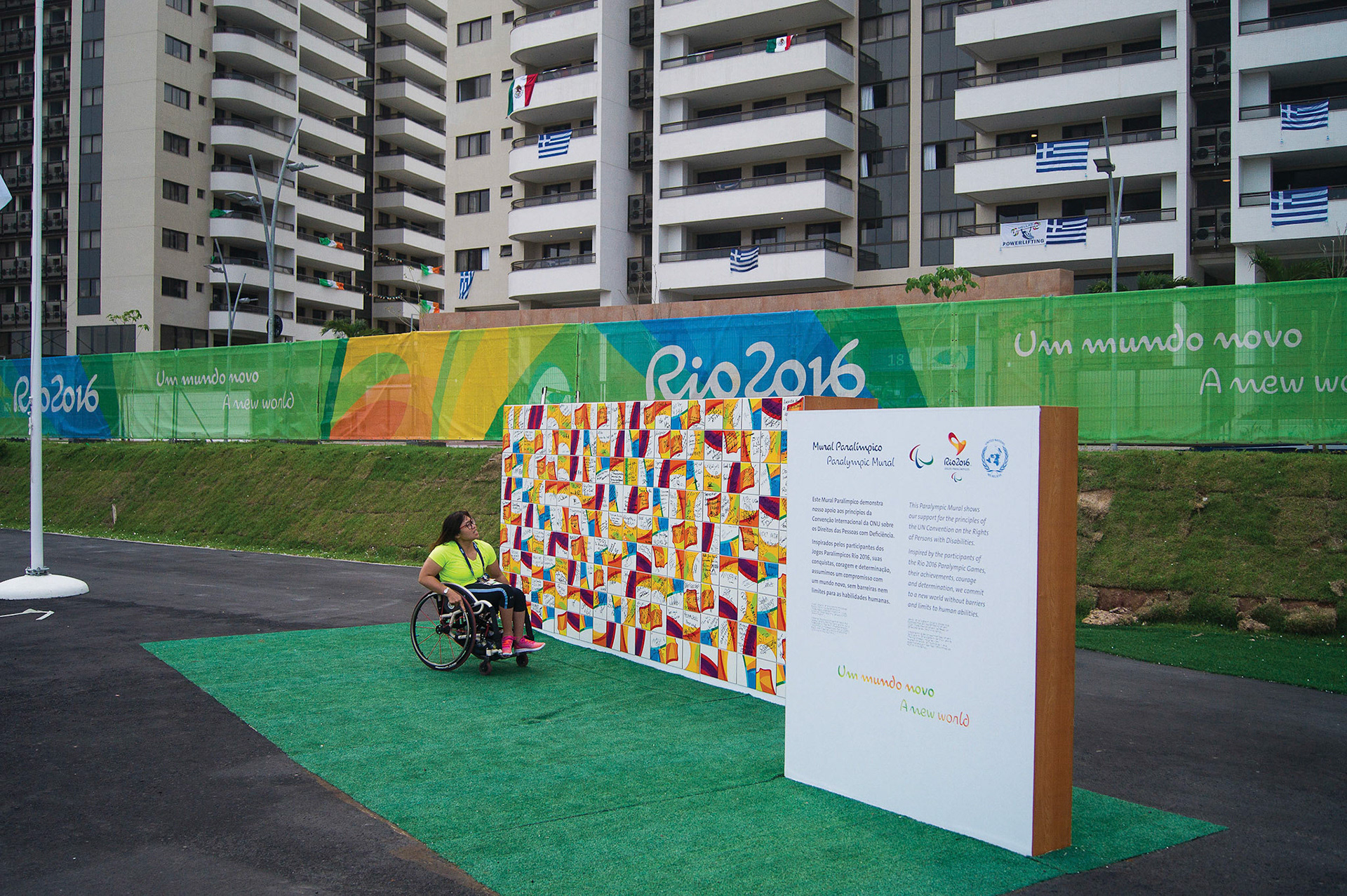
The village's common domain. There were the athlete's service tents, such as postal services and mini markets. Village's Rio 2016 store, Brand spectacular, Truce Wall (signature panel) and a stage for the welcome ceremony were also there.
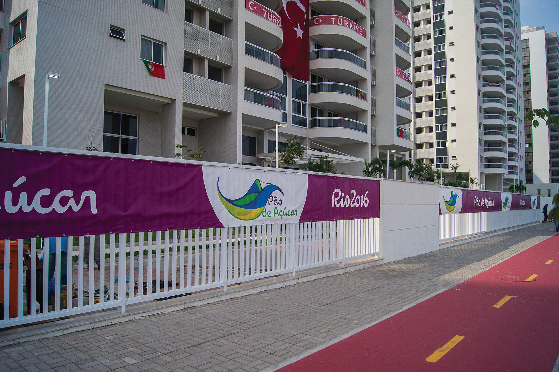
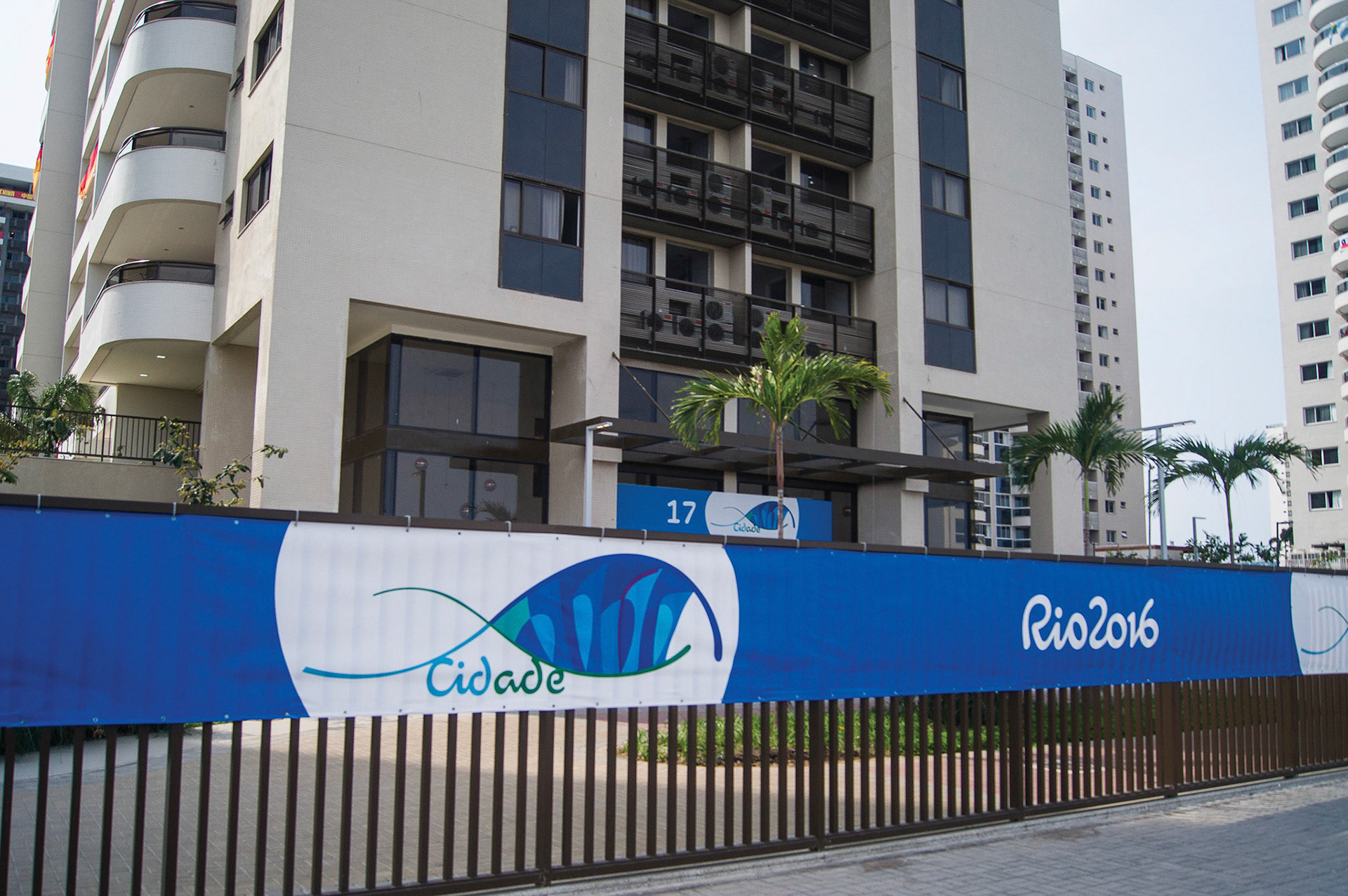
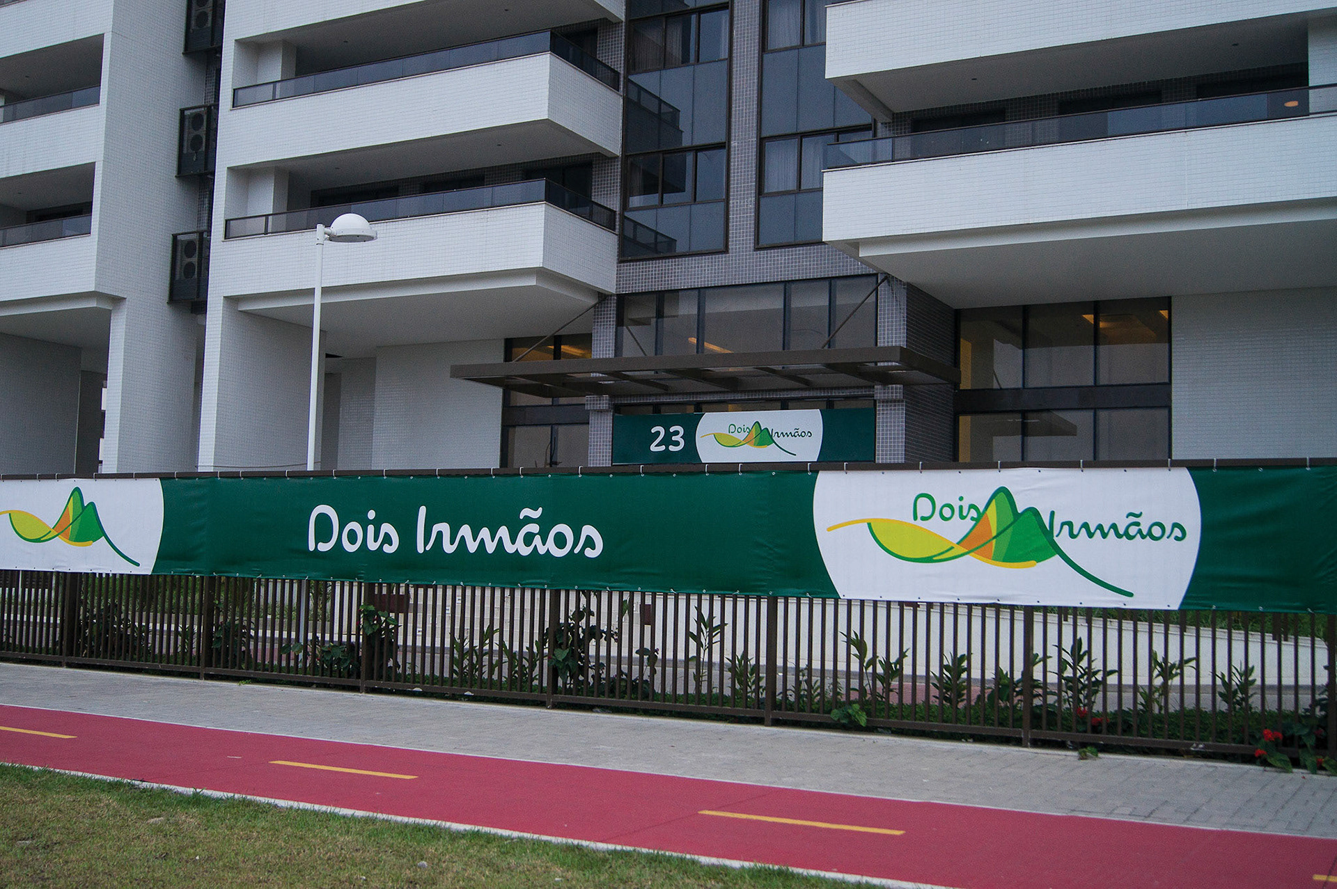
Athlete housing building identification system
Based on seven colours and icons from the Look of the Games panorama, one for each condo, this system was also on the key tags on athletes' credentials. To help them locate themselves in the village and find their housing, we created banner strips to surround the fence perimeter, entrance headers and gate totems for each building.
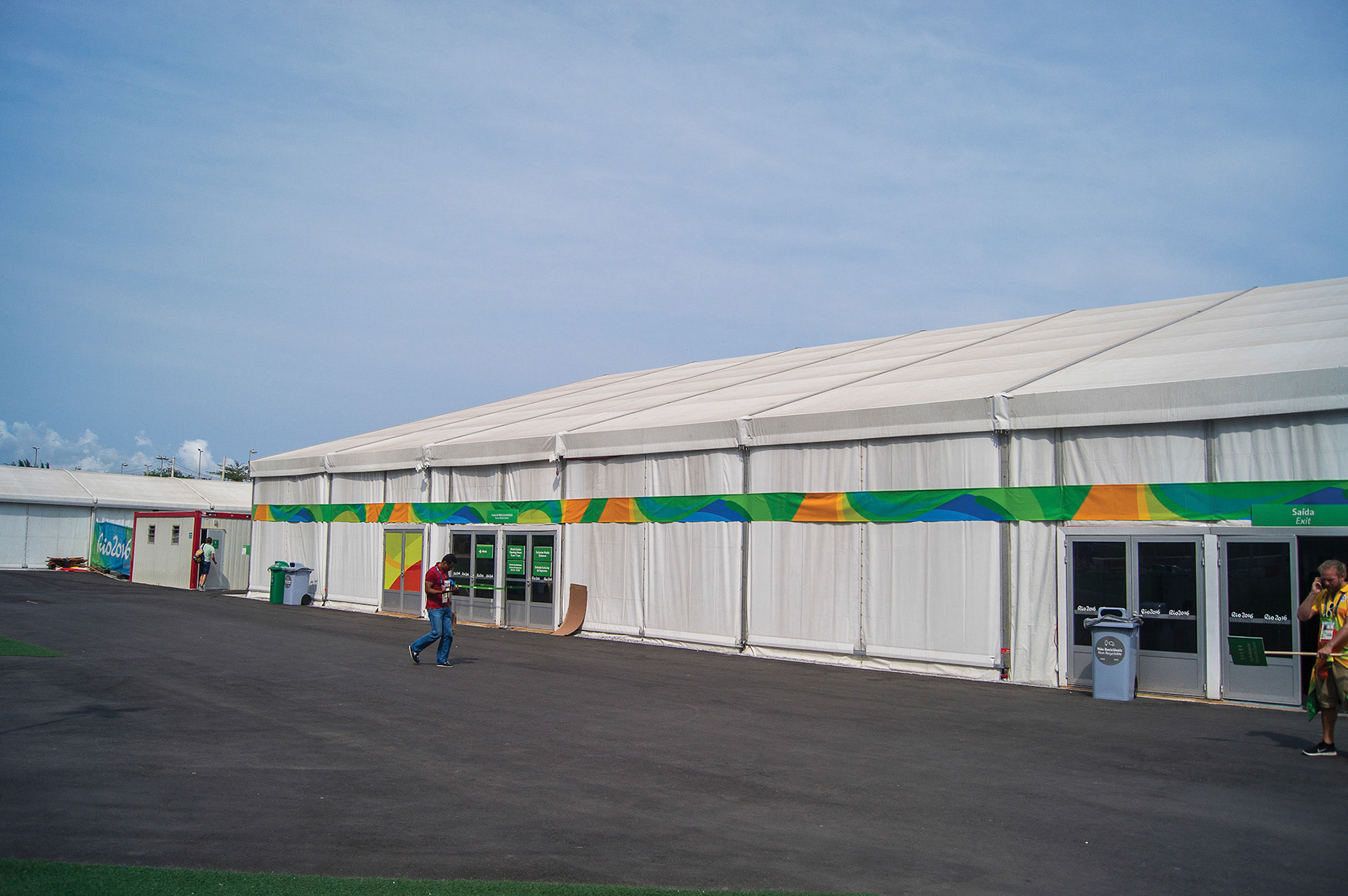
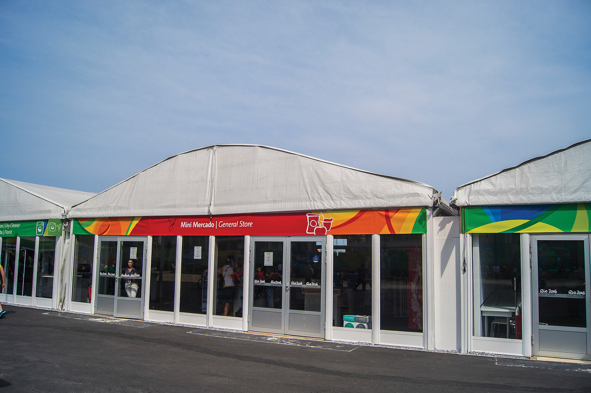
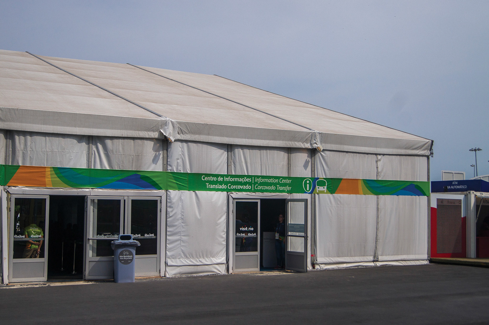
Service and food tents identification system
We created graphics standards for tent headers – a mixture between visual identity and signage – that could connect through plain colour areas. The green was used for services, and the red for the food concession. The header carried look graphics on the sides, while the information and pictograms went in the centre.
Find out more here