The Faraday Grid — Brand Evolution & Visual Language
Evolving a tech start-up brand through visual storytelling, identity systems and illustrative communication.
The Faraday Grid set out to revolutionise the electricity grid with breakthrough technology, making energy more efficient, sustainable, and accessible to all.
As Lead Designer, I collaborated with senior leadership and cross-functional teams to evolve an early brand into a robust, visual design system with real storytelling power., connecting complex science with public awareness.

The Challenge
When I joined Faraday Grid, the visual identity consisted of little more than a logo and rigid templates. The brand lacked a clear narrative, visual consistency, or tools to support different departments in telling the company’s story.
The goal was to go beyond a design updates and shape a brand that could:
1- Explain the science behind the product in a simple, engaging way.
2- Improve communication to build stakeholders and investor confidence.
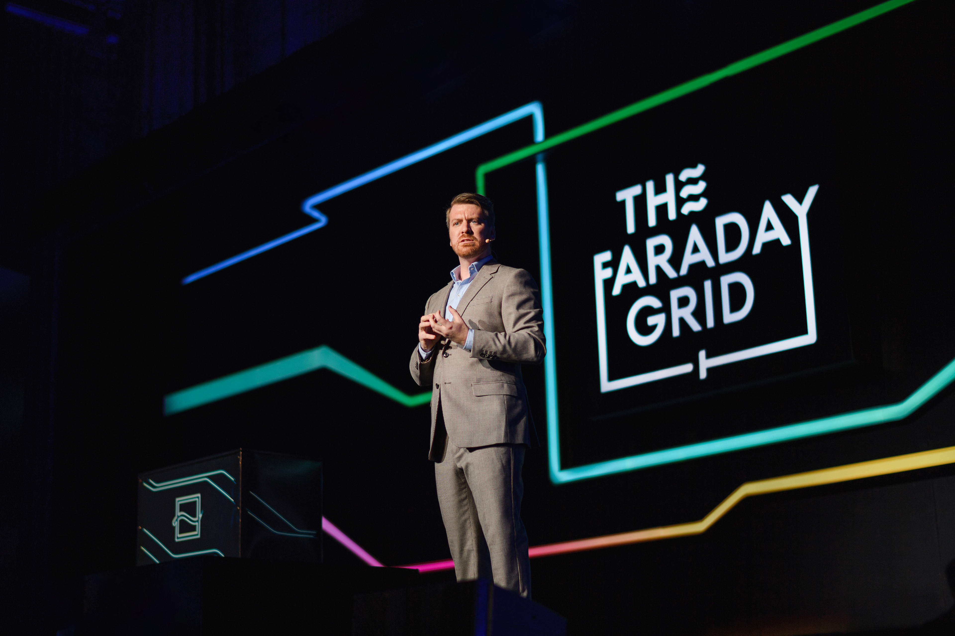
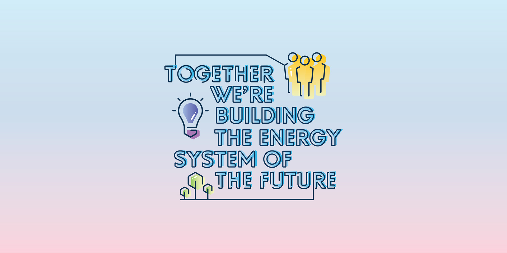
Illustration as strategy: Making Technology More Human.
At the heart of this project was the need to humanise a highly technical innovation. To support this, I introduced an illustration-led approach to create visual elements that made abstract energy concepts more relatable.
These illustrations helped:
• Break down abstract ideas and represent complex scientific principles with clarity and emotional appeal.
• Add personality and emotion to an otherwise technical brand space.
Illustration became a vital part of how Faraday Grid communicated: making the brand more memorable, relatable, and trusted.
Design Strategy & Research
To guide the brand evolution process, I conducted a full brand audit, interviewing team leads from engineering, marketing, communications, business development, recruitment, and leadership.
These insights helped define three core objectives:
1- Explaining the science
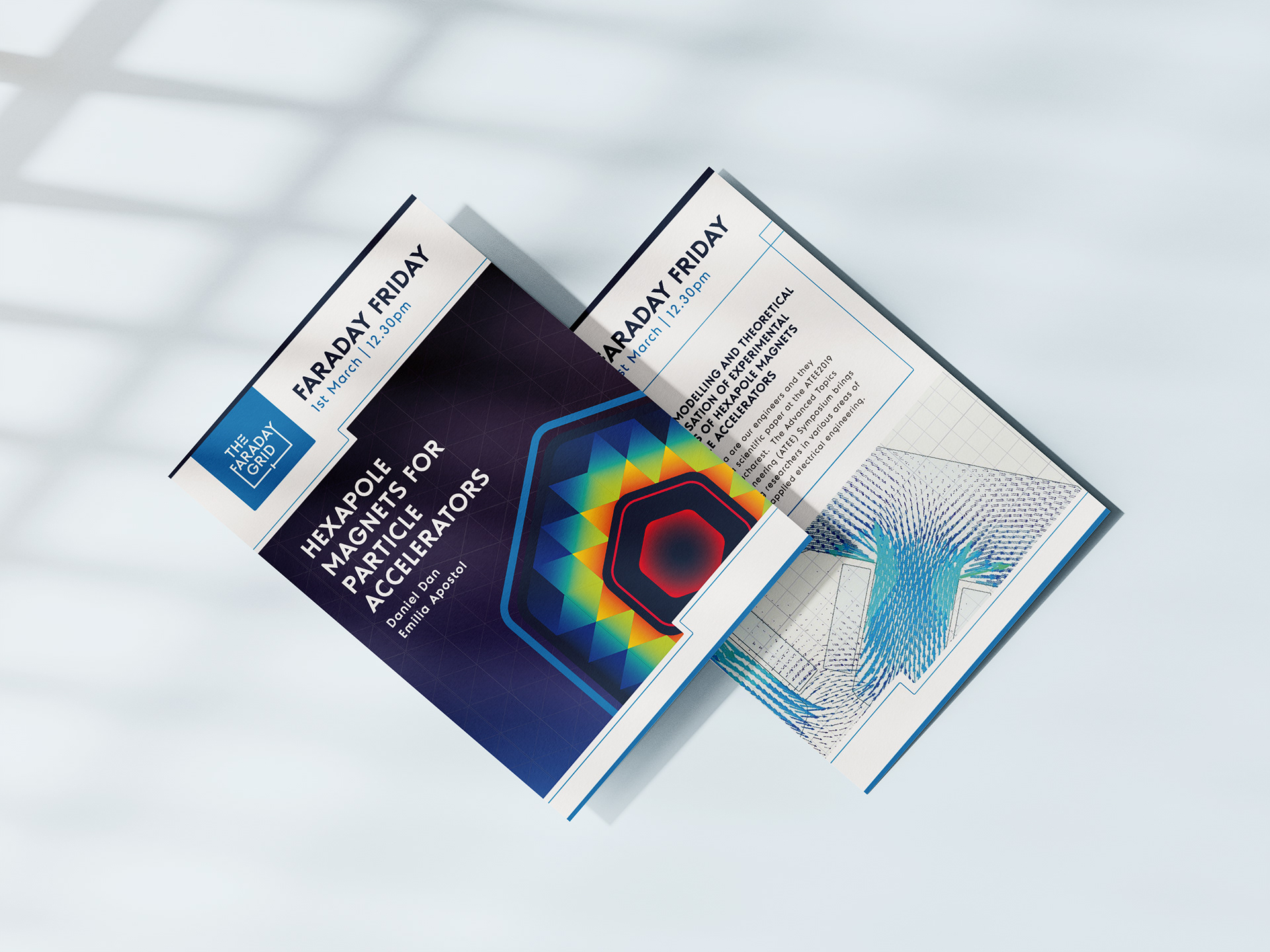
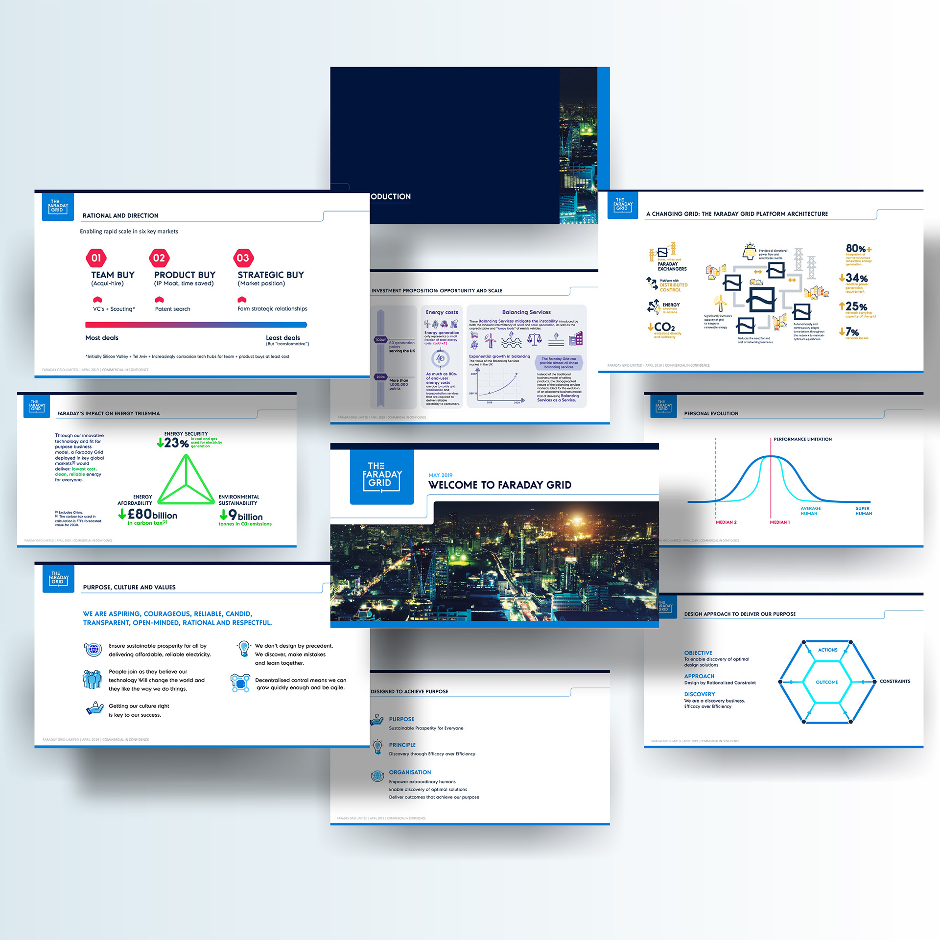
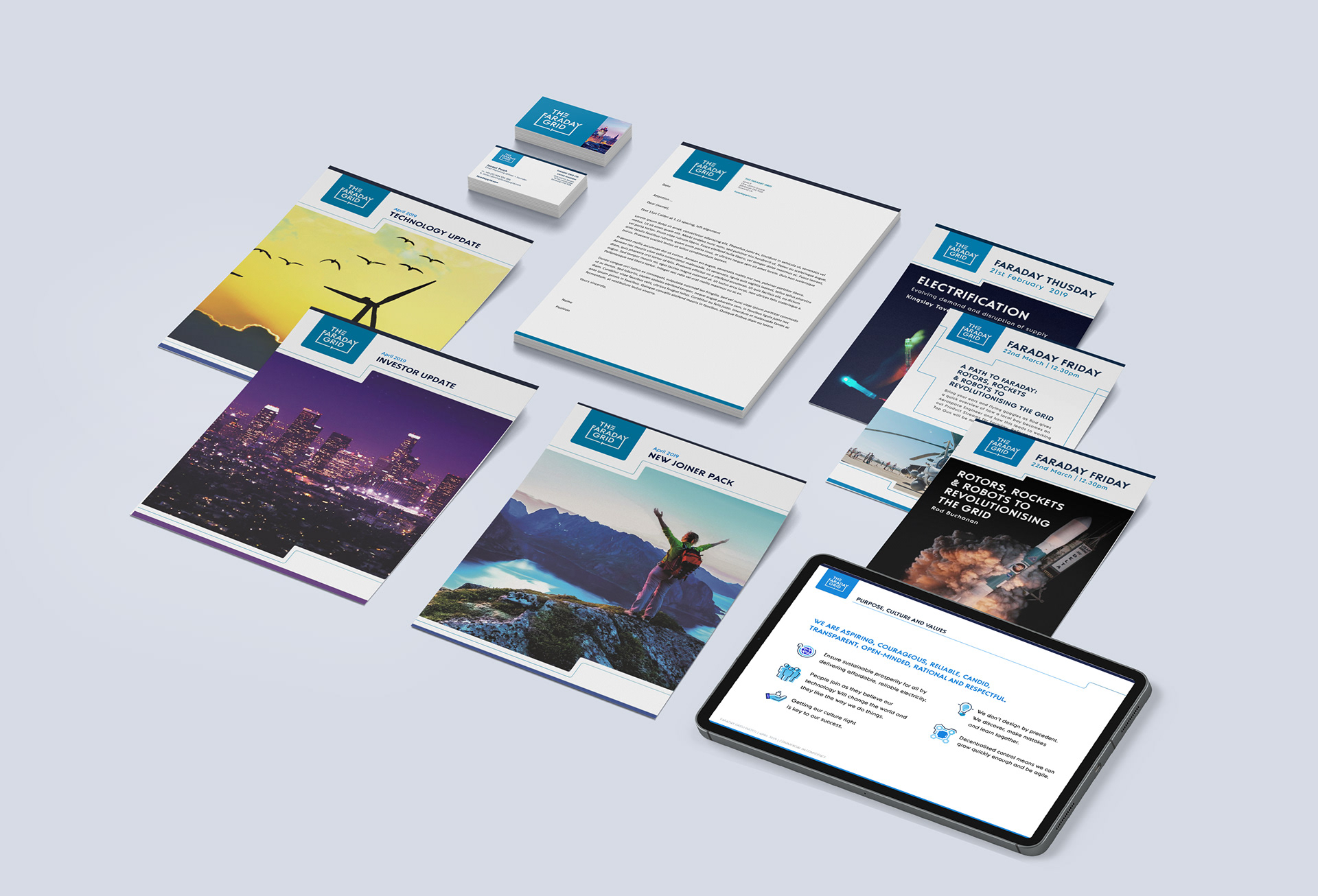
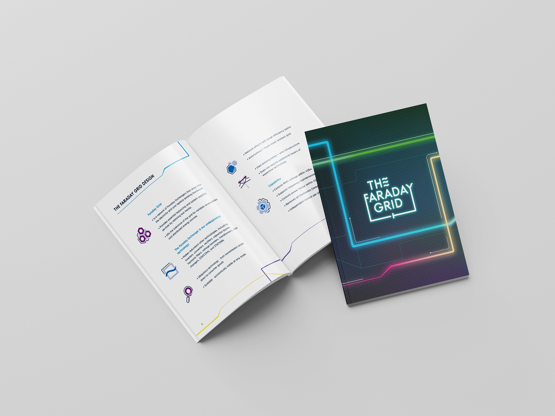
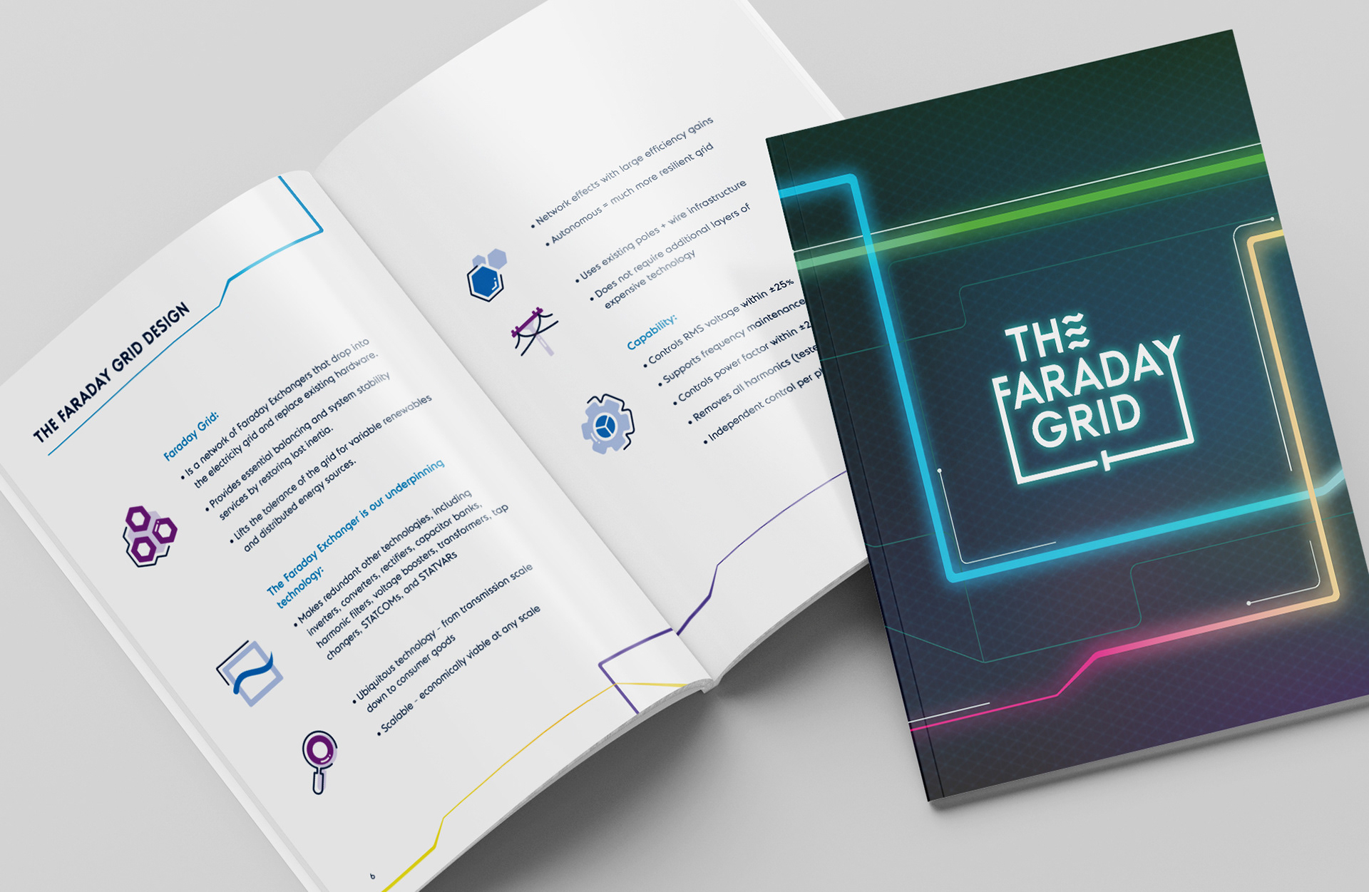
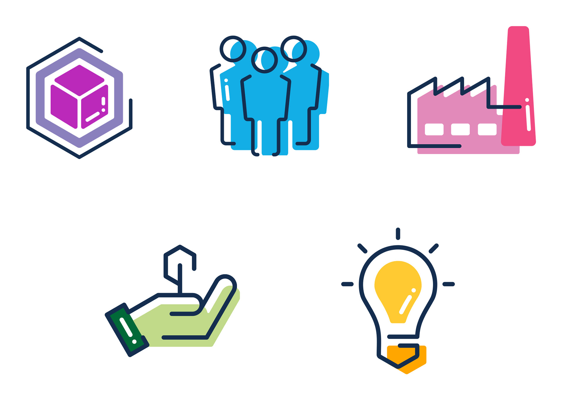
I developed a visual language and full library of infographics, pictograms, and templates to support engineers and business teams in their internal and external presentations, helping them communicate complex concepts with clarity and consistency.
2- Elevating visual design across PR and Communications
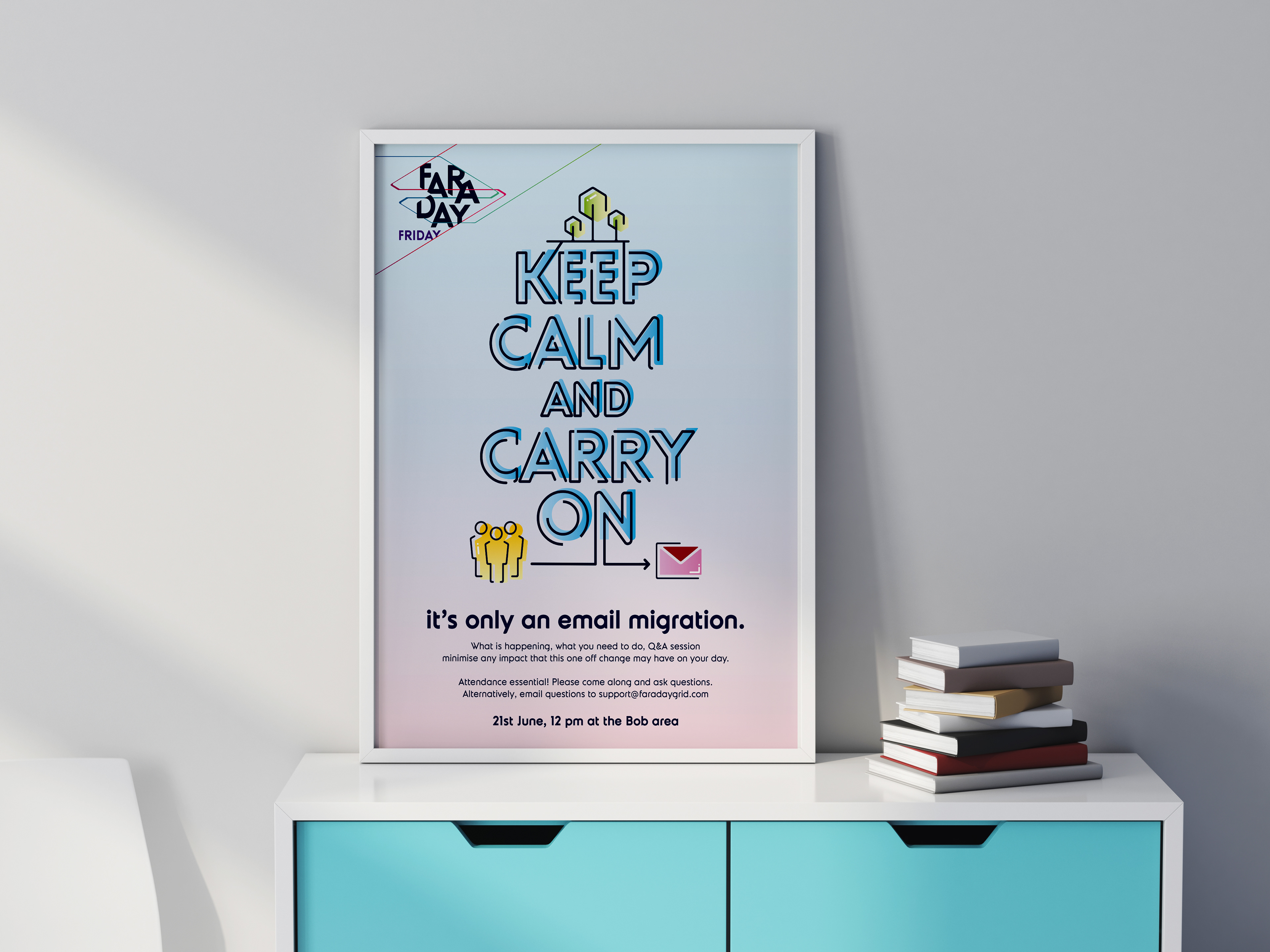
There was a lack of consistency in communications materials, especially presentations. I created a flexible toolkit including 50+ icons, slide templates, colour rules, and layout styles. I also provided guidance and ad-hoc design reviews and support to ensure visual coherence across channels.
3 - Building a adaptable identity for different audiences
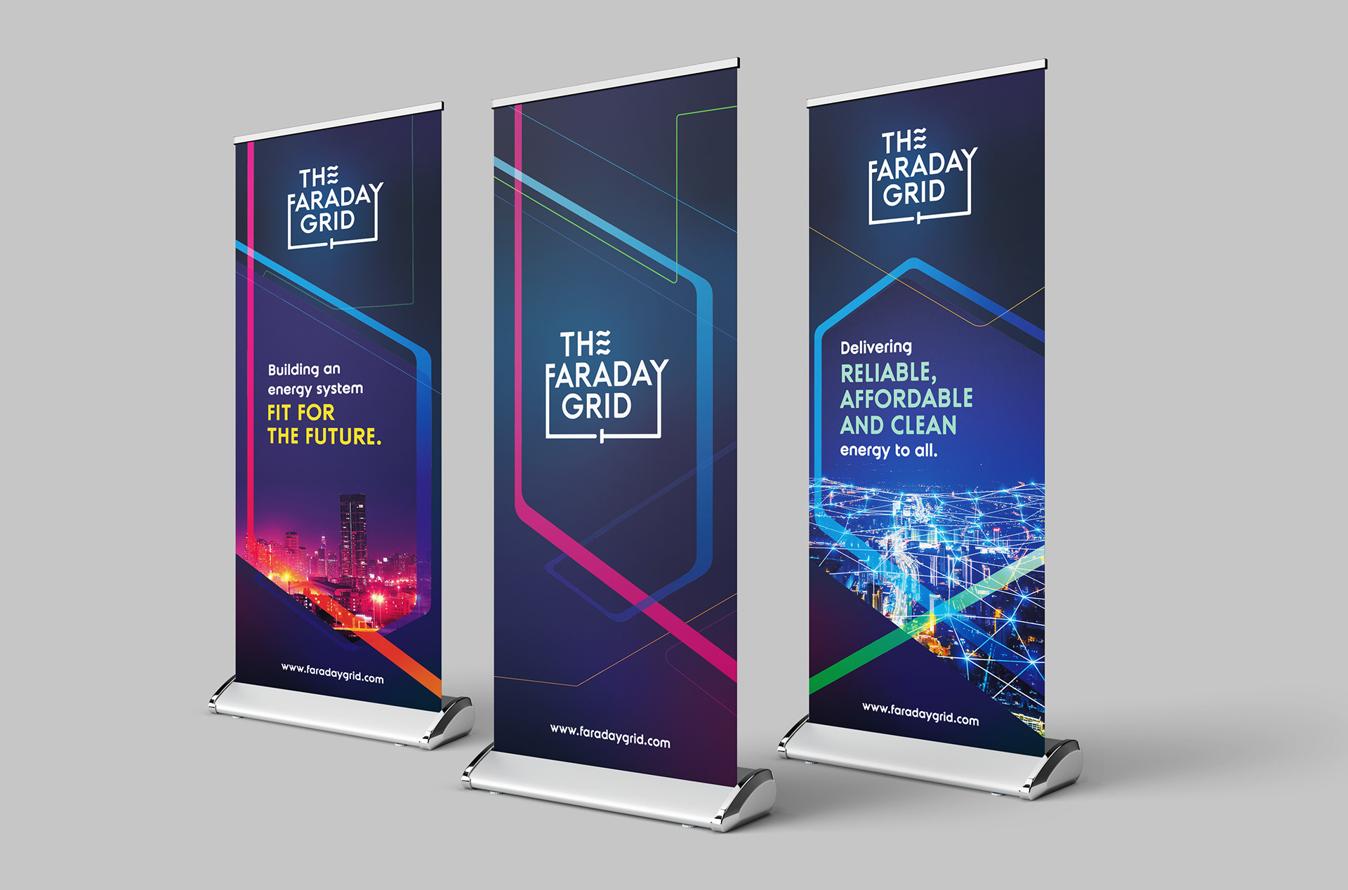
While the immediate focus was B2B, the long-term goal was consumer reach. I built a dual-track identity system:
B2B Communication: Clean, structured layouts rooted in geometric 2D grid systems, aligned with technical audiences.
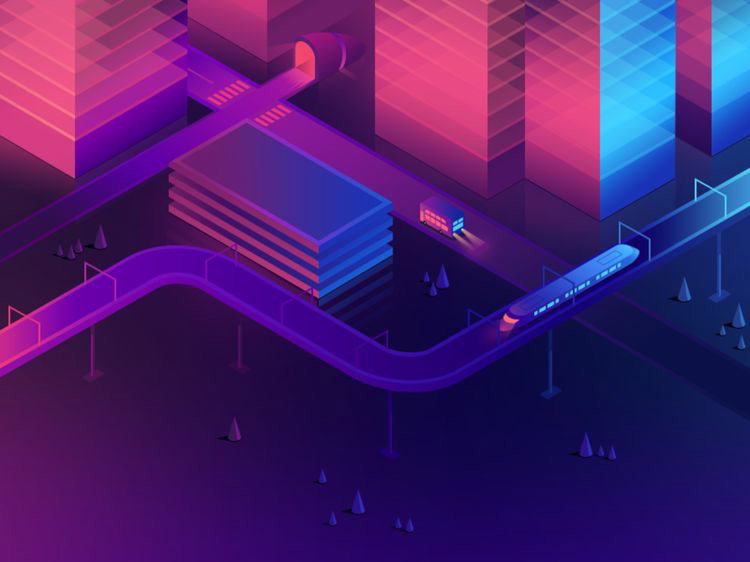
Consumer-Led brand: A more colourful, vibrant, dynamic approach inspired by 3D geometry and isometric grids, developed for public launches, external comms and events.
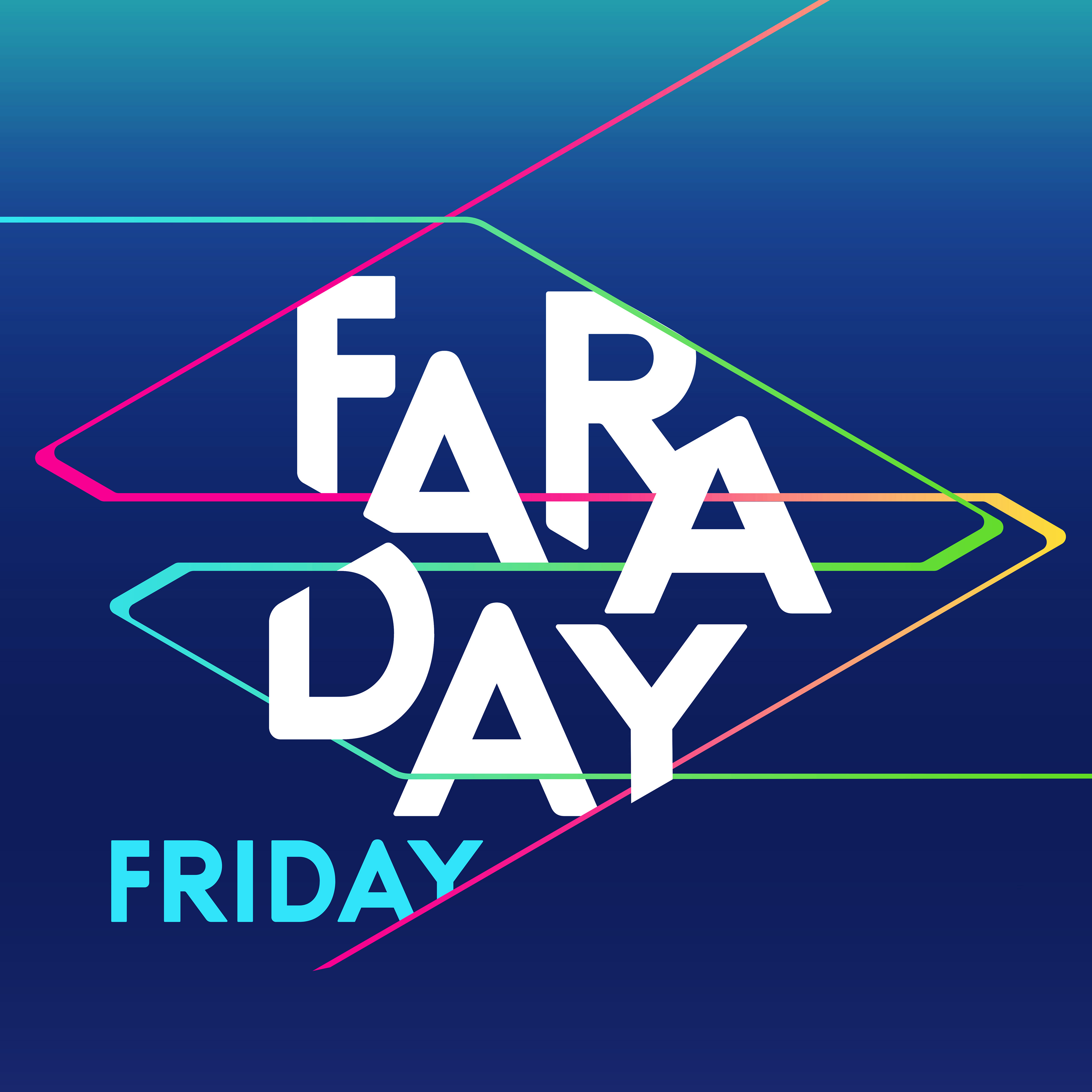
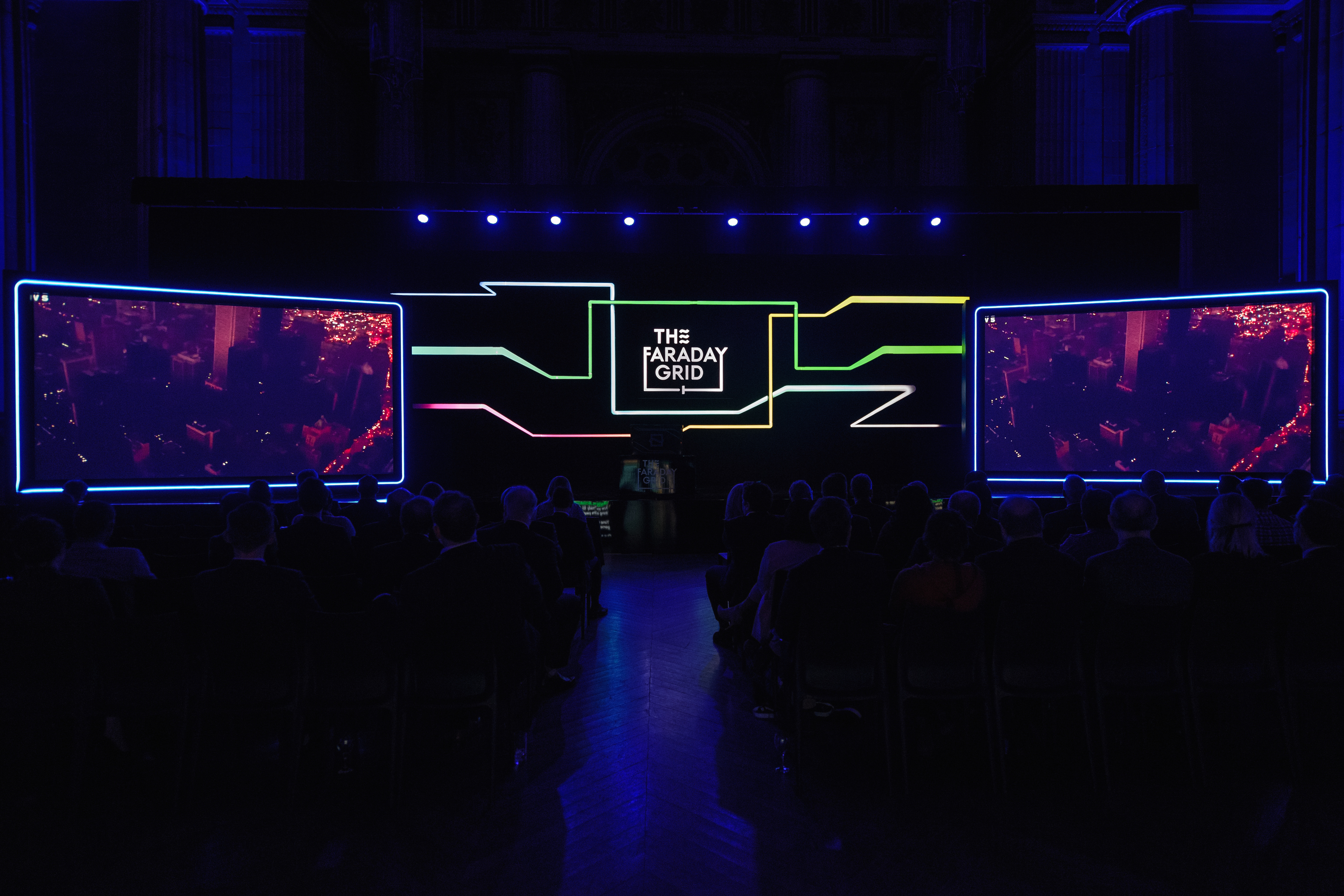
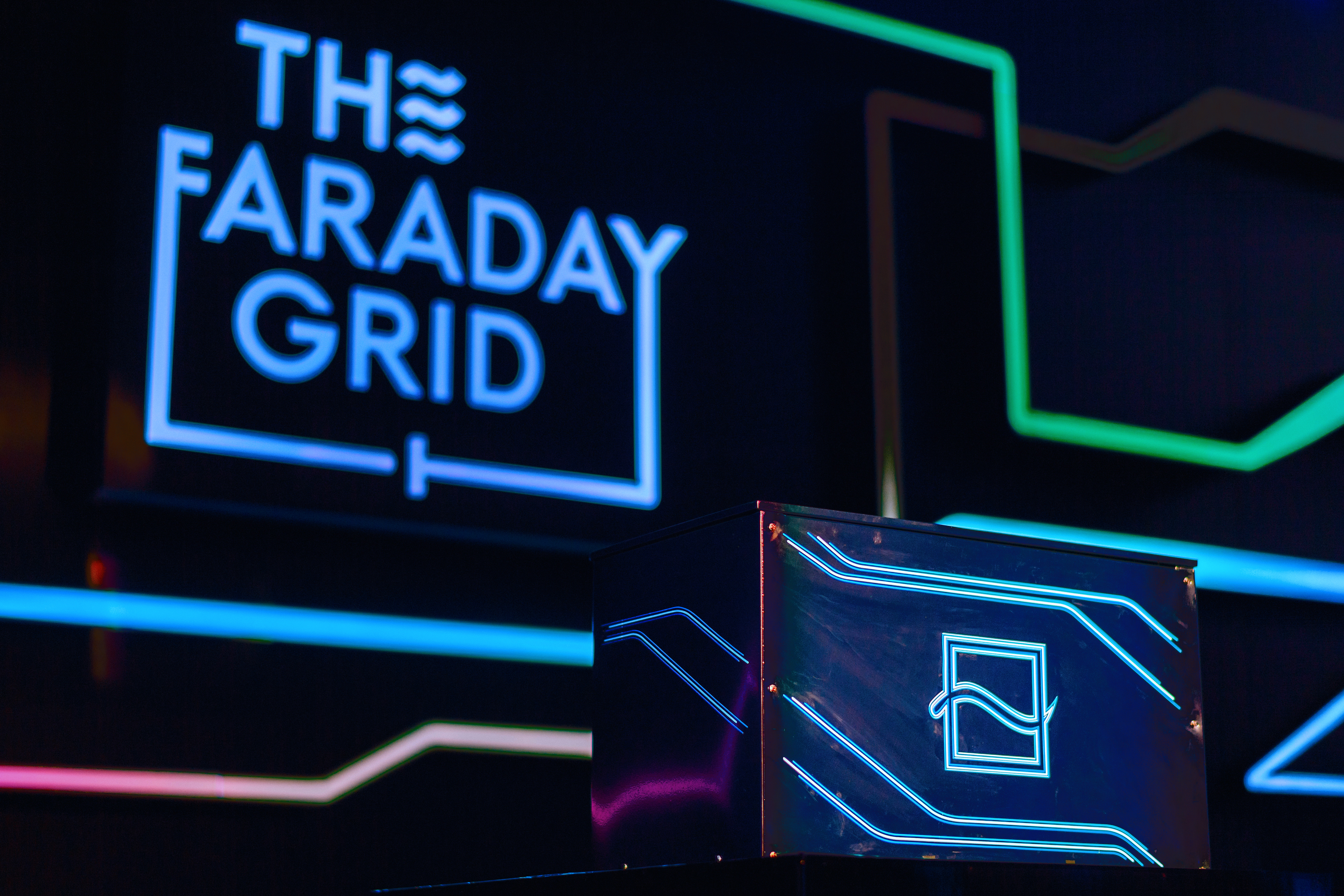
The Creative Direction: Futurism Meets Functional design.
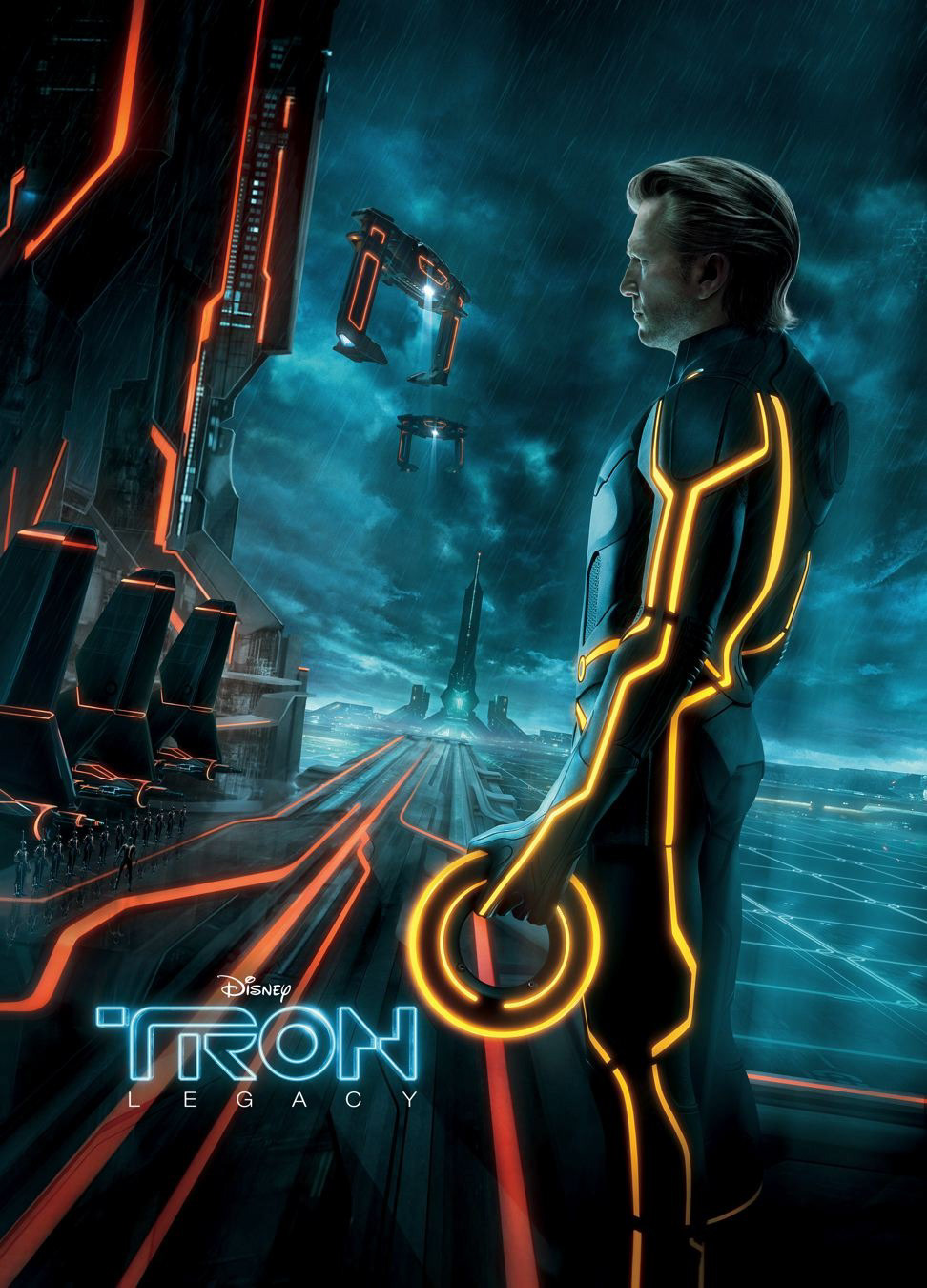
The company’s vision was to build the energy system of the future — and this needed to be reflected in the design language.
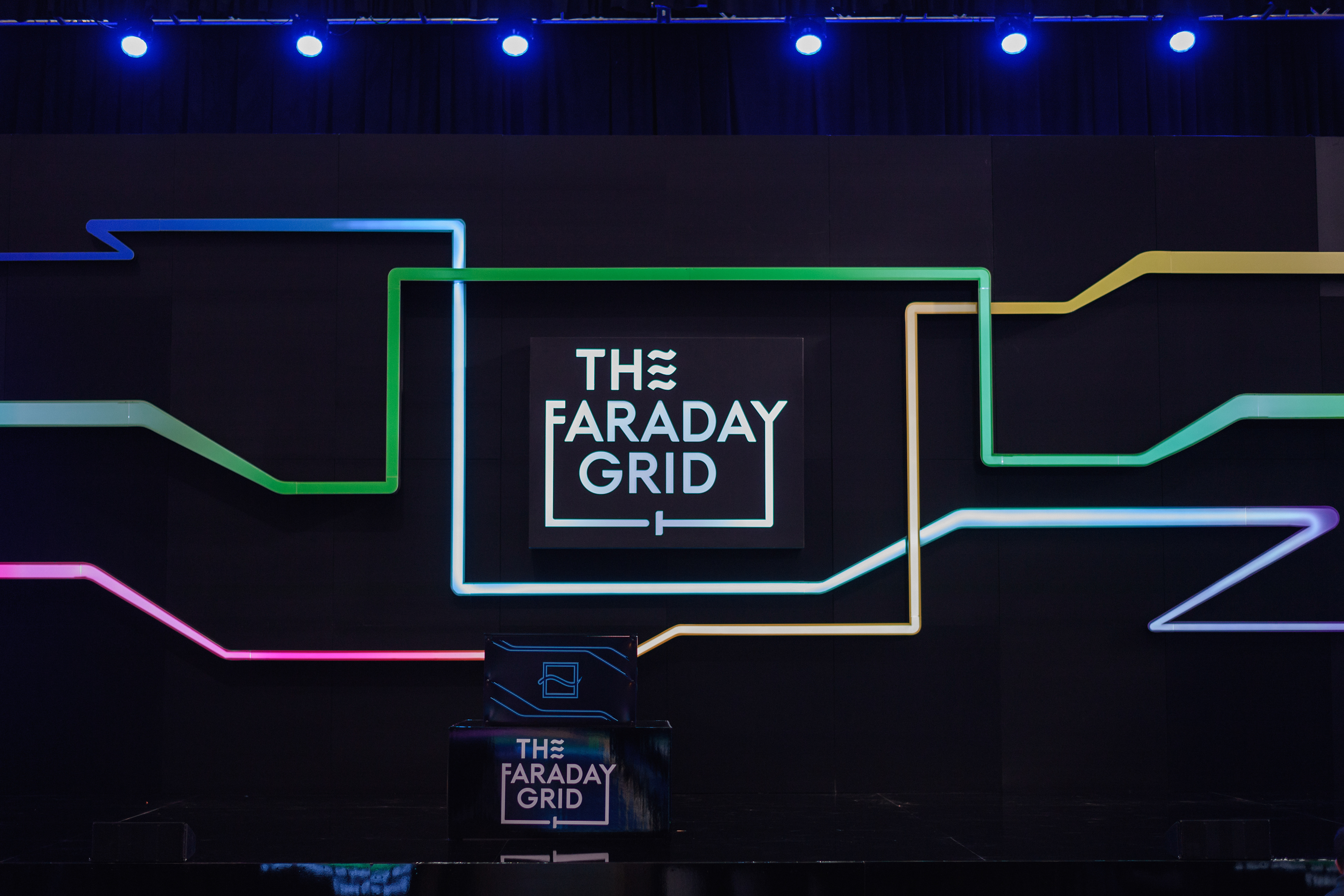
I drew inspiration from optimistic futurism, imagining a better world driven by sustainable technology. Visually, this came to life through neon lights, cyberpunk-inspired palettes, and dynamic grid-based graphics that symbolised a more connected, empowered energy system as a path to a brighter future.
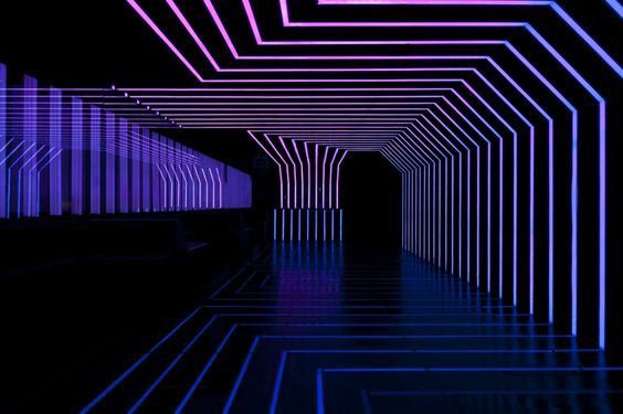
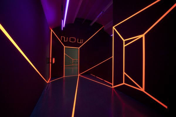
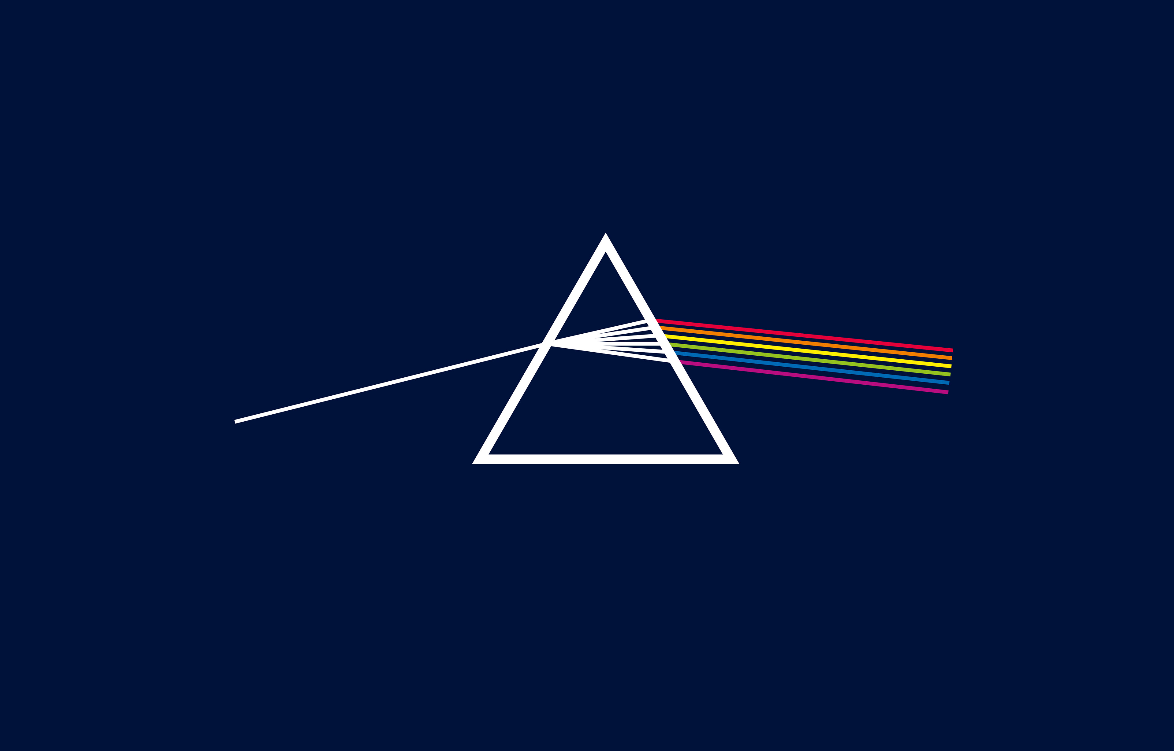
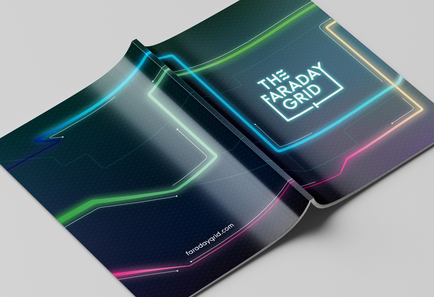
The visual solution: The Expression of Light
The entire system was grounded in the idea of light and flow representing energy as something dynamic and illuminating. The graphic system drew from grid structures and the geometry of light.
Colour Strategy
Inspired by the light spectrum, each colour was strategically assigned to support internal and external functions, allowing the brand to shift based on context.
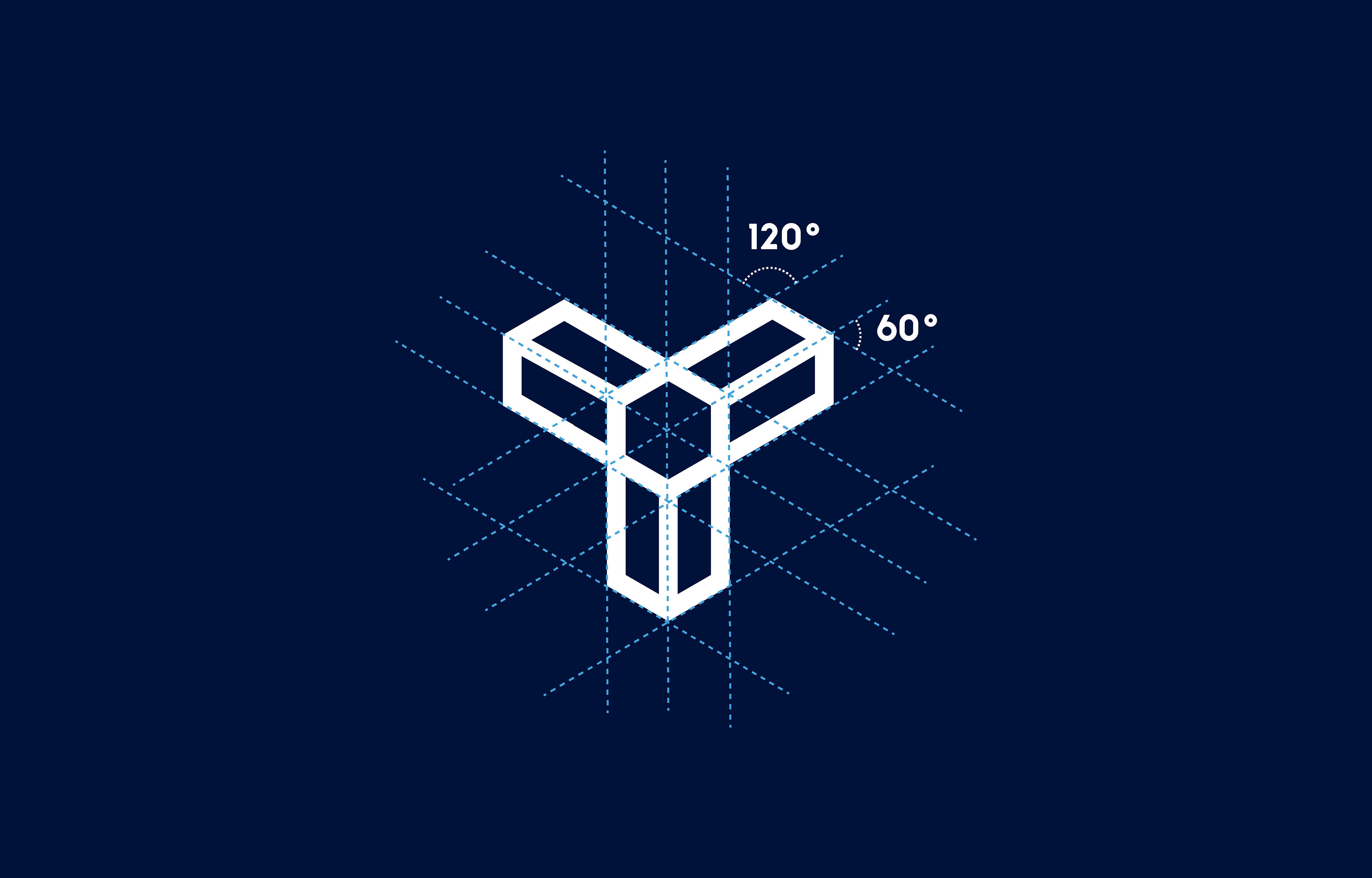
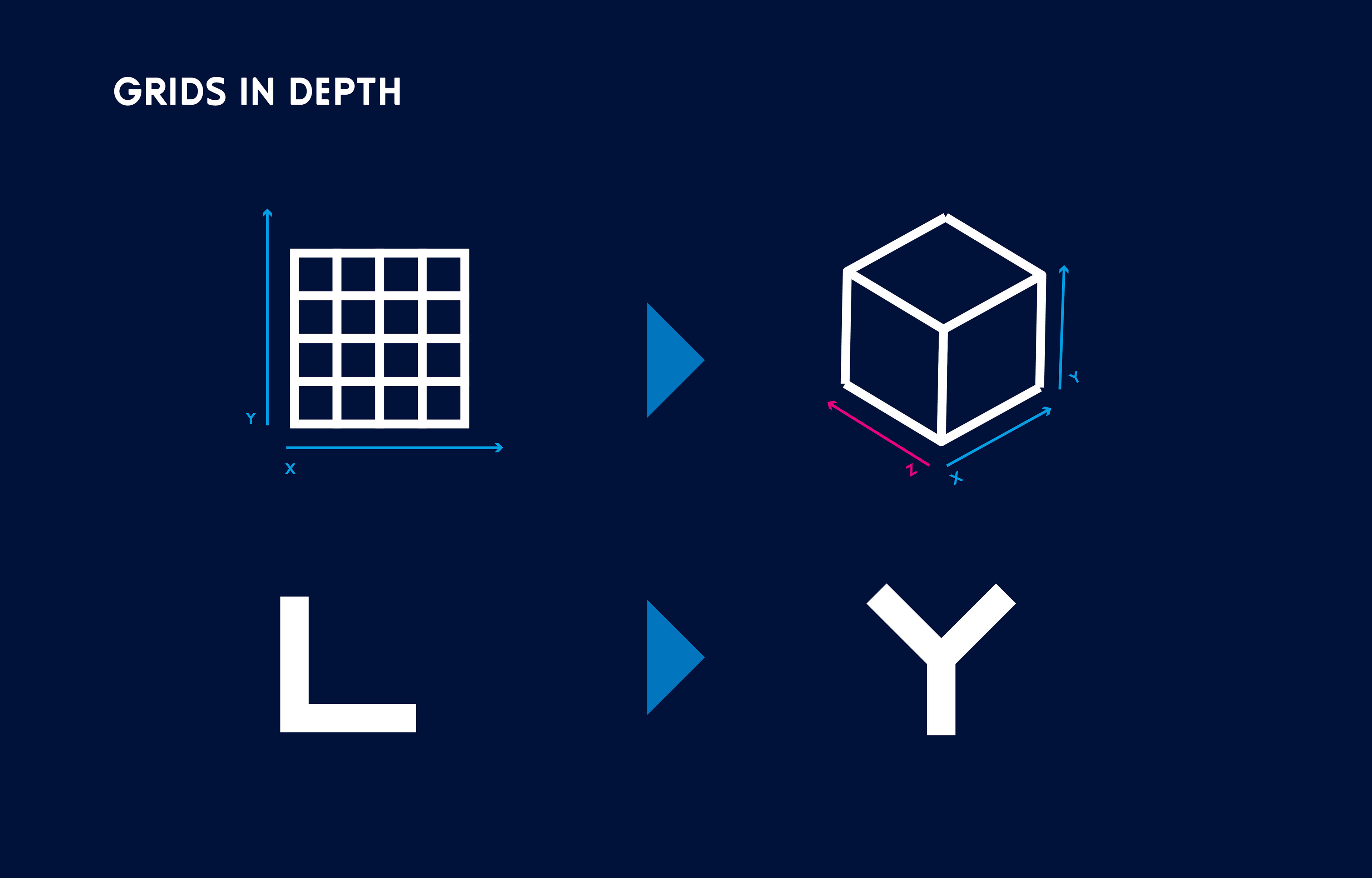
Graphic Strategy: Dual grid system
Internal Identity: A corporate approach. A 2D square-based grid focused on functionality for clarity and simplicity across documents and templates.
: A 3D hexagonal grid used to create dynamic, isometric graphics, motion assets, and bold visuals — inspired by Futurism and cyberpunk aesthetics, reflecting a journey toward a brighter, sustainable future.
Results & Impact
This brand evolution process helped Faraday Grid:
• Raise visibility during funding and expansion periods.
• Launch more cohesive communications with a clear visual narrative.
• Elevated the company's image and had a positive impact on recruitment and employee engagement.
Looking to evolve a brand into a visuals that connects?
This project showcases how illustration, corporate branding, and communications design can shape powerful brand identities for any company, start-up or organisations in the UK.
Check out some related projects:
Faraday Grid Corporate Identity
A multi asset design system solution for a complex organisation.
A multi asset design system solution for a complex organisation.