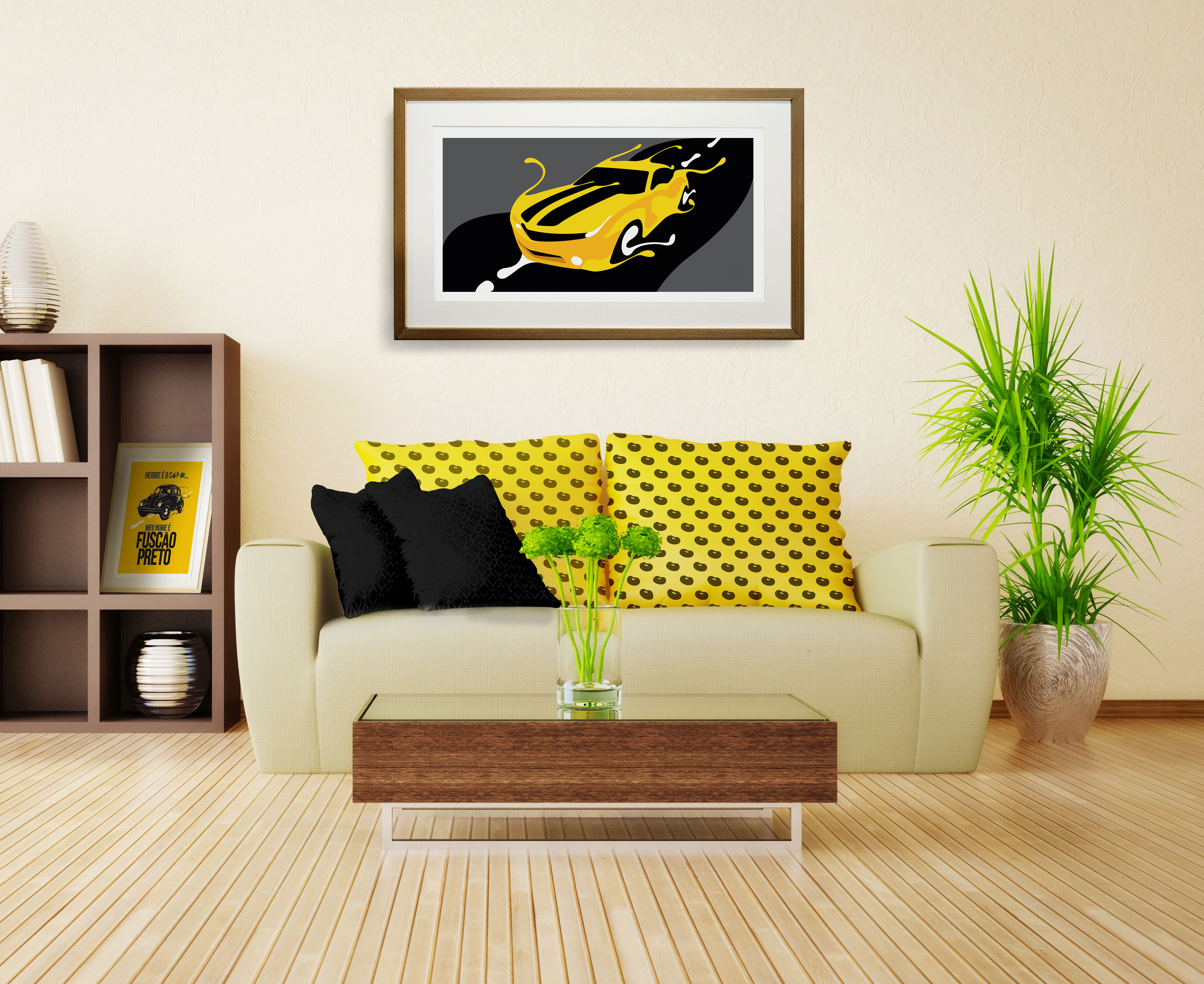
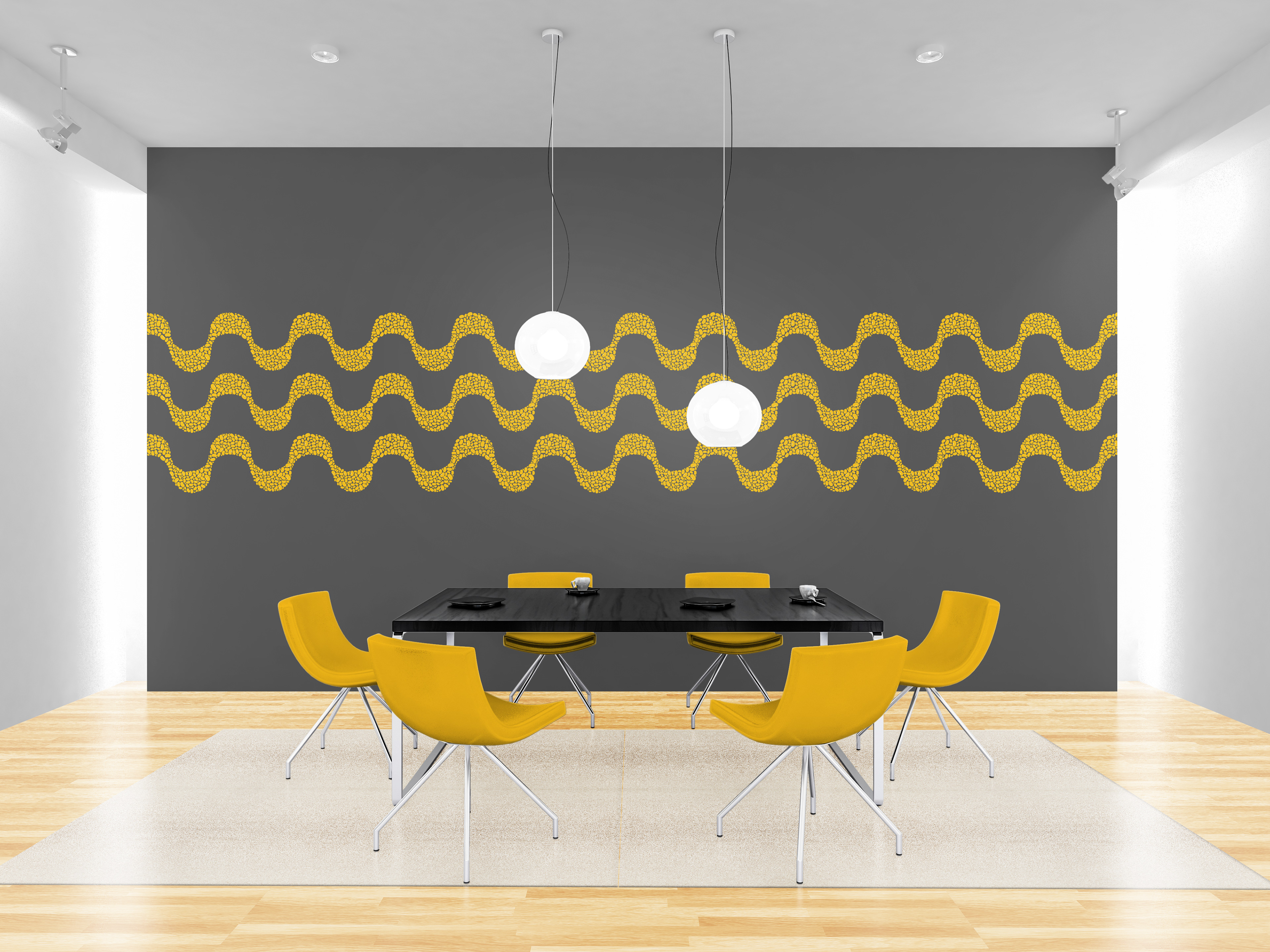
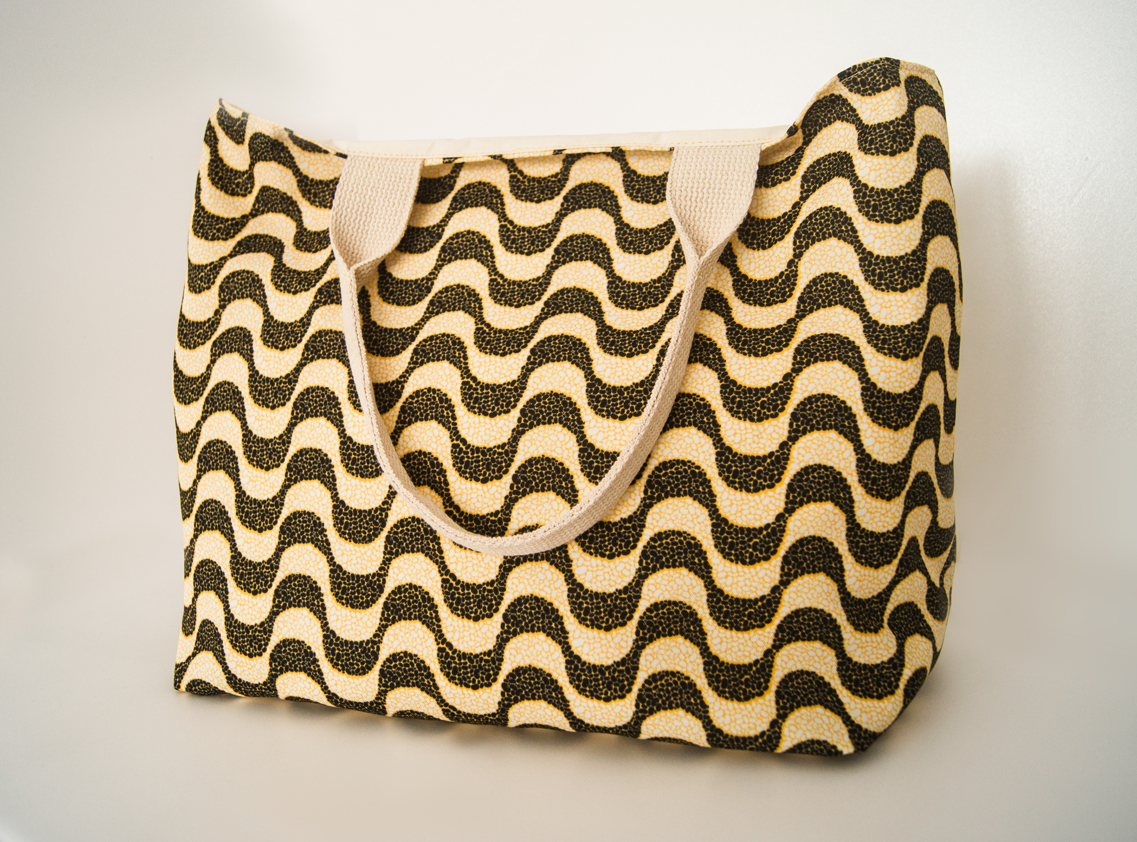
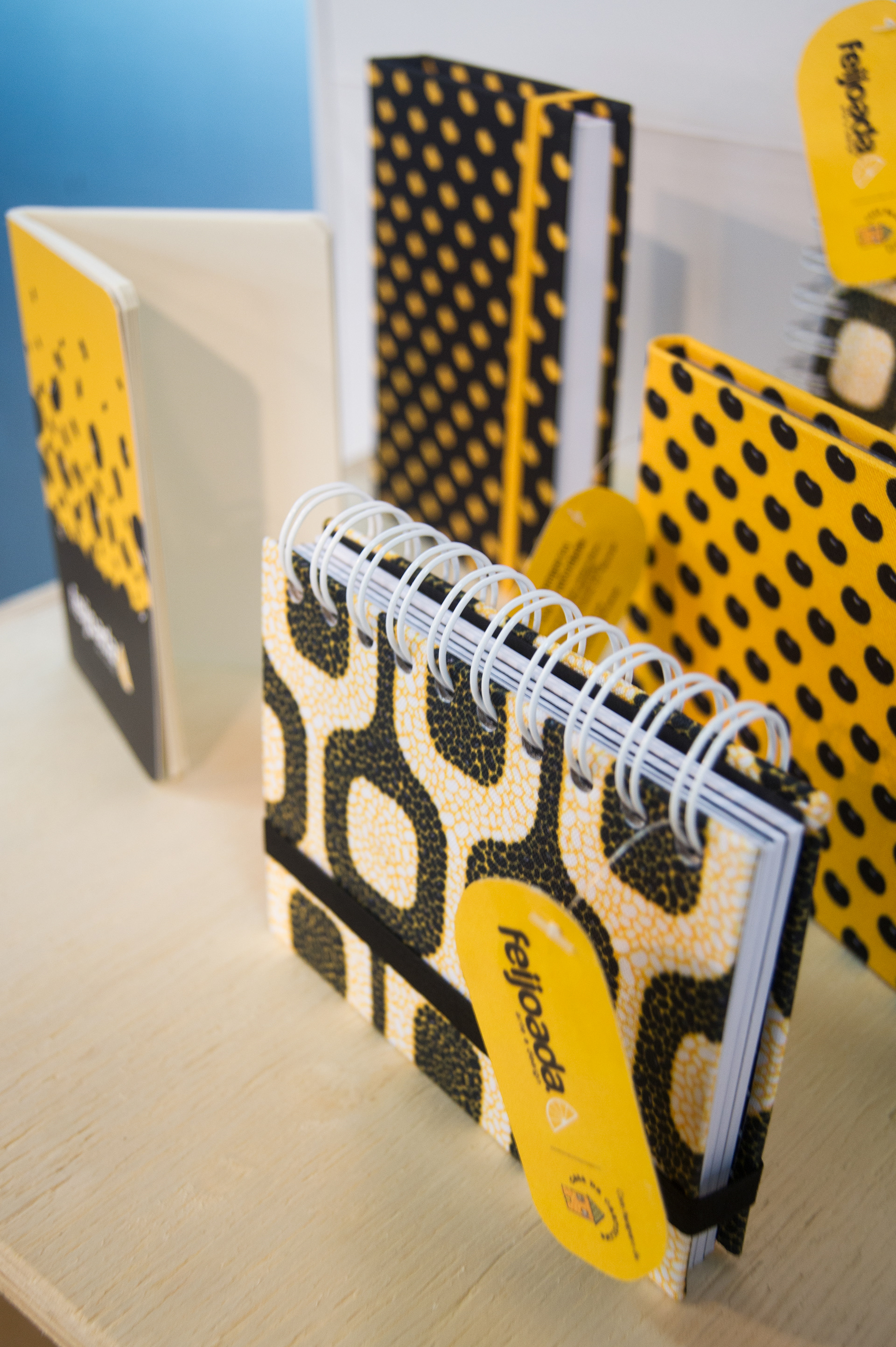
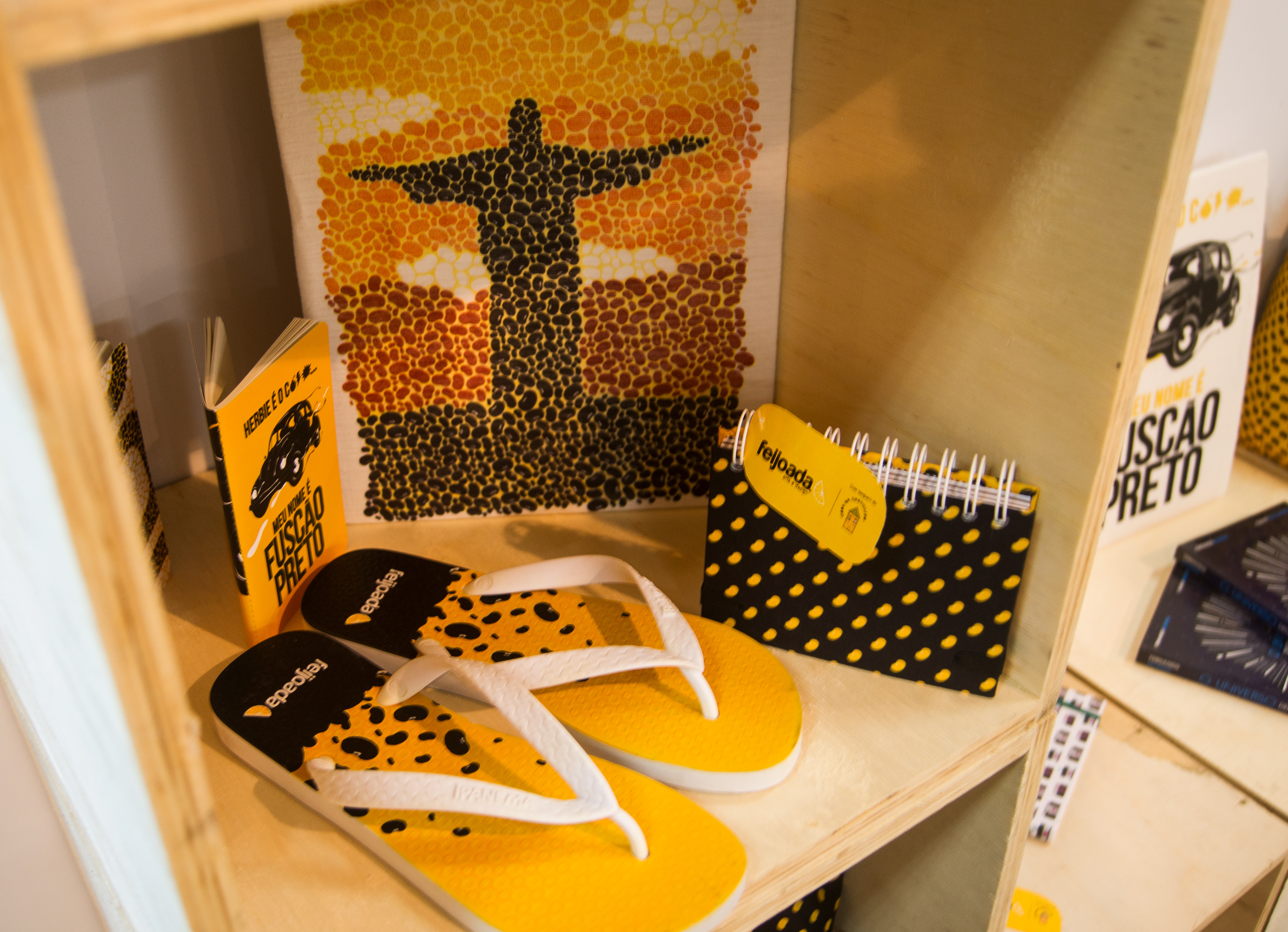
Feijoada Art and Design is an initiative with a Brazilian friend and Designer Alex Hagas. Our goal is to create illustrative works that truly represent our culture and bring art into people's life with affordable products and prints.
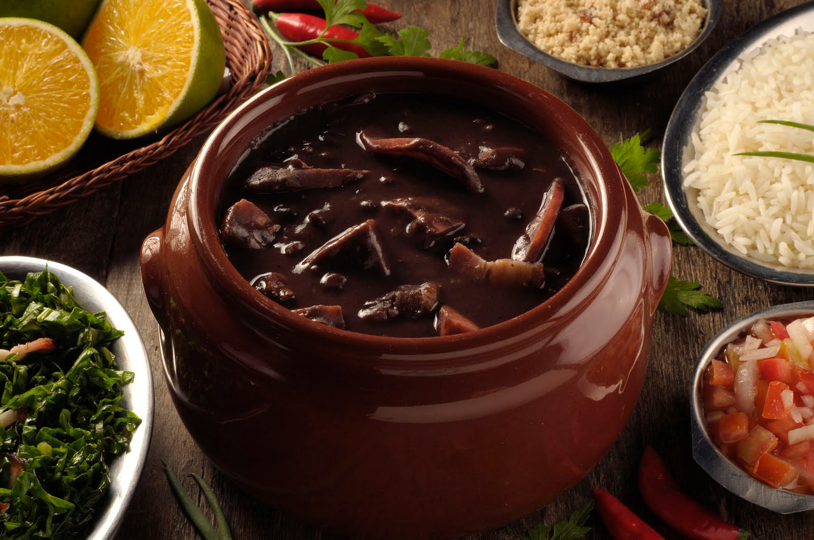
The brand is named after one of the most famous dishes of our cuisine. We are designers and illustrator with particular styles and the name stands for a mix of trends and styles that makes a very authentic Brazilian DNA.
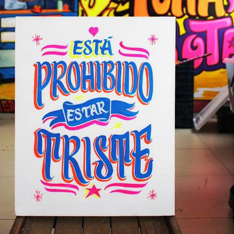
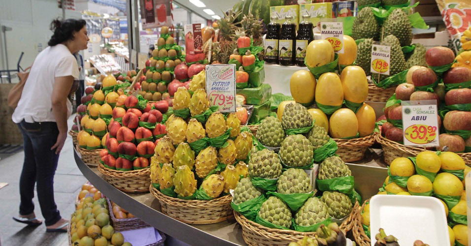
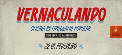
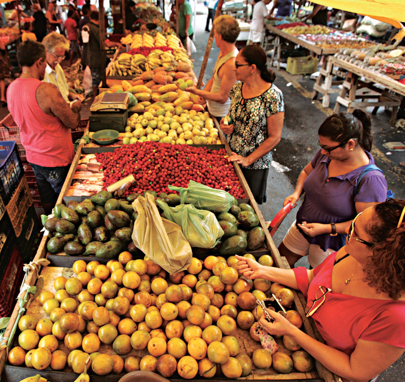
As inspiration for brand and identity development, we explored the visual language of the cuisine and street markets especially in regards to the typographic poster and colours.
Primary brand
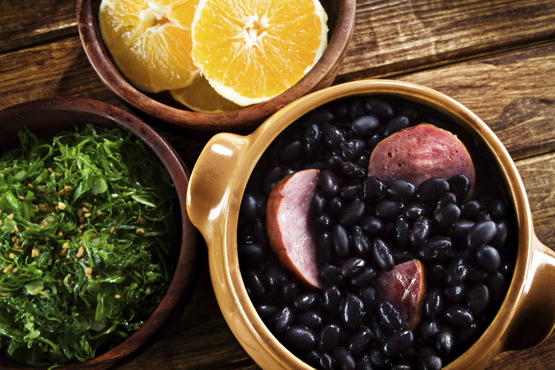
The brand and the primary colours derived from the popular day-to-day cuisine: the classic black beans and rice. While the wordmark relates to the beans, the orange slice gives the extra taste and the accent colour.
Brand elements
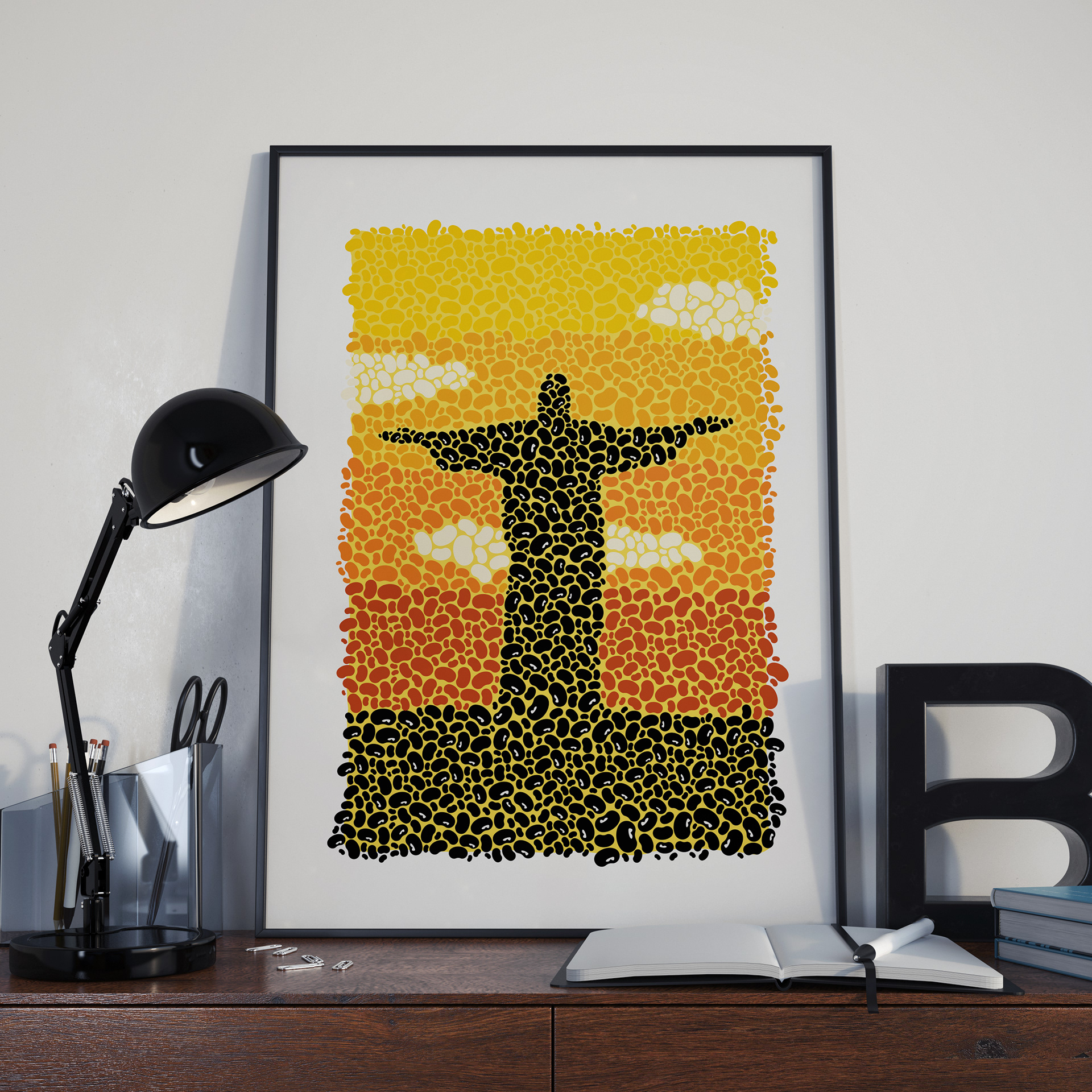
While the orange graphic is part of the logo, both elements are used to create the identity's secondary graphics. The black icon is also an important brand DNA present in other illustrative designs.
Logotype
Brand patterns
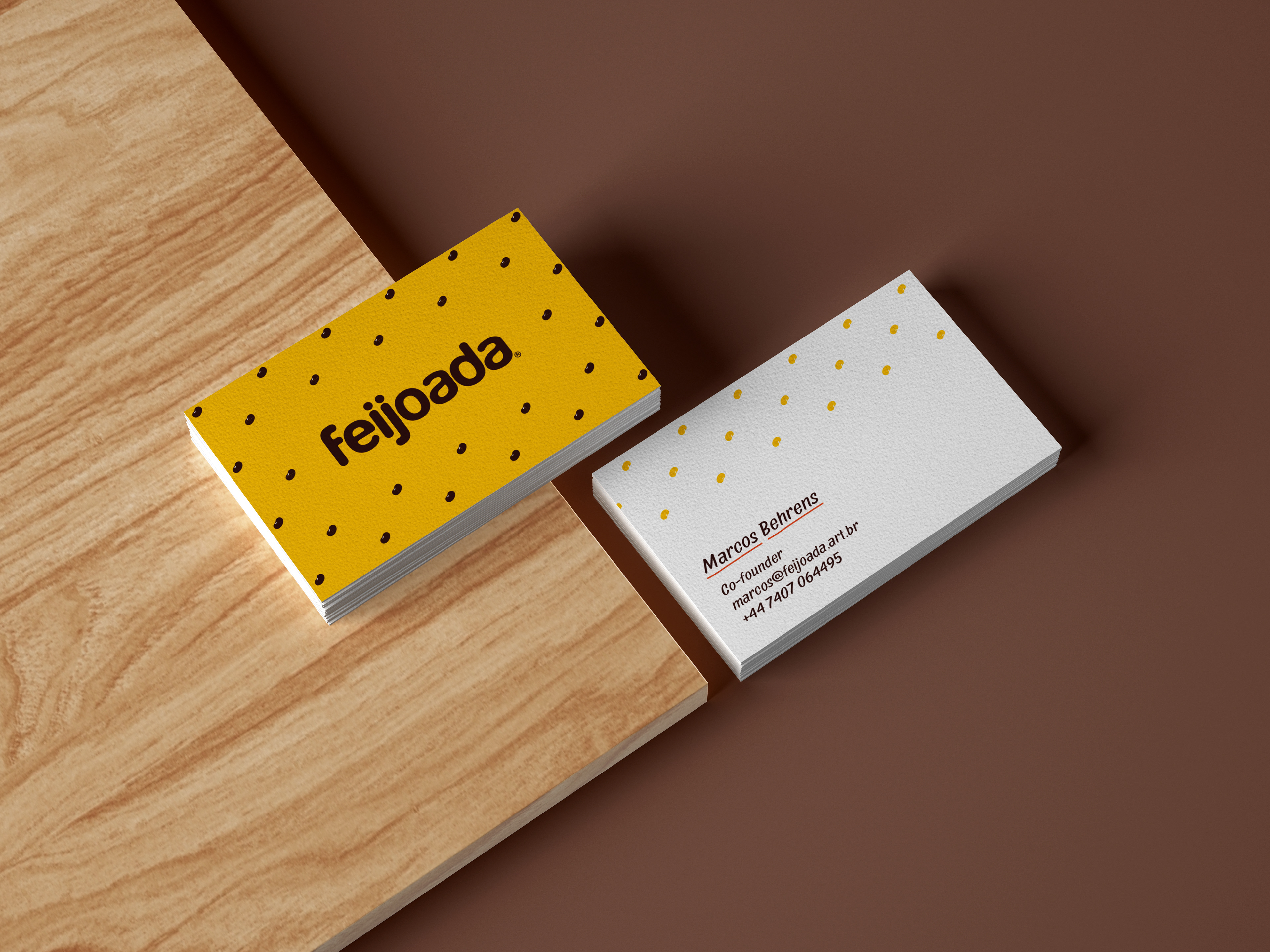
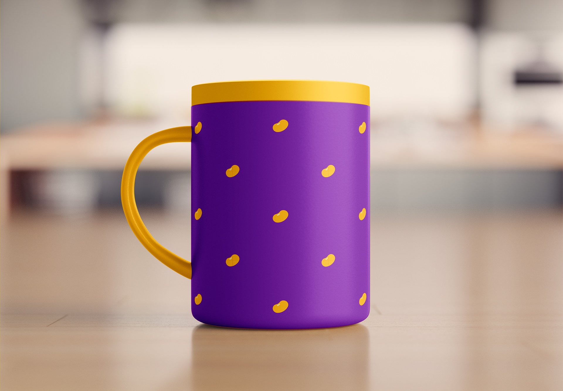
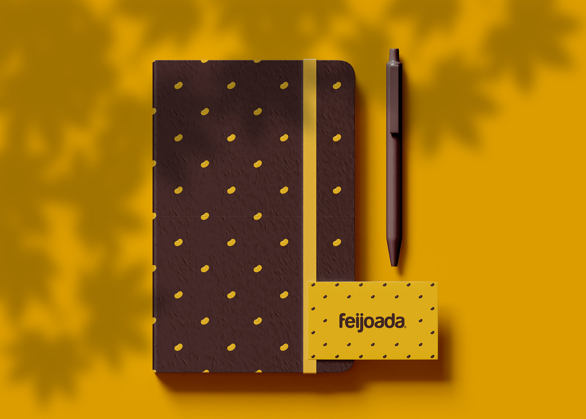
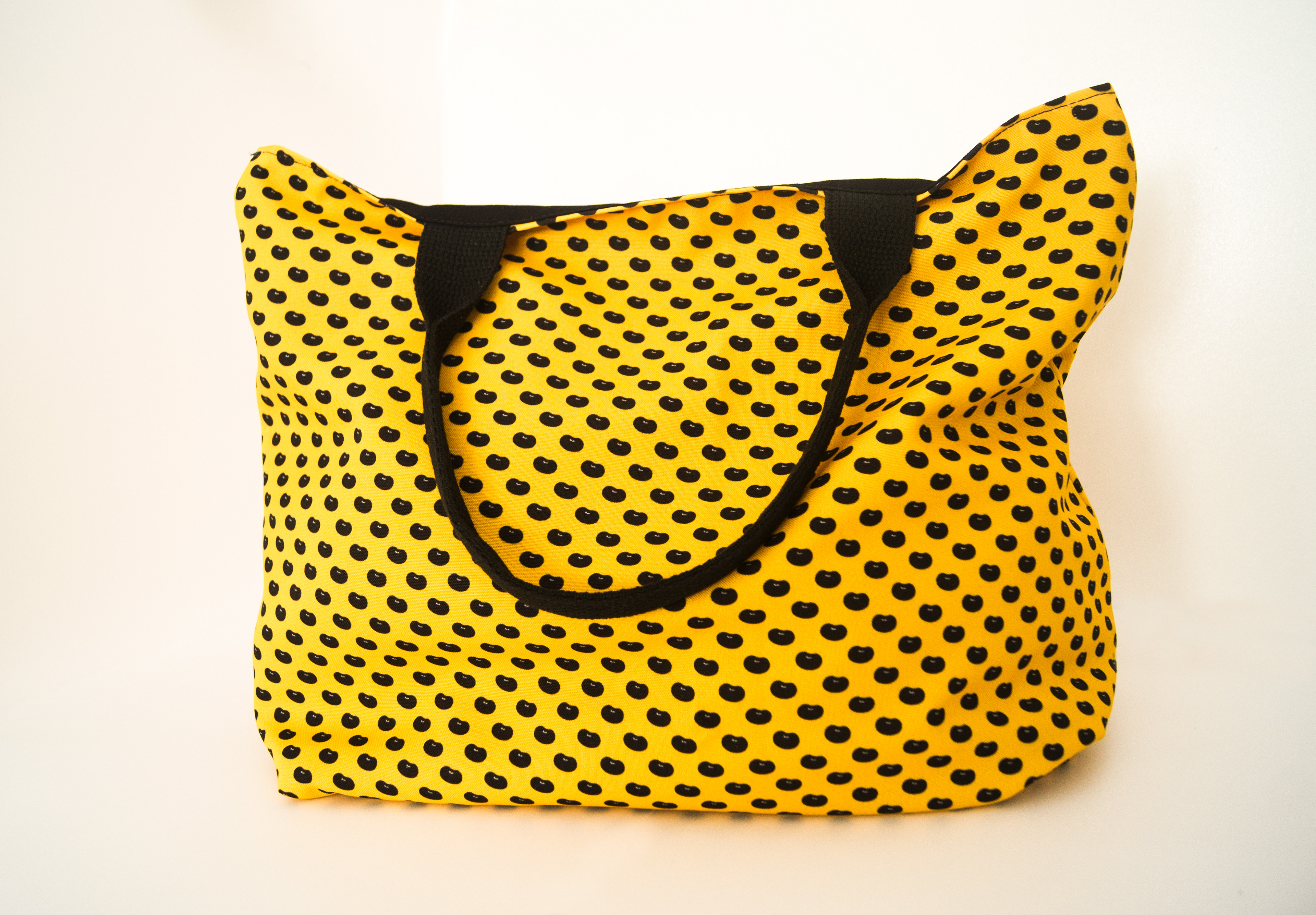
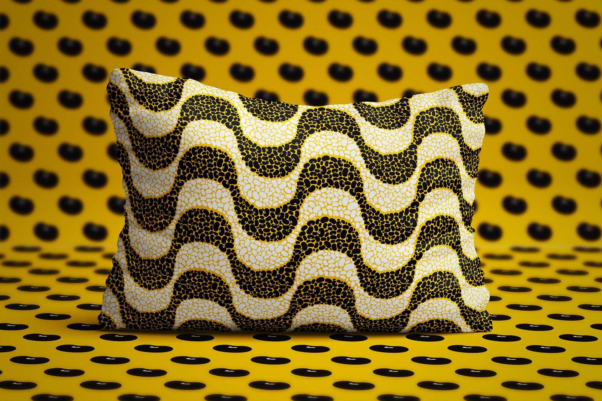
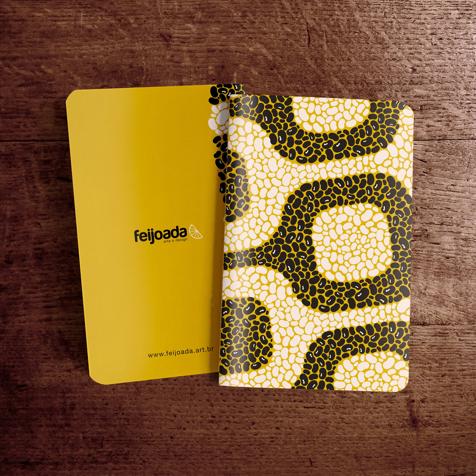
The brand identity roll-out is based on pattern designs from the bean and orange icons.
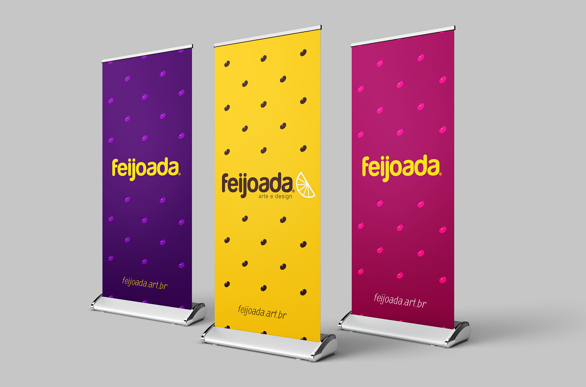
Colour usage on patterns
Usage of logos on patterned backgrounds
Typographic style
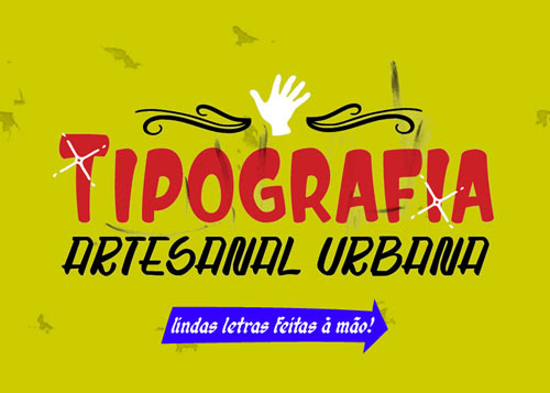
Calligraphic posters on street fairs and farmer's markets inspired the type treatment of the identity creating and charismatic and engaging look and feel.
Usage of type compositions on patterned backgrounds
You can see the complete brand guide here.
