
Corporate Identity System for Faraday Grid.
Expressing Grid Dynamics through Visual Language.
The Faraday Grid intended to revolutionise the energy grid with ground breaking technology to allow electricity to be more efficient, sustainable and affordable to the end consumer.
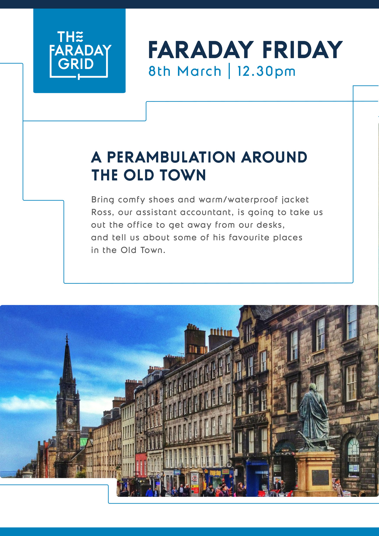
The Faraday Grid corporate identity extends the visual DNA of the brand into professional communications. It’s built for clarity, flexibility, and coherence across corporate touchpoints.
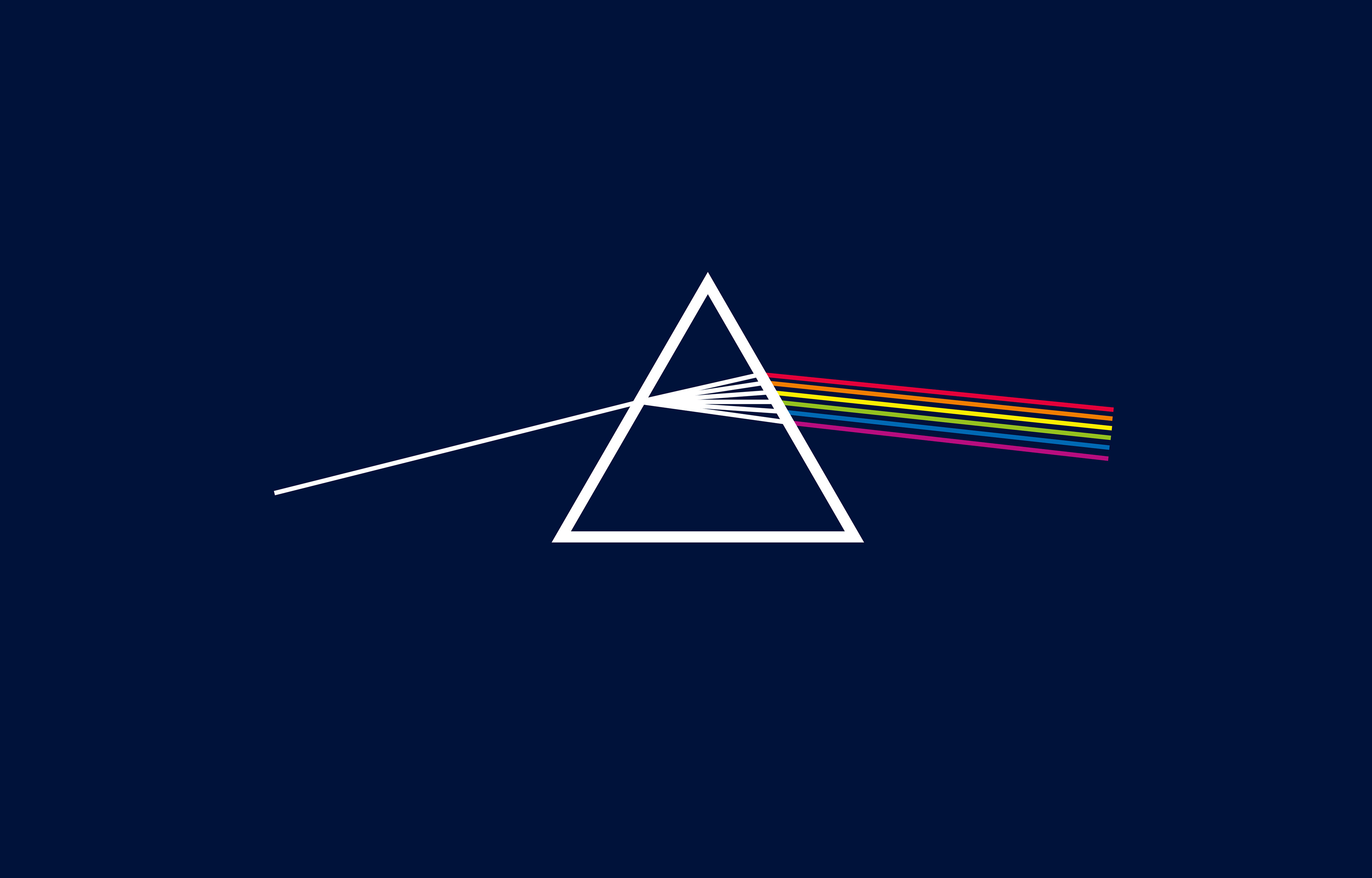
The expression of the light
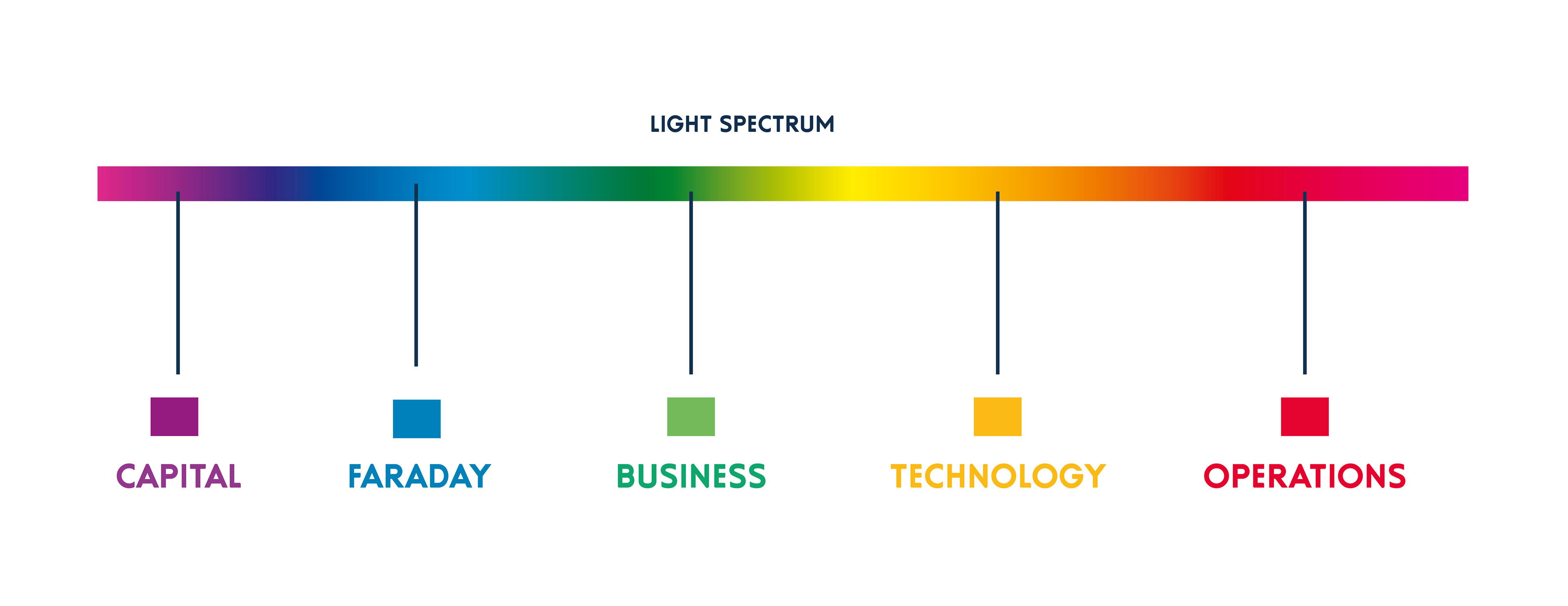
The brand colour range comes from light spectrum setting out a colour-coded strategy to address internal communications and corporate needs.
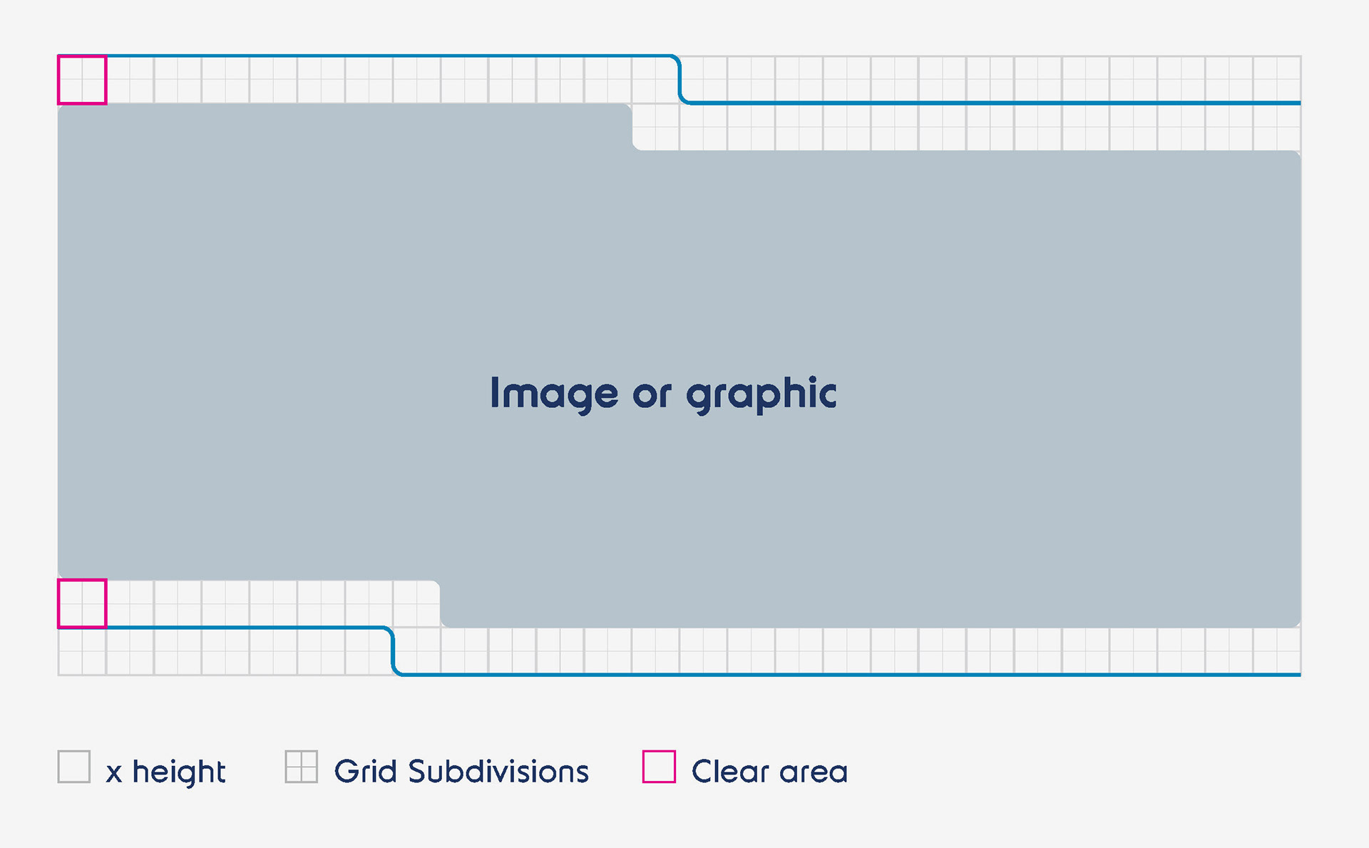
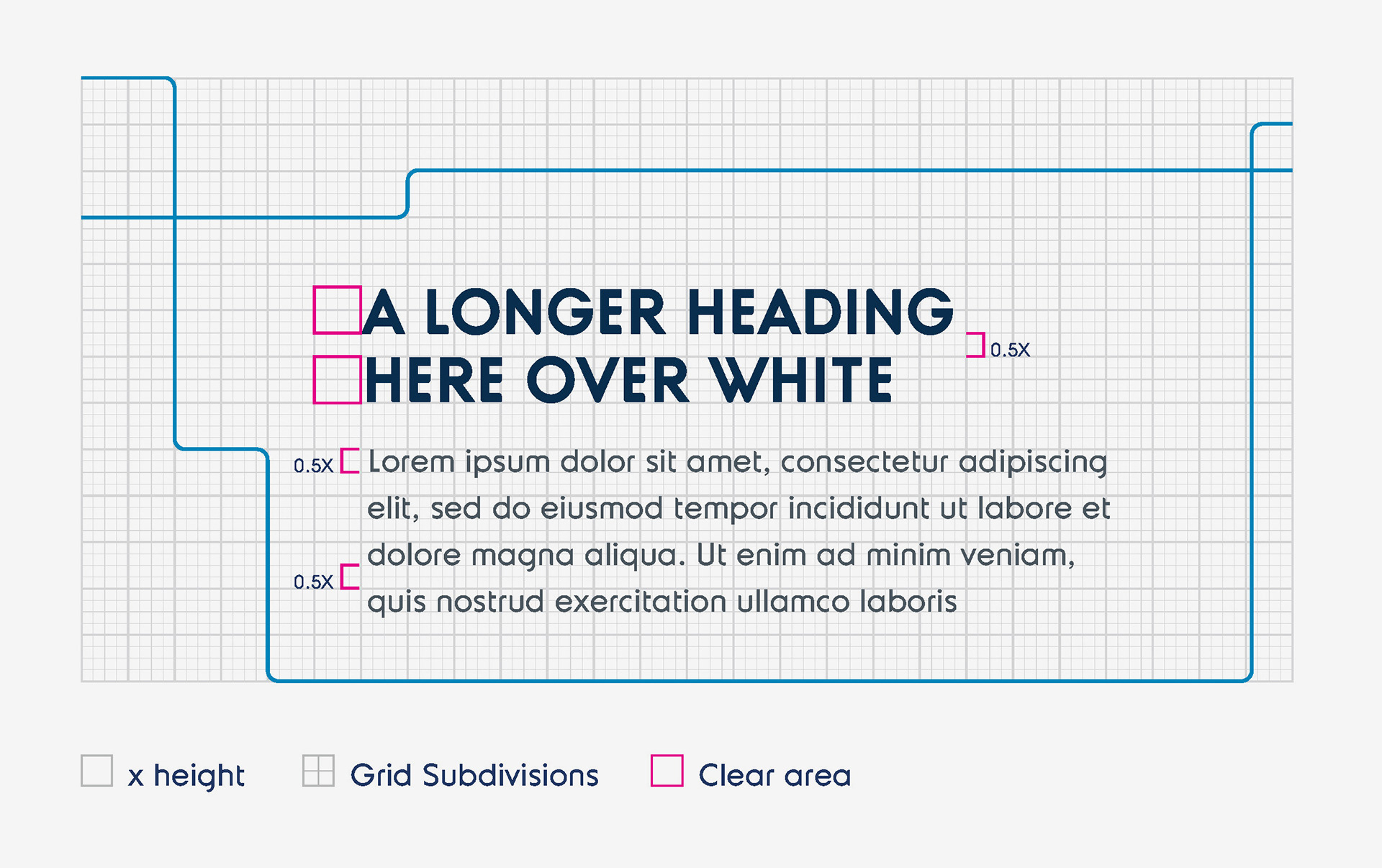
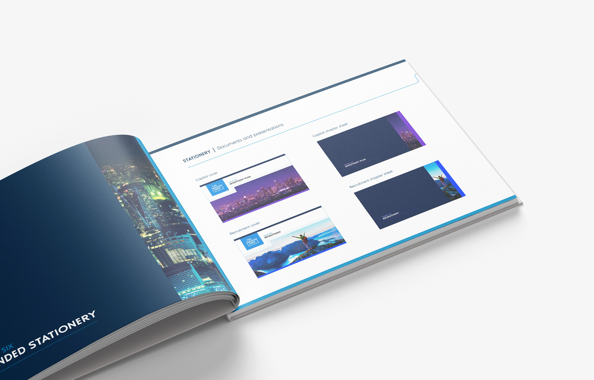
Design System in Action
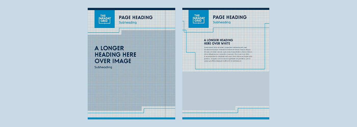
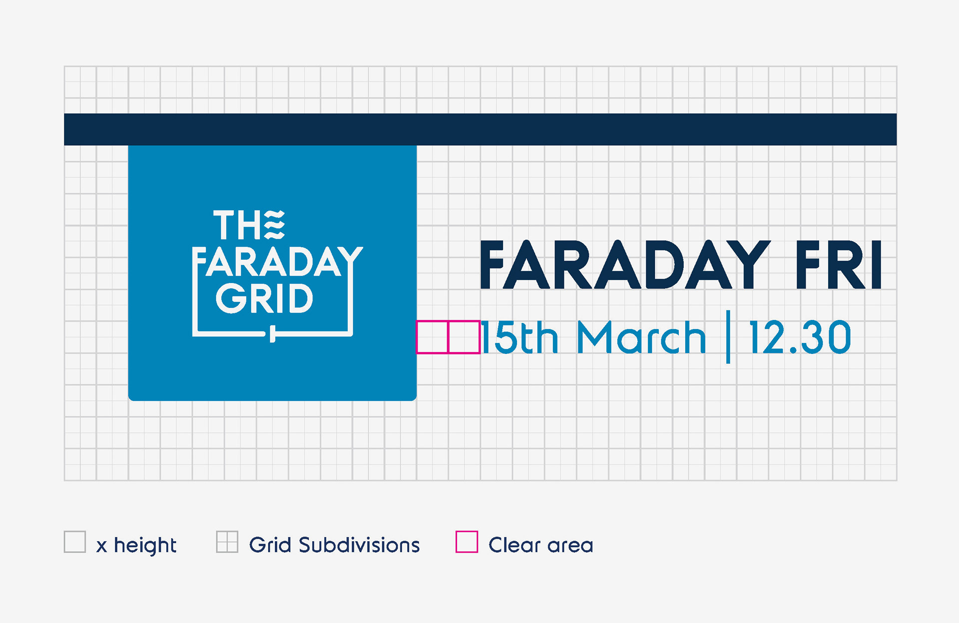
A modular layout system inspired by gridlines, intersections, and nodes enables dynamic communication templates. Paired with the “Expression of Light” colour strategy, the system brings a sense of movement, adaptability, and energy to documents and printed materials.
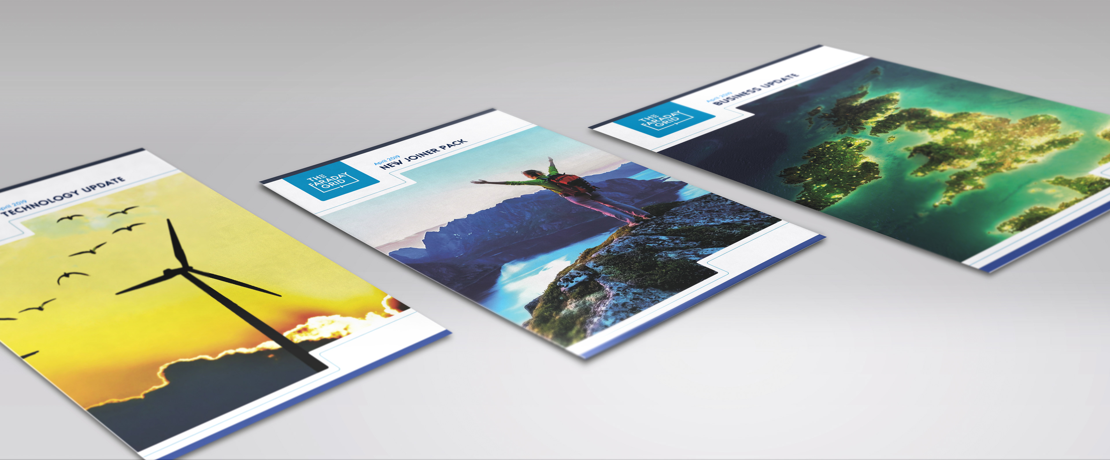
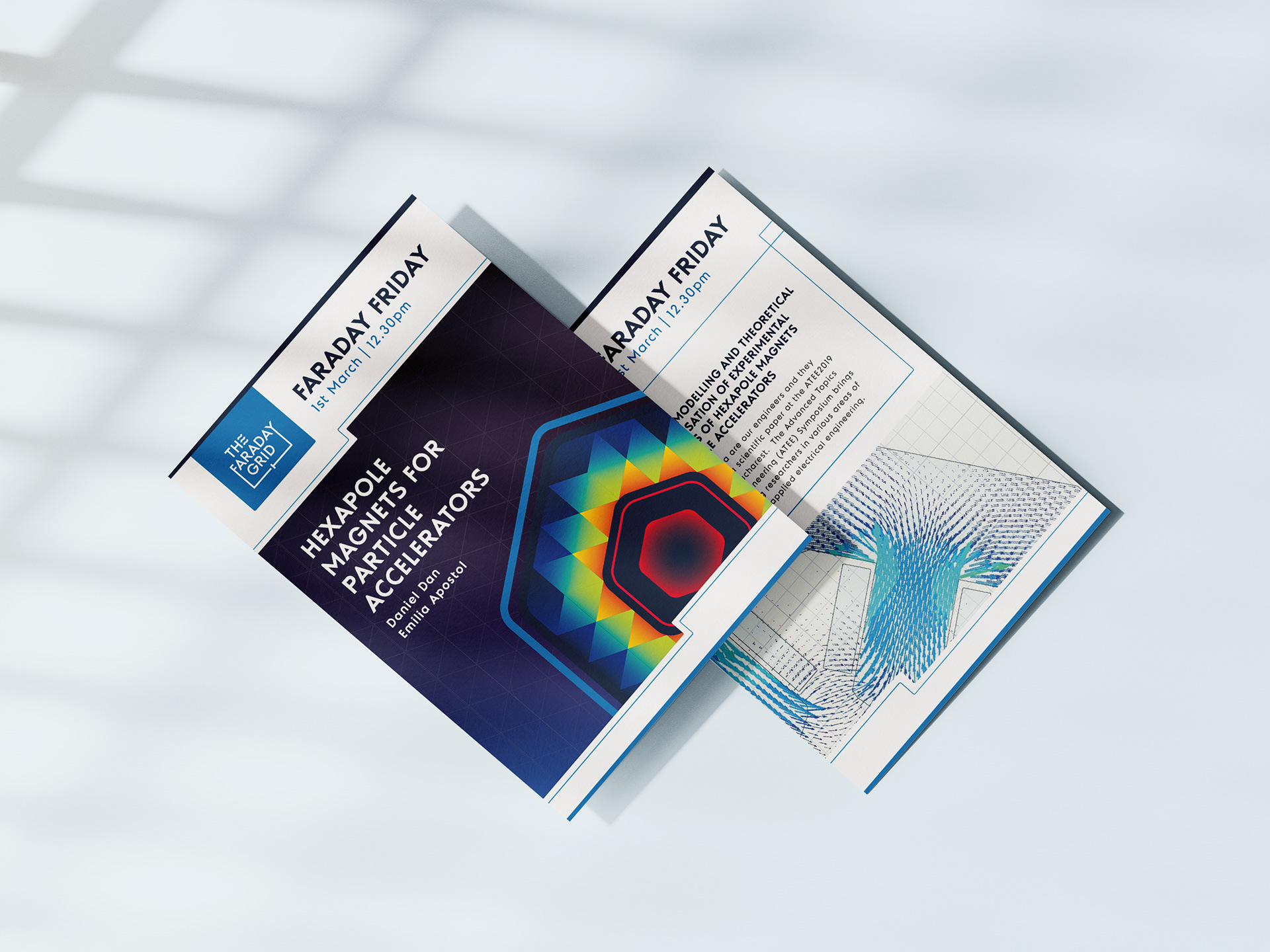
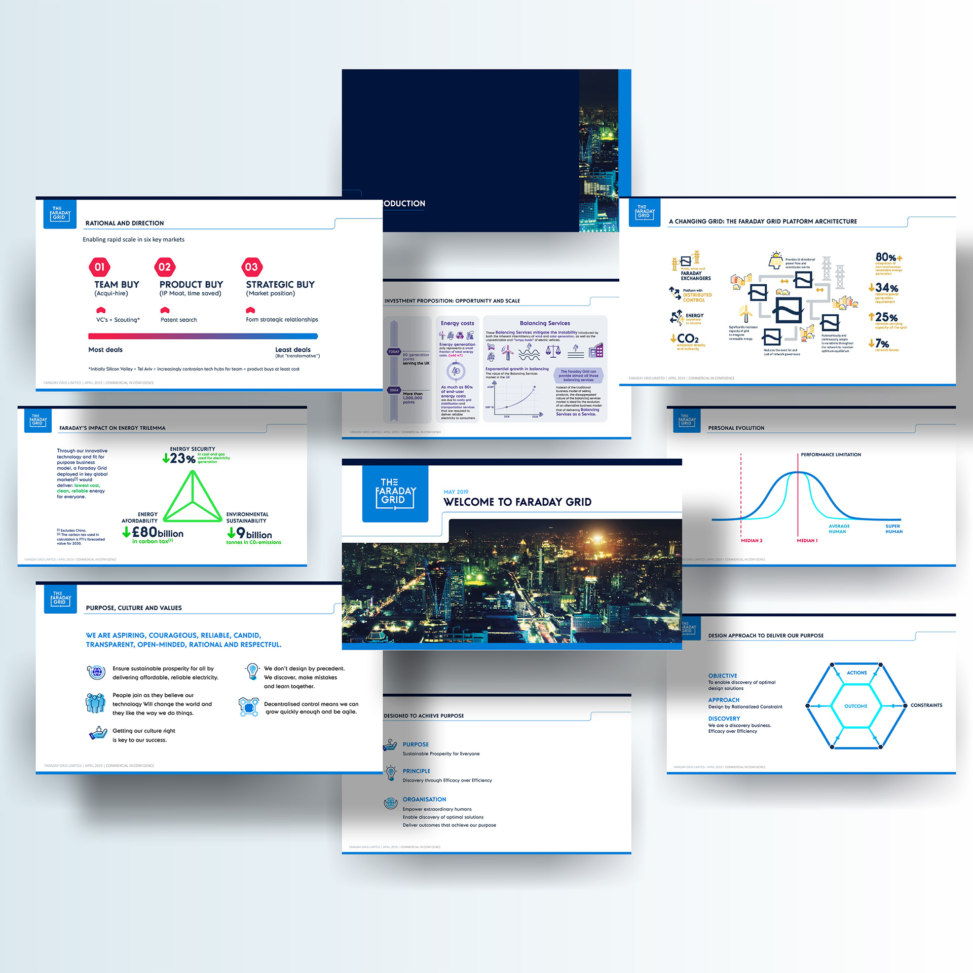
Visual Implementation
From letterheads and business cards to presentation slides and reports, the identity scales beautifully—unifying corporate messaging under a dynamic, system-driven aesthetic without adding visual noise.


Want a visual identity that’s structured yet expressive?
Let’s build systems that reflect your brand's movement and core values.