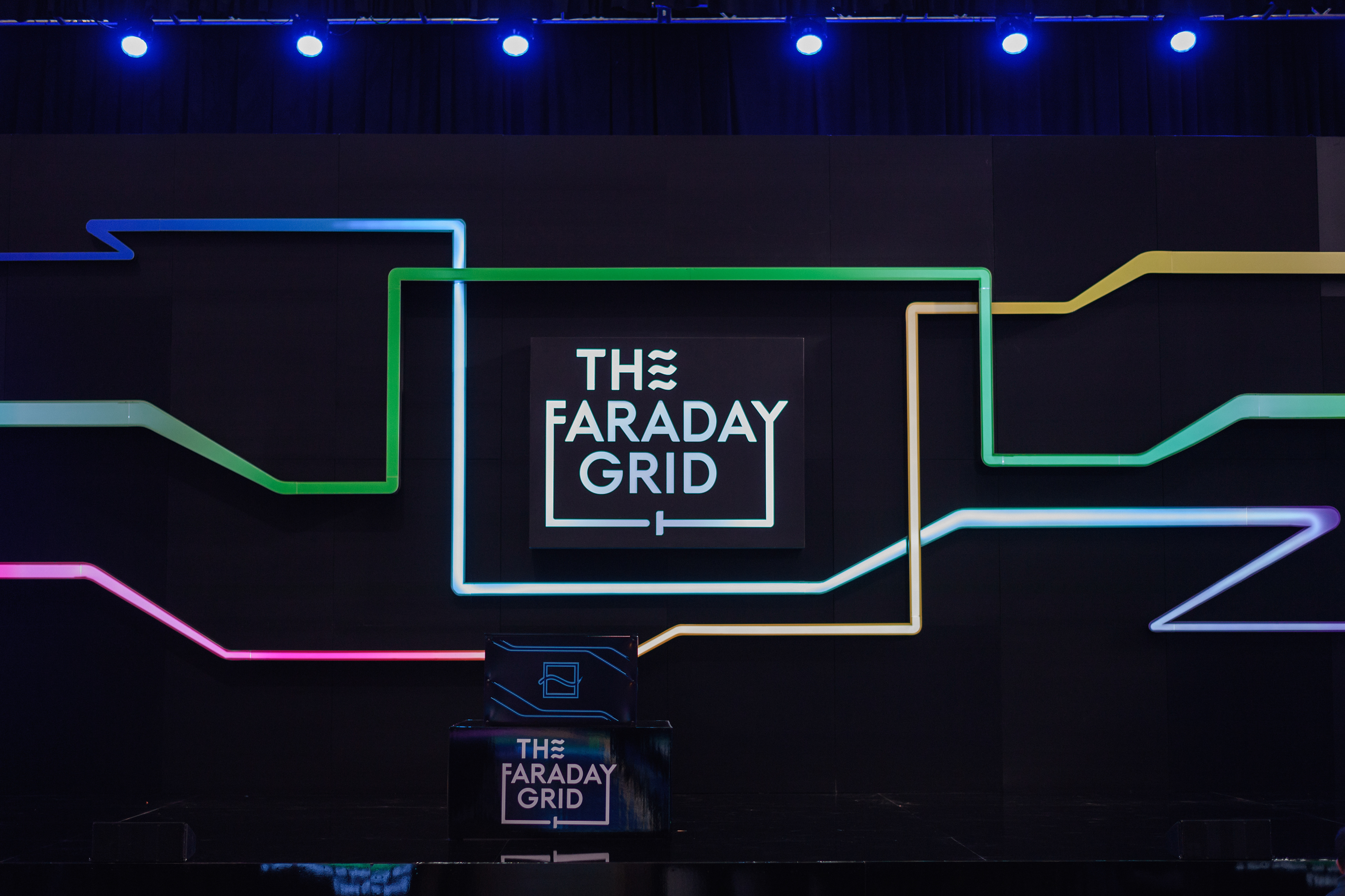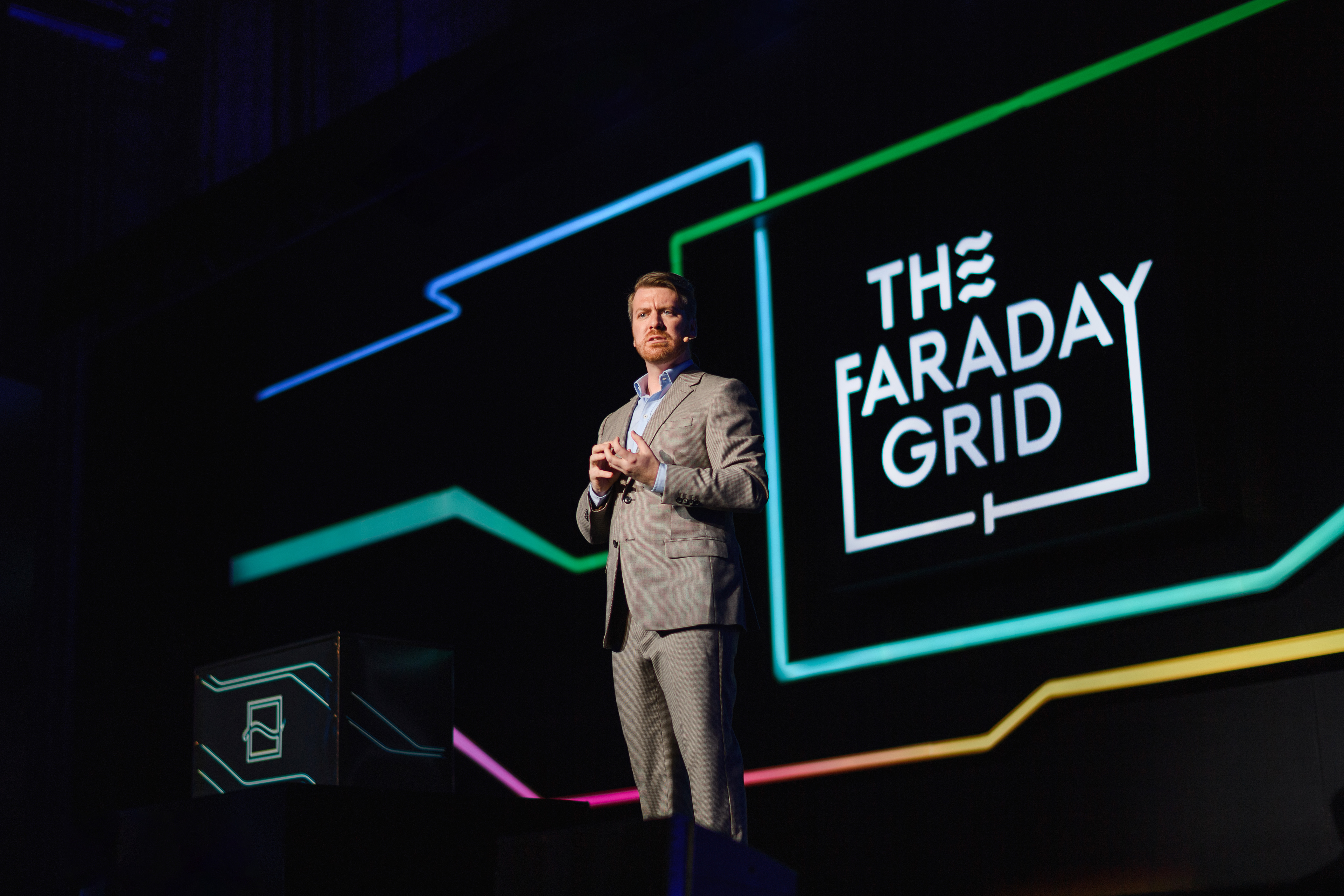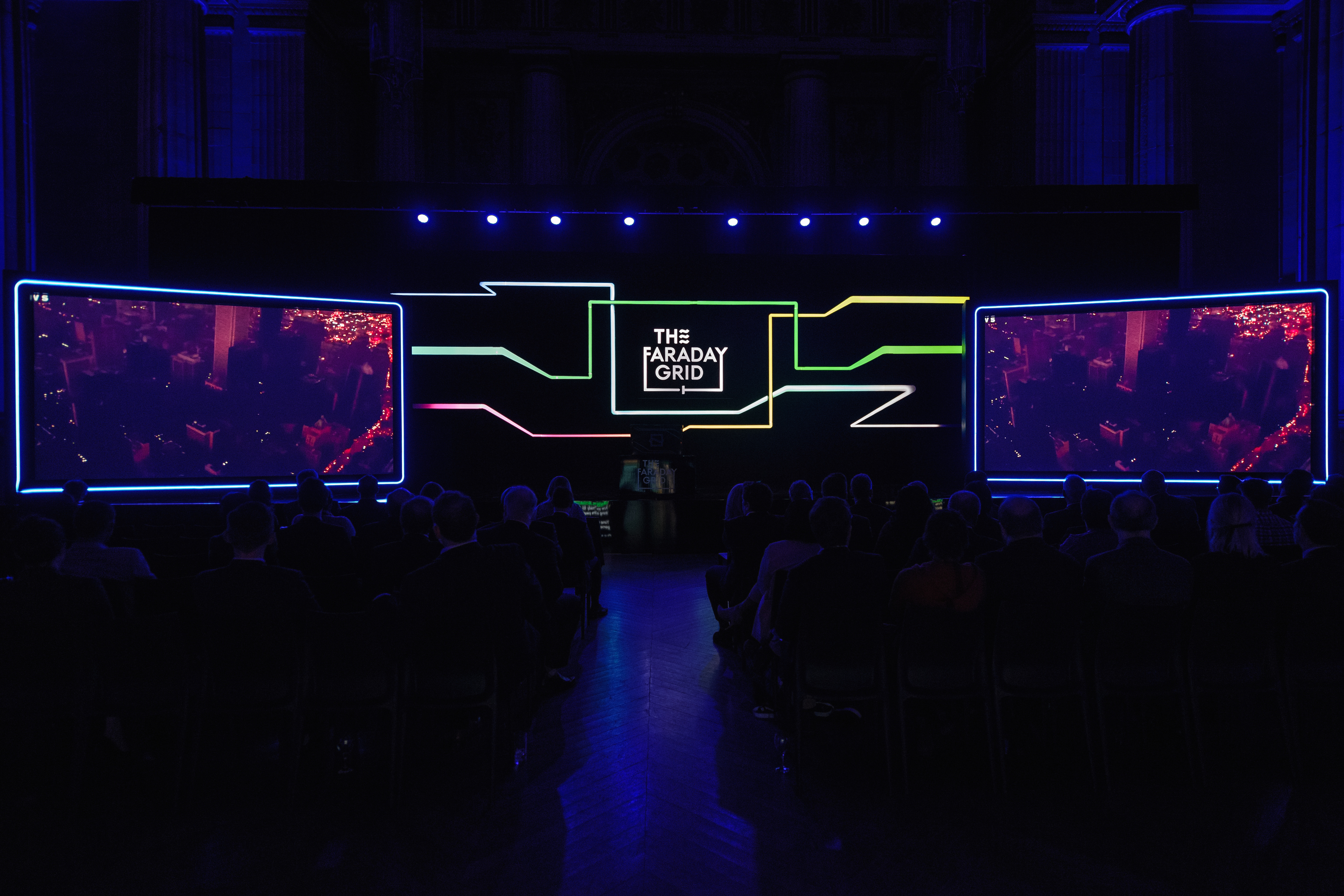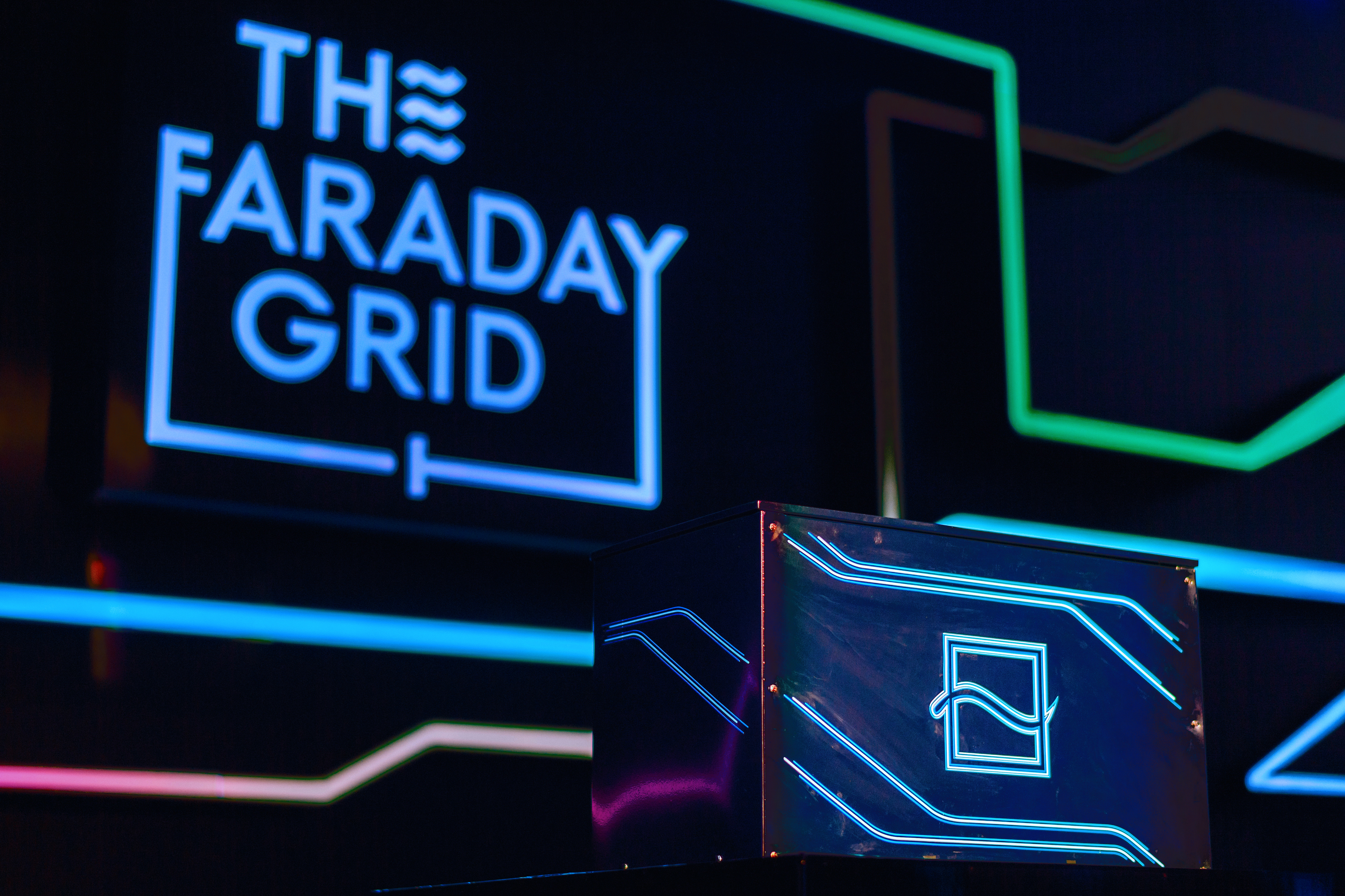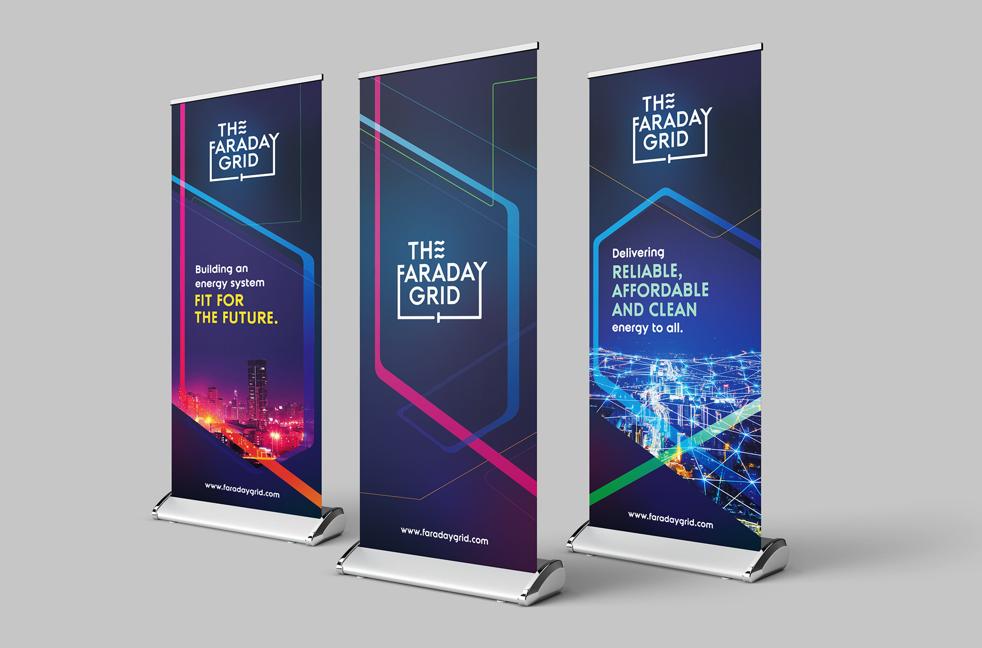
The Faraday Grid intended to revolutionise the energy grid with ground breaking technology to allow electricity to be more efficient, sustainable and affordable to the end consumer.
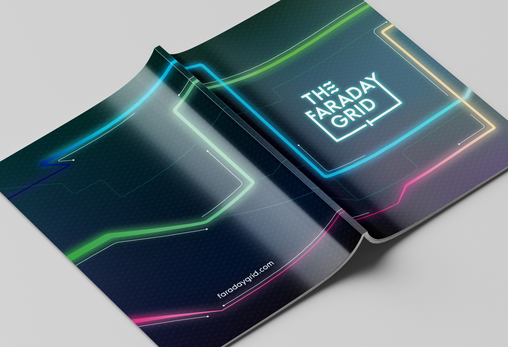
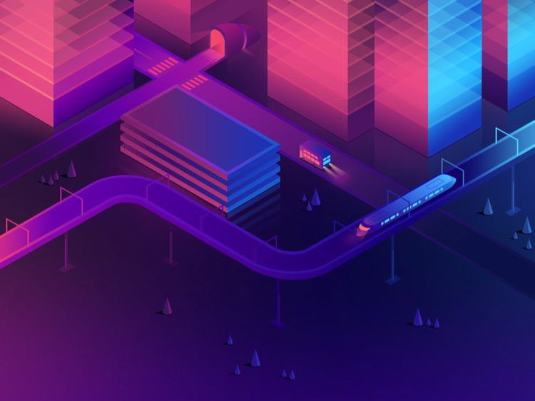
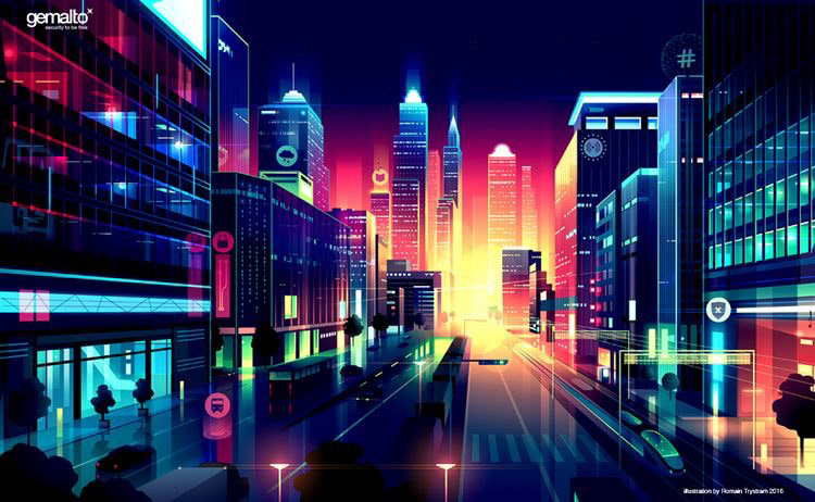
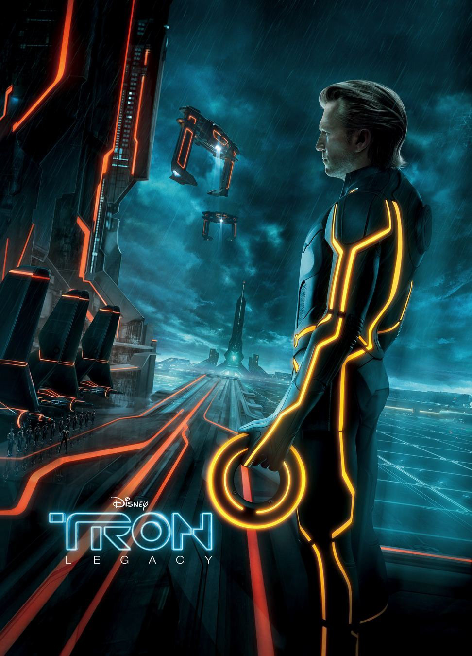
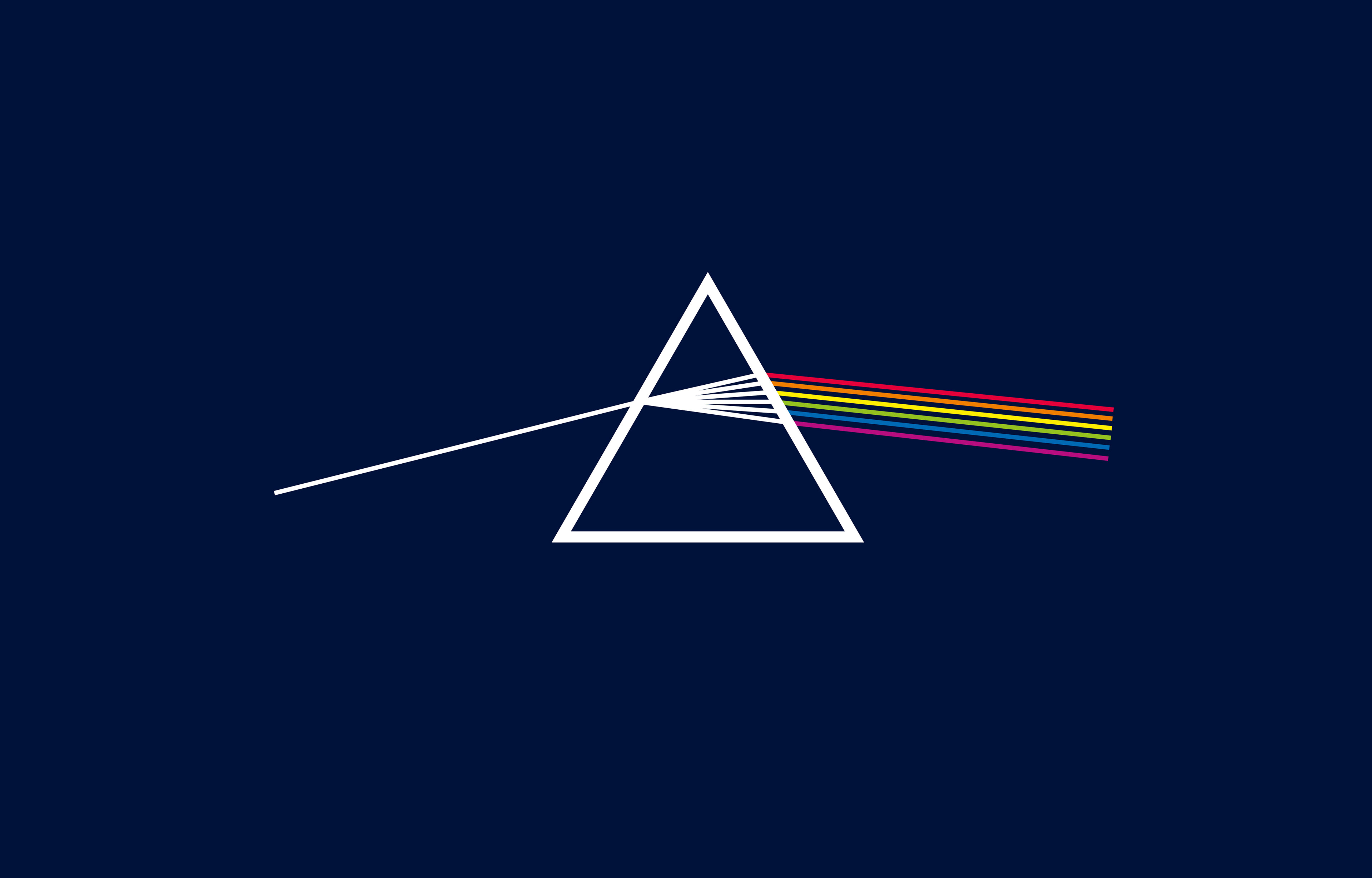
Futurism and neon lights and cyber-punk aesthetics inspired the identity. It portrayed the energy grid with vibrant colours and dynamic graphics as a path to a brighter future.

Futurism Moodboard
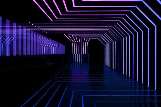
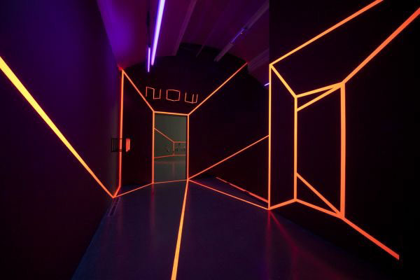
The expression of the light
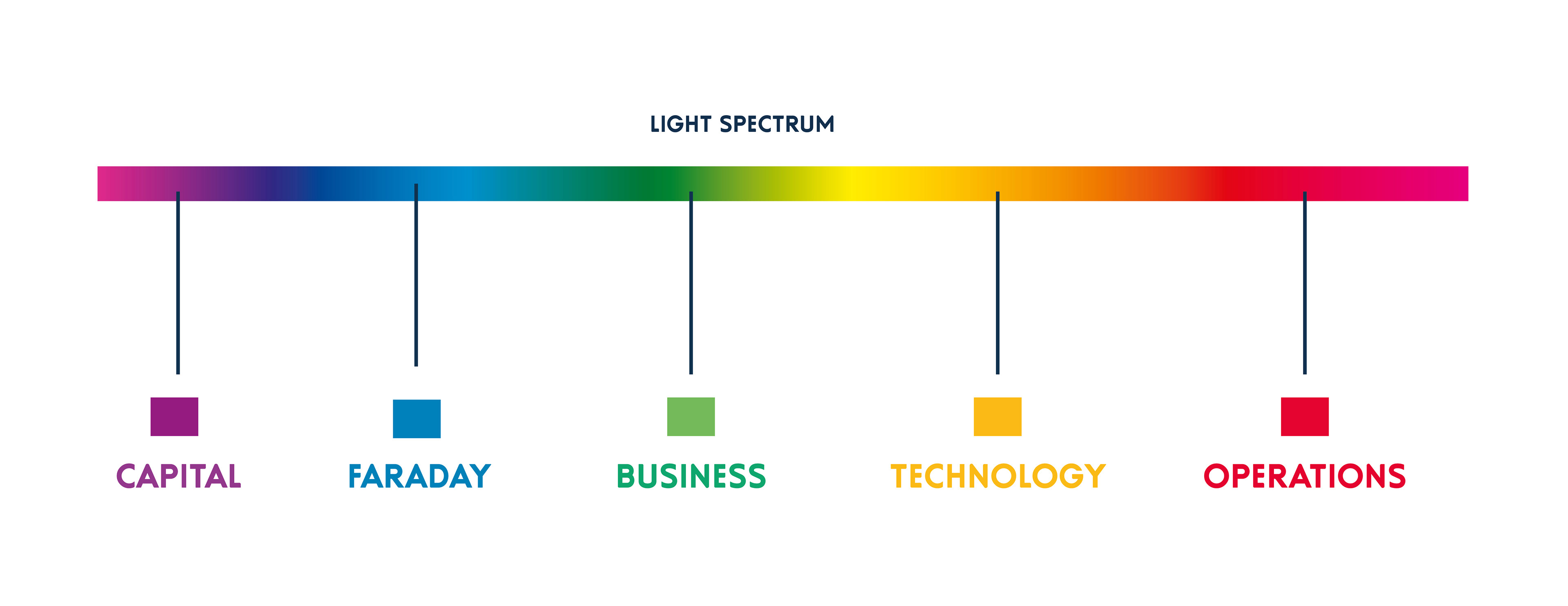
The brand colour range comes from light spectrum setting out a colour-coded strategy to address internal communications and corporate needs.
Graphic DNA
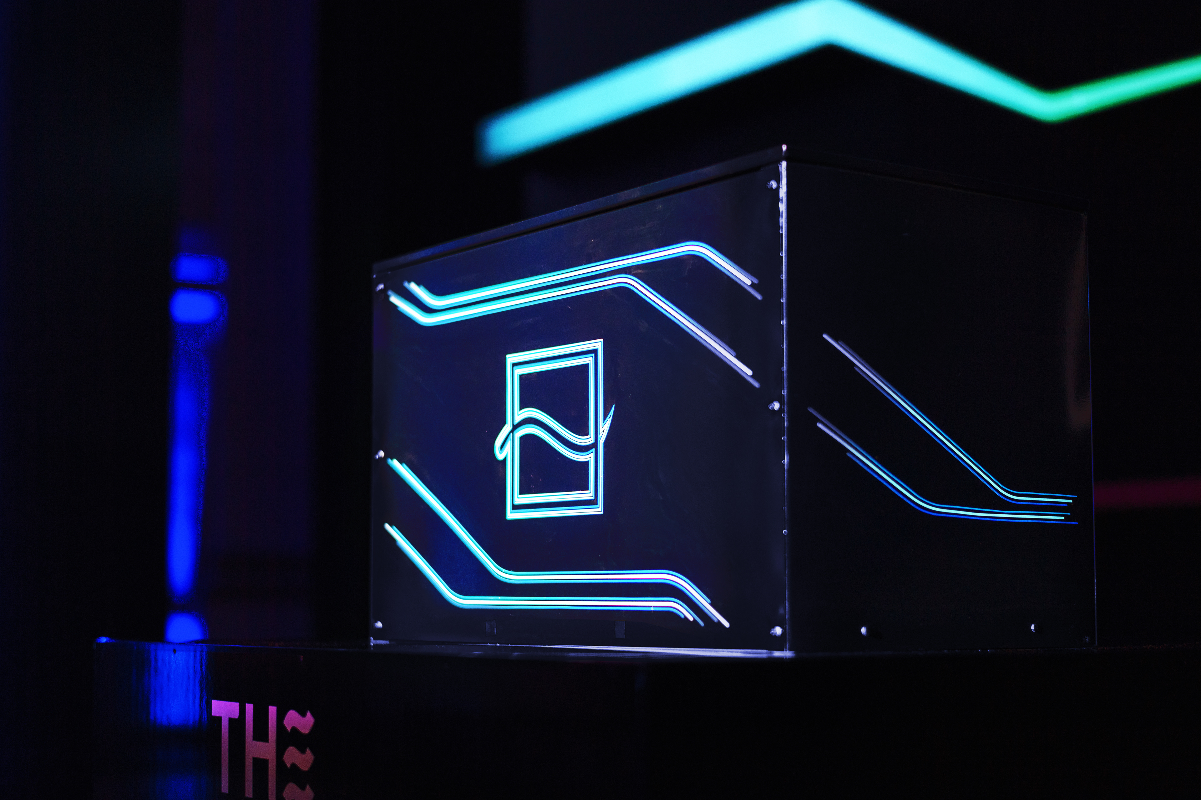
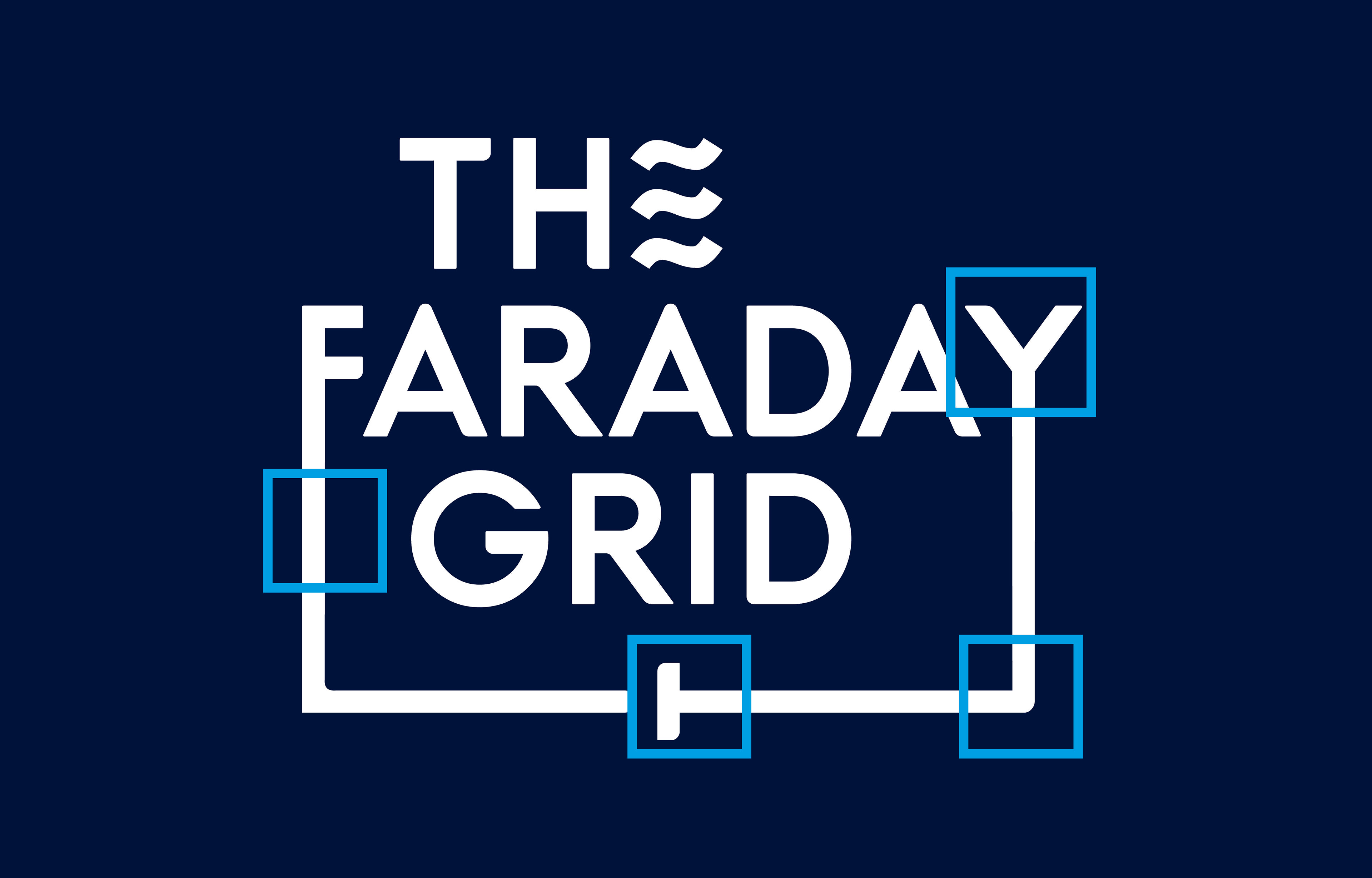
The Faraday Grid’s logo is formed of elements that relates to lines, conections, intersections, joints and forks forming grids.
The lines, as they move through the plane, create grids and systems. It shows the grid as an organic multidimentional structure that moves, grows and adapts in every direction. It was unfold into event branding, stage design, animation and collaterals.
The graphic grid
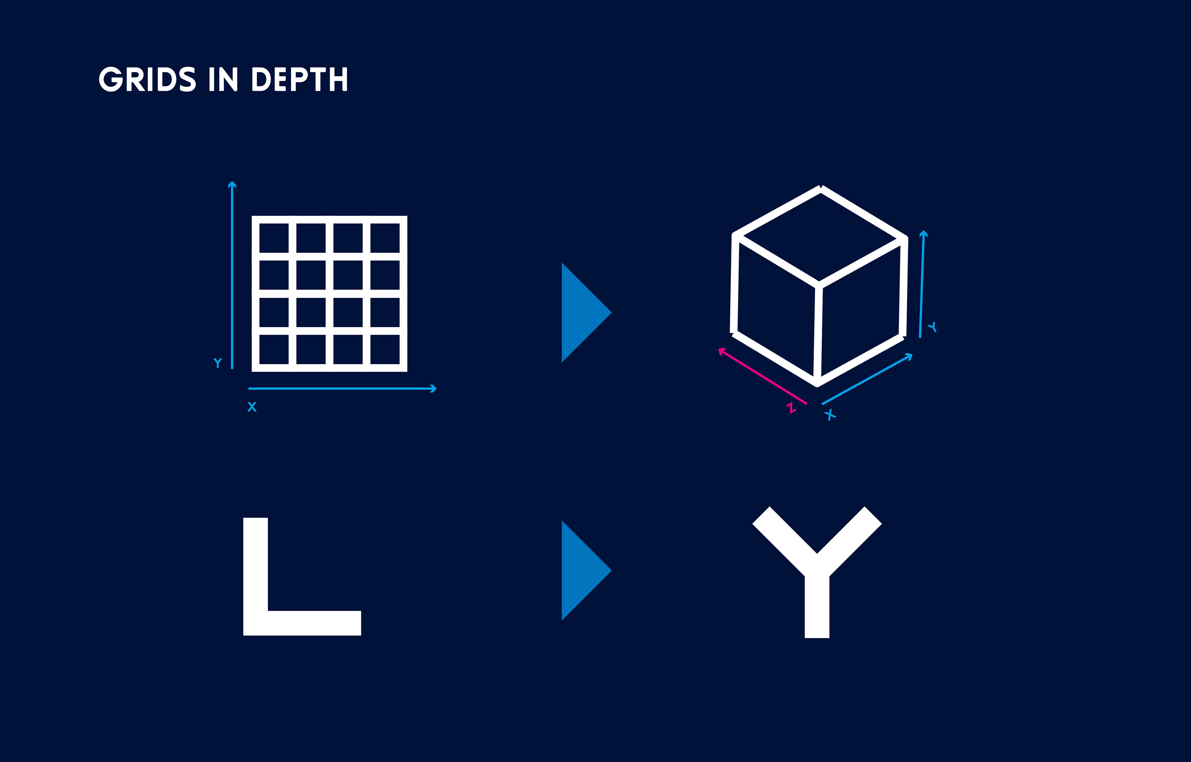
By adopting a tri-dimentional approach and extruding the axis of a cube, we discover the scheme on the left based primarily on 60ª and 120ª angles.
That principle applies in establishing design standards and the isometric grid.
However, subdivisions of those angles by 15ª may apply for better represent concepts and shapes during the design development.