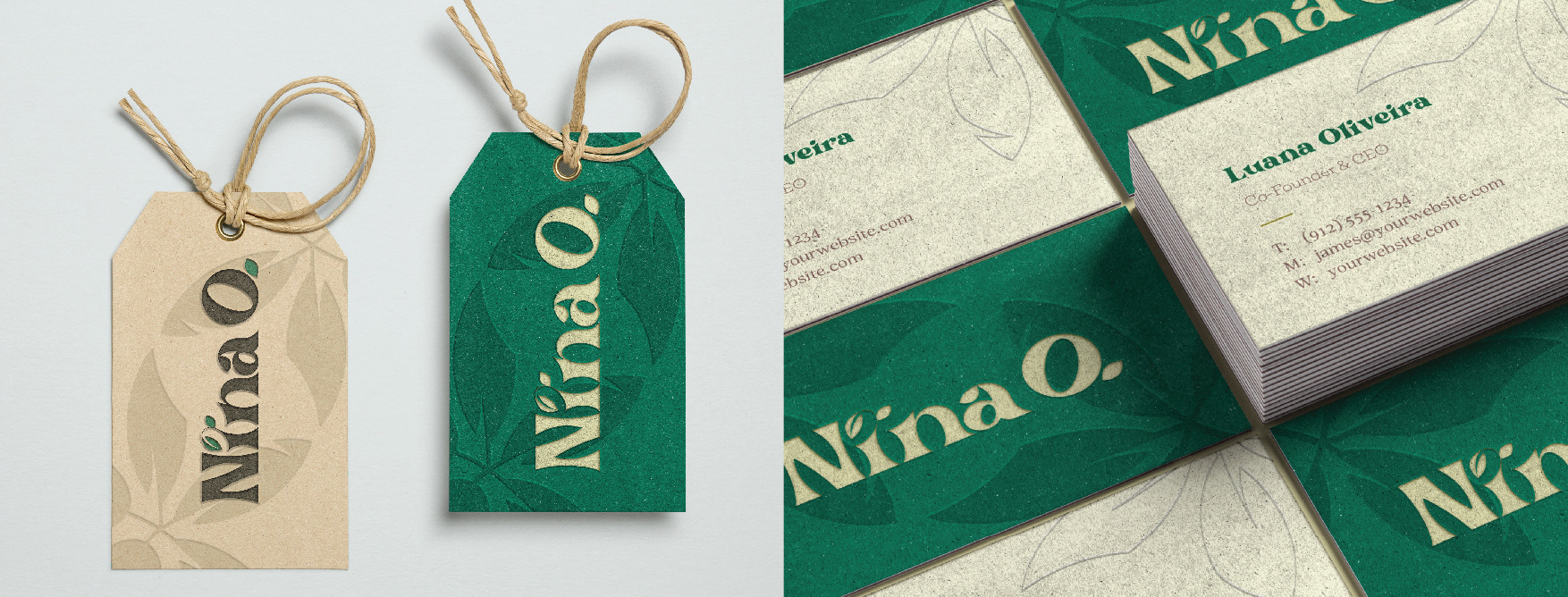
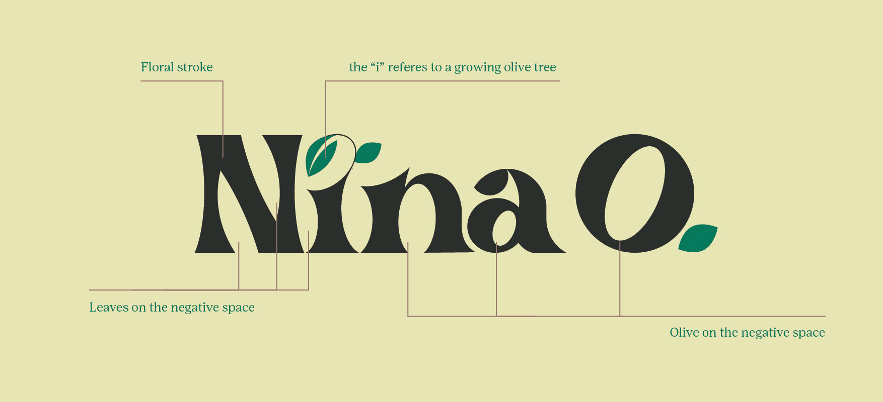
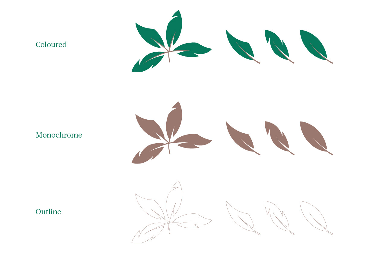
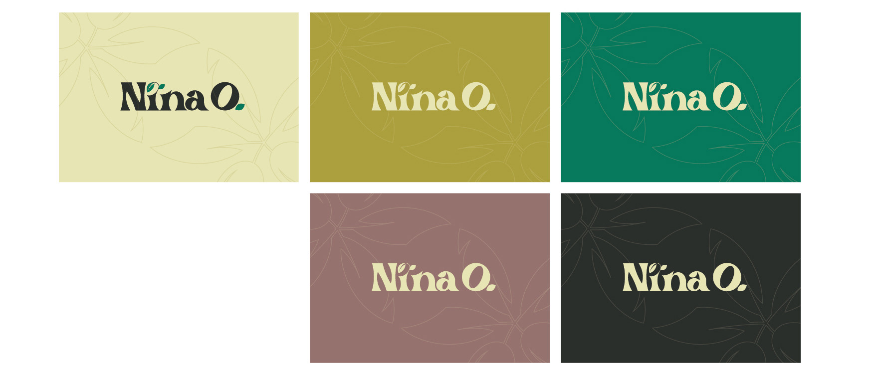
This is a concept for anew brand for on Brazil's personal care market. The "O" stands for Oliveira, that translates as Olive tree in English.
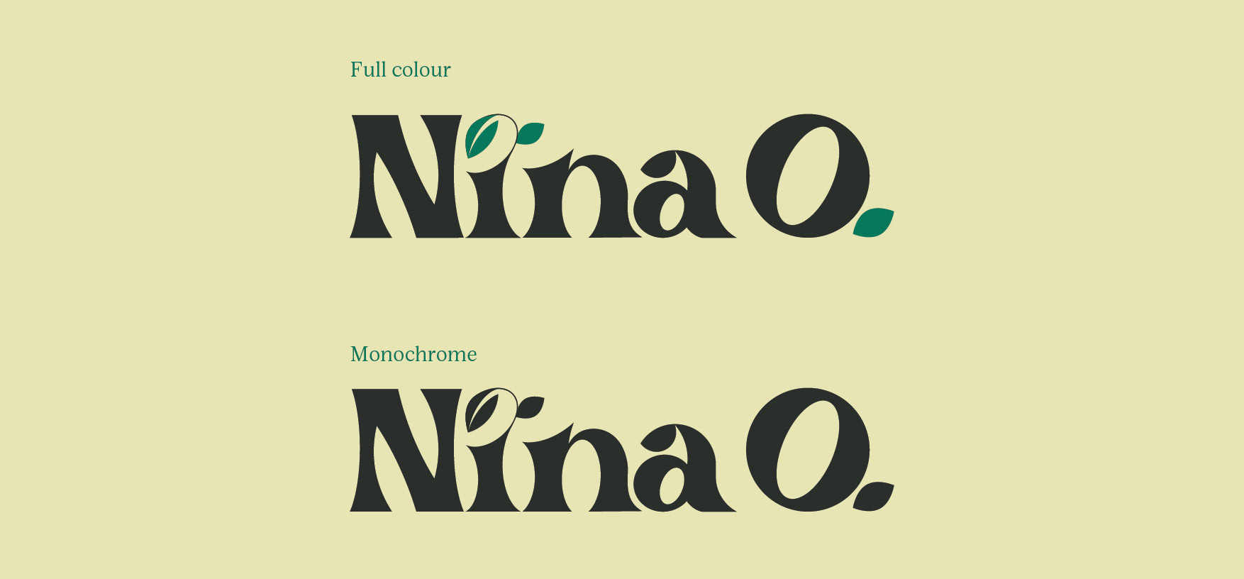
The developed bespoke typeface is organic and floral and takes the curves of the plant, leaves and olives in its design DNA. The "i" is a focal point and also depicts a growing olive tree.

Brand DNA
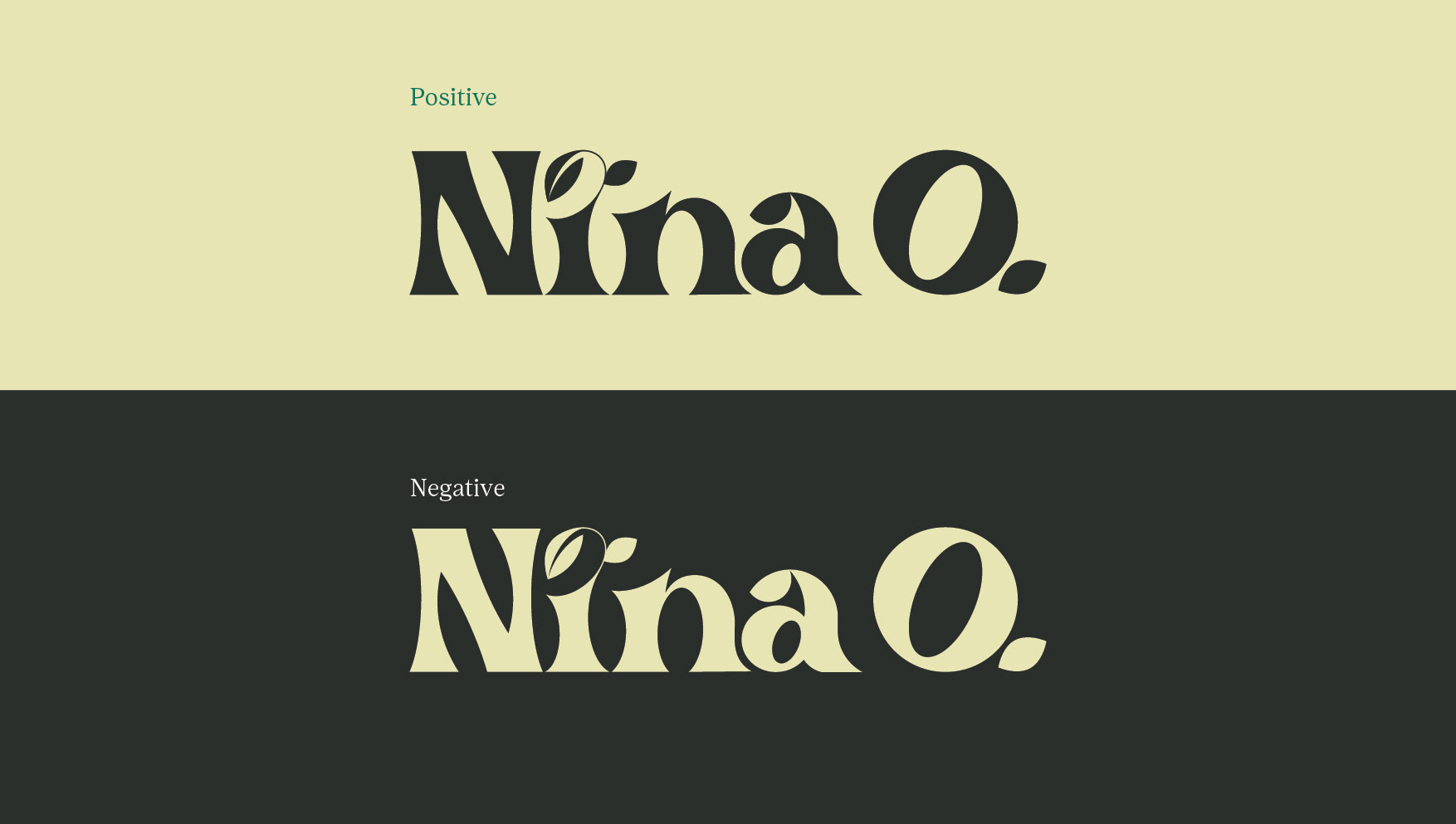
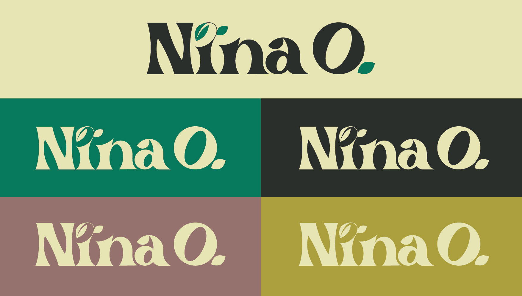
Logo versions
Colour palette
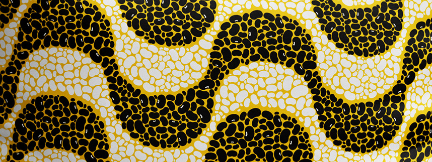
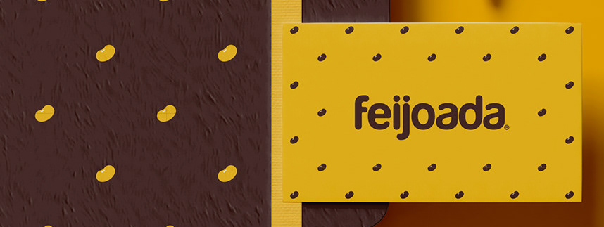
Graphic elements
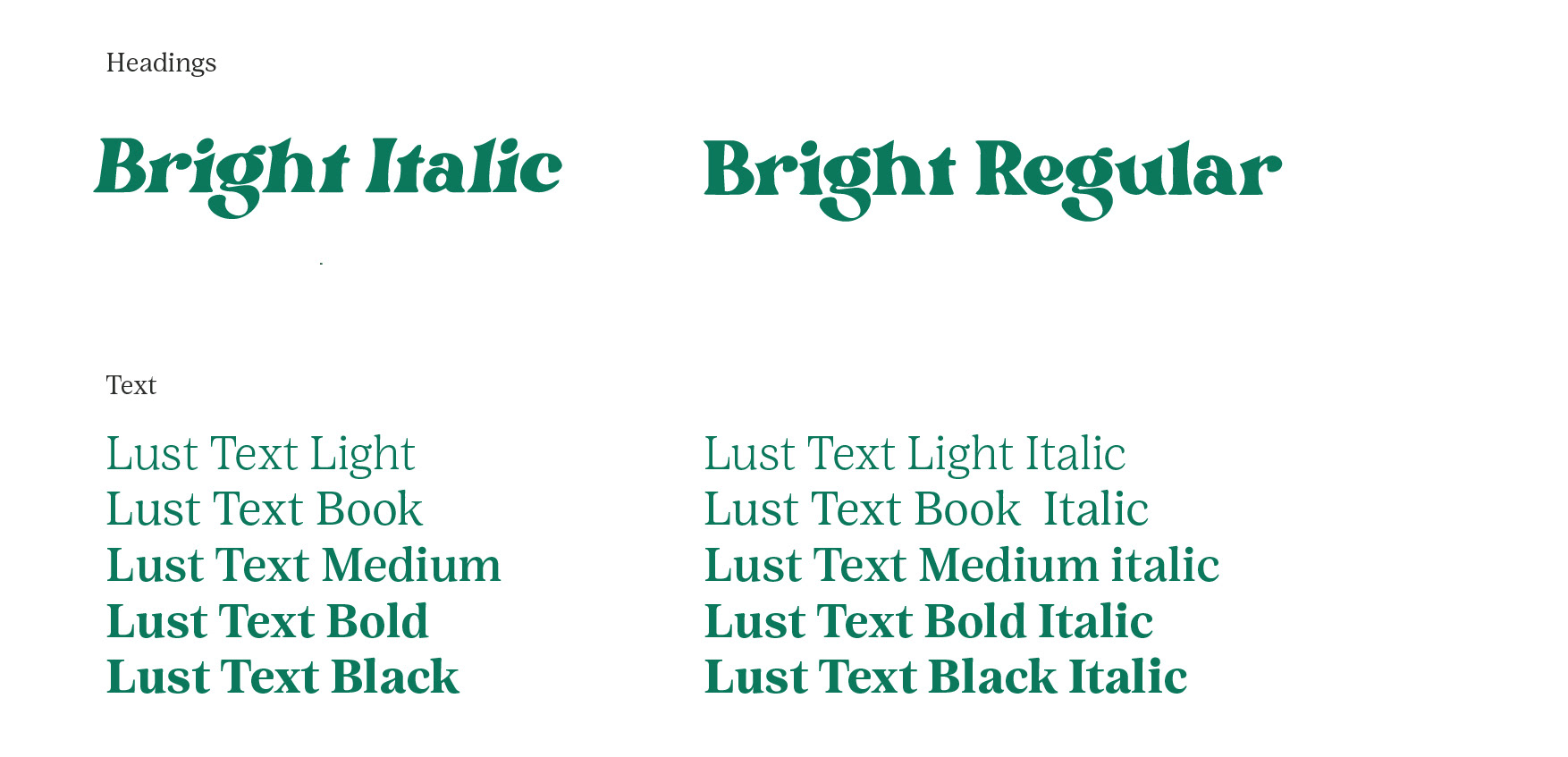
Typography
Design Application